


Color Palette With Five Shade Surfie Green Java Granny Apple Sunshade Blaze Orange




Try Before you Buy Download Free Sample Product
 Impress Your
 Audience
 100%
100% Editable
 Save Hours
 of Time


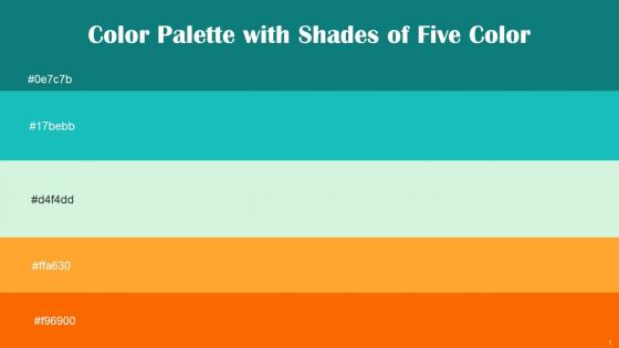
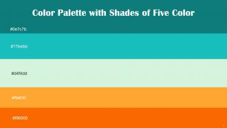
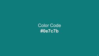
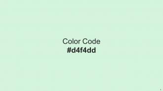
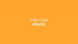
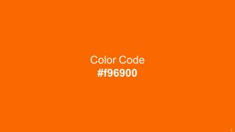
Heres a visually-pleasing color palette with Five Color Shades With Hex Code 0e7c7b, 17bebb, d4f4dd, ffa630, f96900. These colors are intuitively picked to ignite the spark of brilliance in your designs and creativity.
People who downloaded this PowerPoint presentation also viewed the following :
Color Palette With Five Shade Surfie Green Java Granny Apple Sunshade Blaze Orange with all 14 slides:
Use our Color Palette With Five Shade Surfie Green Java Granny Apple Sunshade Blaze Orange to effectively help you save your valuable time. They are readymade to fit into any presentation structure.








FAQs for Color Palette With Five Shade Surfie Green Java Granny Apple
Color psychology significantly influences audience perception by triggering emotional responses, enhancing memory retention, conveying brand identity, and guiding attention to key information during presentations. Strategic color choices enable presenters to build trust through blues, create urgency with reds, and establish credibility through professional palettes, with many organizations finding that consistent, psychologically-informed color schemes ultimately deliver stronger audience engagement and more memorable messaging.
A cohesive color palette enhances presentation impact by creating visual harmony, improving readability, reinforcing brand identity, and guiding audience attention strategically. Through consistent color application, organizations streamline content comprehension, establish professional credibility, and strengthen message retention, with many corporate teams finding that unified palettes ultimately deliver more persuasive presentations and enhanced audience engagement.
Key factors include brand consistency, audience demographics, cultural meanings, accessibility requirements, and presentation environment lighting. These considerations work together by ensuring visual coherence with company identity, resonating with target stakeholders, and maintaining readability across different viewing conditions, with many organizations finding that strategic color choices enhance message retention and professional credibility.
Contrasting colors enhance slide readability by creating clear visual separation between text and backgrounds, reducing eye strain, and ensuring content remains visible across different viewing conditions and screen types. Through strategic color combinations, presenters deliver more accessible content that engages diverse audiences effectively, while maintaining professional appearance standards that reinforce key messages and ultimately improve audience comprehension and retention rates.
**INPUT**: What are some common color combinations that work well for various topics and themes? **OUTPUT**: Effective color combinations include blue-white for corporate presentations, green-gold for financial topics, red-black for urgent communications, purple-silver for luxury brands, and orange-gray for creative projects. These strategic pairings enhance audience engagement by reinforcing message clarity, establishing emotional connections, and supporting brand recognition, with many organizations finding that consistent color schemes increase presentation effectiveness and professional credibility. [Word count: 60 words]
Cultural context significantly influences color interpretation in global presentations, as colors carry different symbolic meanings across regions—red signifies luck in China but danger in Western cultures, while white represents purity in America but mourning in some Asian countries. Understanding these cultural nuances enables presenters to select appropriate color palettes that resonate with diverse audiences, avoid potential misunderstandings, and enhance message effectiveness across international markets, ultimately delivering more impactful and culturally sensitive communications.
**INPUT**: What tools and resources can help in selecting an effective color palette for presentations? **OUTPUT**: Color palette selection tools include Adobe Color, Coolors.co, Canva's palette generator, brand guideline templates, and accessibility checkers like WebAIM. These resources streamline design workflows by offering pre-tested combinations, ensuring brand consistency, and verifying readability standards, with many presenters finding that systematic palette selection enhances audience engagement while maintaining professional credibility across diverse presentation contexts. **Word count: 58 words**
Color palettes can be adapted through strategic color psychology, industry-specific associations, cultural considerations, and audience demographics analysis. Financial services typically favor blues and grays for trust, while healthcare uses calming greens and whites, and retail brands often choose vibrant colors for engagement, ultimately ensuring visual communication resonates with target markets and reinforces brand positioning.
Best practices for educational color schemes include using high contrast combinations, limiting palettes to 3-4 colors, applying the 60-30-10 rule, and ensuring accessibility compliance. These approaches enhance readability, reduce cognitive load, and maintain audience focus, with many educators finding that strategic color choices improve information retention and engagement, ultimately delivering more effective learning experiences.
Color theory trends evolve through cultural shifts, technological advances, psychological research, and industry innovations across fashion, digital media, and design sectors. Presenters can stay updated by following design publications, attending industry conferences, analyzing successful brand campaigns, and experimenting with emerging palette tools, ultimately ensuring their presentations remain visually compelling and culturally relevant.
Limited color palettes create visual cohesion, brand consistency, easier decision-making, stronger emotional impact, and professional polish, while diverse palettes offer creative flexibility, broader audience appeal, and expressive range. Many designers find that limited palettes streamline workflow and enhance brand recognition, particularly in corporate presentations and marketing materials, ultimately delivering stronger visual hierarchy and memorable audience experiences.
Accessibility considerations influence color choices by ensuring sufficient contrast ratios, avoiding color-only information delivery, and accommodating color blindness through complementary visual cues. Organizations implementing accessible design practices, particularly in healthcare and financial services, find that high-contrast palettes, alternative text indicators, and inclusive color combinations ultimately enhance comprehension for all audiences while meeting compliance standards.
Background color significantly influences presentation aesthetics by setting mood, establishing visual hierarchy, ensuring readability, and reinforcing brand identity. Strategic color choices enhance audience engagement and comprehension, with many organizations finding that consistent, purposeful backgrounds streamline information delivery, reduce visual fatigue, and ultimately create more professional, memorable presentations that strengthen their competitive positioning.
Gradients and textures enhance color palettes by adding visual depth, creating focal points, and establishing brand differentiation across materials. Through strategic layering, organizations streamline brand consistency while maintaining visual interest, with many design teams finding that gradient backgrounds and subtle textures deliver enhanced user engagement, professional aesthetics, and ultimately stronger brand recognition in increasingly competitive markets.
**INPUT**: What strategies can help presenters maintain color consistency across multiple slides? **OUTPUT**: Effective color consistency strategies include creating master slide templates, establishing brand color guidelines, using presentation software's color picker tools, and maintaining a documented color palette reference. These approaches streamline design workflows by ensuring uniform branding, reducing editing time, and enhancing visual cohesion, with many organizations finding that consistent color schemes significantly improve audience engagement and professional credibility. [Word count: 58 words]
-
SlideTeam is a great place for PPT templates. They have many templates on a single topic. It has made my life a lot easier.
-
I really liked their customized design services. I got my desired template made by their expert team. Thank You!