


Color Palette With Five Shade Fire Orange International Orange Robins Egg Blue Cyan Aqua




Try Before you Buy Download Free Sample Product
 Impress Your
 Audience
 100%
100% Editable
 Save Hours
 of Time


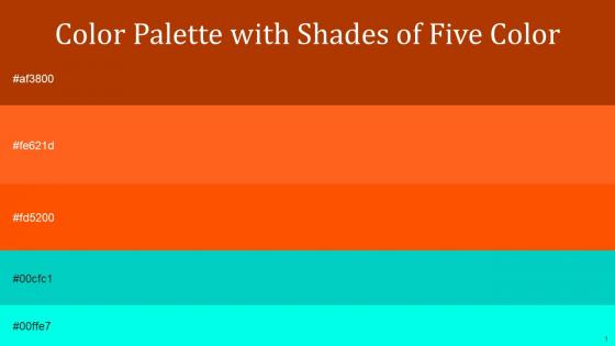
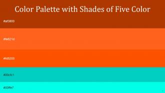
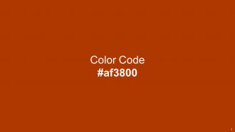
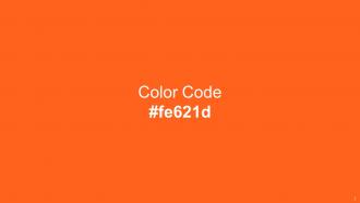
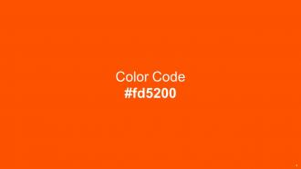
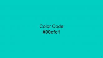
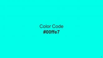
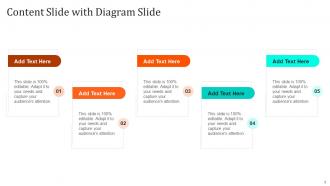
Heres a visually-pleasing color palette with Five Color Shades With Hex Code af3800, fe621d, fd5200, 00cfc1, 00ffe7. These colors are intuitively picked to ignite the spark of brilliance in your designs and creativity.
People who downloaded this PowerPoint presentation also viewed the following :
Color Palette With Five Shade Fire Orange International Orange Robins Egg Blue Cyan Aqua with all 14 slides:
Use our Color Palette With Five Shade Fire Orange International Orange Robins Egg Blue Cyan Aqua to effectively help you save your valuable time. They are readymade to fit into any presentation structure.






FAQs for Color Palette With Five Shade Fire Orange International Orange Robins Egg
Different colors evoke distinct psychological responses, with blue conveying trust and professionalism, red creating urgency and energy, green suggesting growth and stability, and yellow inspiring optimism and creativity. These color associations significantly influence audience engagement and message retention, with many businesses finding that strategic color choices in presentations enhance credibility, improve comprehension, and ultimately drive stronger decision-making outcomes.
A cohesive color palette enhances audience engagement by creating visual consistency, improving readability, and establishing emotional connections that guide viewer attention effectively. Through strategic color choices, presentations deliver stronger brand recognition, reduced cognitive load, and increased retention rates, with many organizations finding that unified palettes boost audience focus and professional credibility significantly.
Creating a brand color palette involves selecting a primary color that reflects your brand personality, choosing 2-3 complementary secondary colors, and ensuring accessibility through adequate contrast ratios. These colors should work harmoniously across digital platforms, print materials, and packaging, with many successful brands like Coca-Cola and IBM finding that consistent color application across all touchpoints ultimately delivers stronger brand recognition and customer trust.
Cultural differences significantly influence color perception by affecting emotional associations, symbolic meanings, and aesthetic preferences across different audiences. While red symbolizes luck in Chinese culture but danger in Western contexts, and white represents purity in some cultures versus mourning in others, successful international presentations require culturally-sensitive color choices that enhance rather than hinder cross-cultural communication and engagement.
Effective color palette creation tools include Adobe Color, Coolors.co, Paletton, Canva's color palette generator, and Material Design Color Tool. These platforms streamline design workflows by offering color harmony algorithms, accessibility testing, and brand integration features, with many marketing teams and design agencies finding that systematic palette tools enhance visual consistency, reduce project timelines, and deliver stronger brand recognition across campaigns.
Contrasting colors improve readability by creating clear visual hierarchy, reducing eye strain, enhancing text legibility, and enabling faster information processing across different lighting conditions. Through strategic color differentiation, presentations and documents deliver better audience engagement, improved message retention, and more accessible content for diverse viewers, while ensuring professional clarity that ultimately strengthens communication effectiveness.
Trending business presentation color combinations this year include navy blue with gold accents, sage green with cream, charcoal gray with coral highlights, deep teal with warm whites, and burgundy with soft beige. These sophisticated palettes enhance professional credibility while maintaining visual engagement, with many organizations finding that these strategic color choices strengthen brand perception and audience retention.
Adapting color palettes for accessibility involves ensuring sufficient contrast ratios, avoiding color-only information conveyance, and incorporating colorblind-friendly combinations like blues with oranges rather than reds with greens. These approaches enhance usability by meeting WCAG guidelines, supporting diverse visual needs, and creating inclusive experiences, with many organizations finding that accessible design ultimately delivers broader audience reach and improved user engagement across all demographics.
Color strategically directs audience focus by creating visual hierarchy, emphasizing key information, and establishing clear pathways through content. Through contrasting hues for important data, consistent schemes for related concepts, and strategic accent colors, presenters enhance comprehension, reduce cognitive load, and ultimately deliver more impactful messaging that resonates with audiences.
Color strategically directs attention by using high-contrast combinations for critical data, warm colors like red and orange for urgent information, and cool blues for supporting details. Through techniques like accent colors, gradient emphasis, and selective saturation, presenters can guide audience focus seamlessly, ultimately enhancing message retention and ensuring key insights resonate effectively across diverse business communications.
Corporate presentations benefit from navy, gray, and white palettes that convey professionalism and trust, while educational content works well with blue and green combinations that enhance focus and comprehension. Creative presentations thrive with bold, contrasting colors like orange and teal or purple and yellow, with many organizations finding that matching palette intensity to audience expectations ultimately delivers stronger engagement and clearer message retention.
You can blend personal style with professional expectations by incorporating muted versions of favorite colors, using personal preferences in accent colors while maintaining neutral bases, and adapting intensity based on industry standards. Many professionals find that strategic color combinations enable authentic self-expression while meeting workplace norms, ultimately delivering confident presentations that reflect both personality and professional credibility.
Presenters face challenges including cultural color associations that vary globally, accessibility needs for colorblind audiences, maintaining brand consistency across different contexts, and ensuring readability under various lighting conditions. These considerations require strategic balance between visual appeal and universal comprehension, with many organizations finding that flexible, culturally-neutral palettes enhance audience engagement while minimizing potential misinterpretation across diverse stakeholder groups.
You can evaluate color palette effectiveness through audience feedback surveys, engagement metrics during key presentation moments, comprehension assessments, and visual accessibility reviews. Post-presentation analysis should examine whether colors enhanced message clarity, supported brand consistency, and facilitated audience understanding, with many presenters finding that systematic color evaluation significantly improves future presentation outcomes and audience retention rates.
Common pitfalls include using too many colors, poor contrast ratios, culturally inappropriate choices, clashing combinations, and ignoring brand guidelines. These mistakes can overwhelm audiences, reduce readability, and undermine professional credibility, with many presenters finding that strategic color restraint and accessibility considerations ultimately deliver clearer messaging and stronger audience engagement.
-
Great combination of visuals and information. Glad I purchased your subscription.
-
SlideTeam offers so many variations of designs and topics. It’s unbelievable! Easy to create such stunning presentations now.