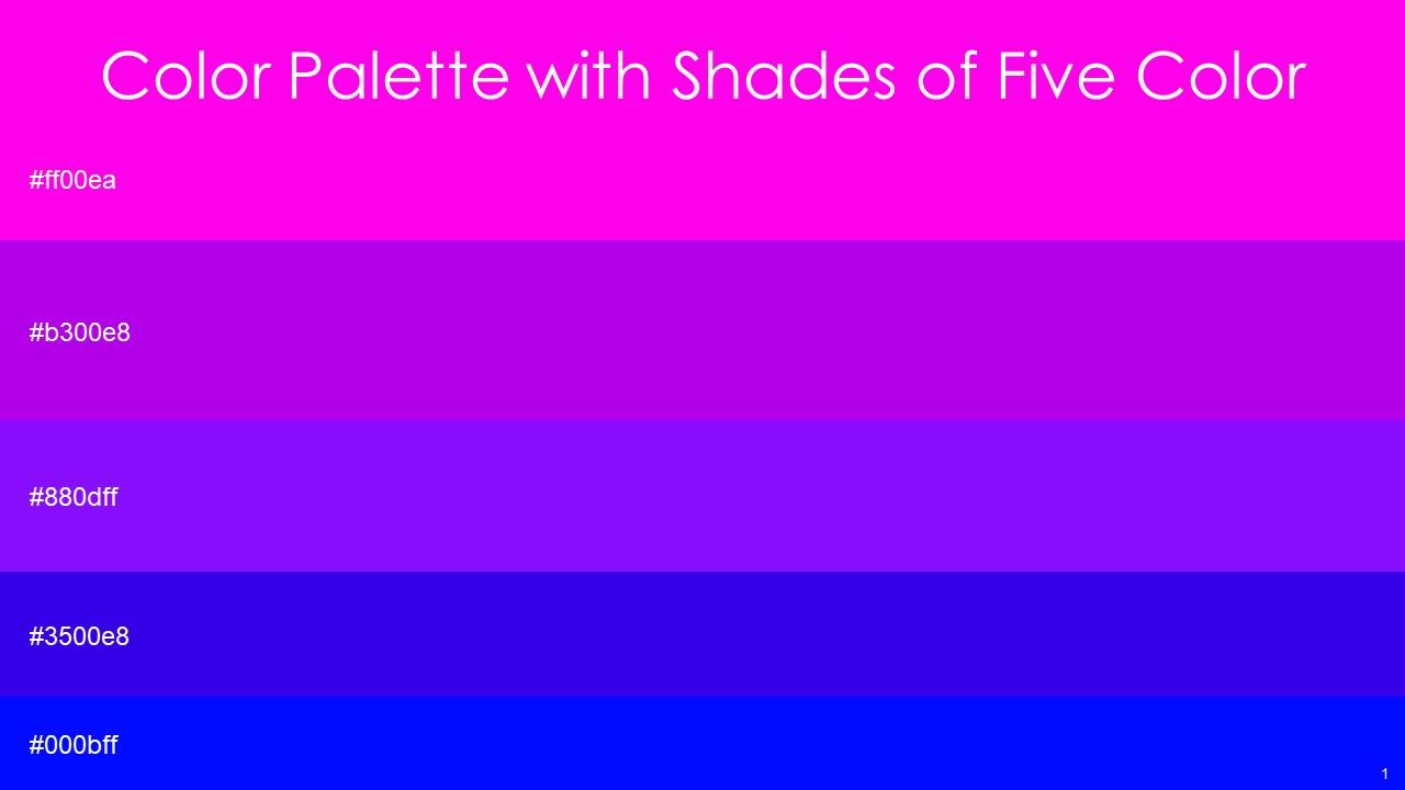
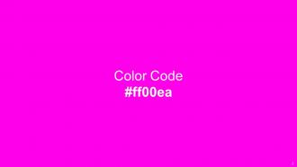
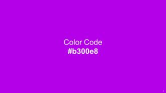
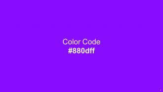
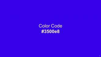
Color Palette With Five Shade Magenta Fuchsia Electric Violet Electric Violet Blue Blue

Rating:
90%
Color Palette With Five Shade Magenta Fuchsia Electric Violet Electric Violet Blue Blue
Slide 1 of 14

or

Favourites Favourites

Try Before you Buy Download Free Sample Product

Audience Impress Your
Audience
Editable 100%
Editable
Time Save Hours
of Time
The Biggest Sale is ending soon in
0
0
:
0
0
:
0
0
Rating:
90%
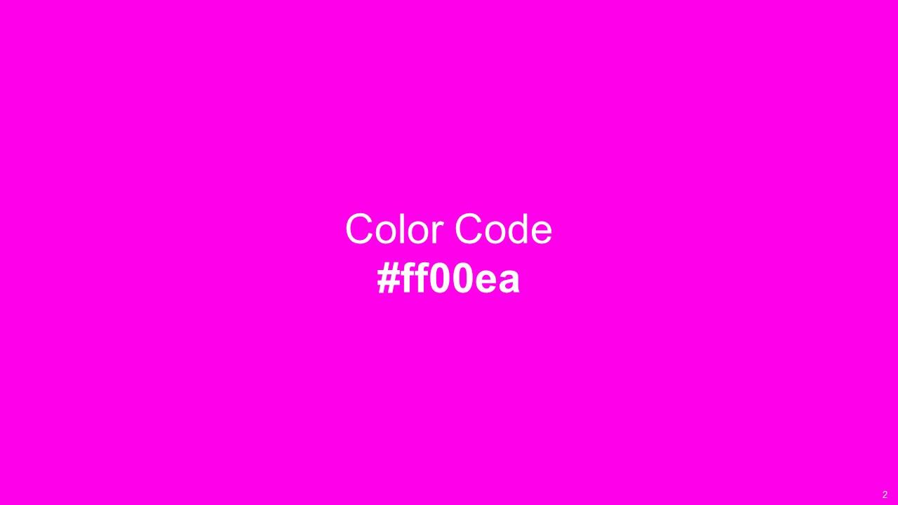
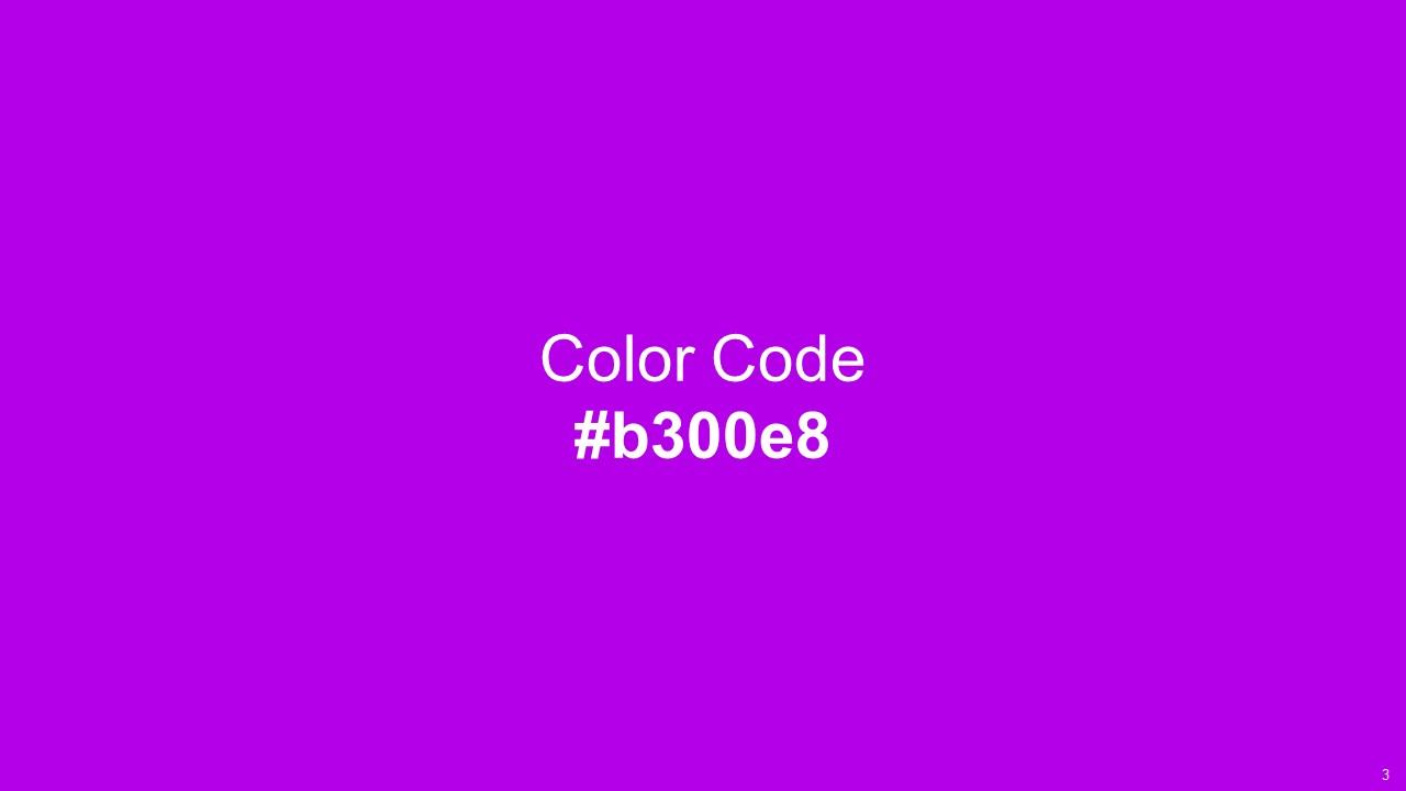
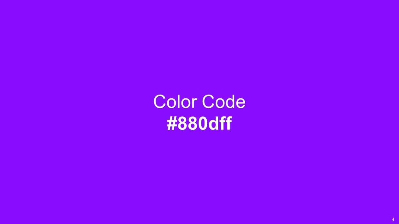
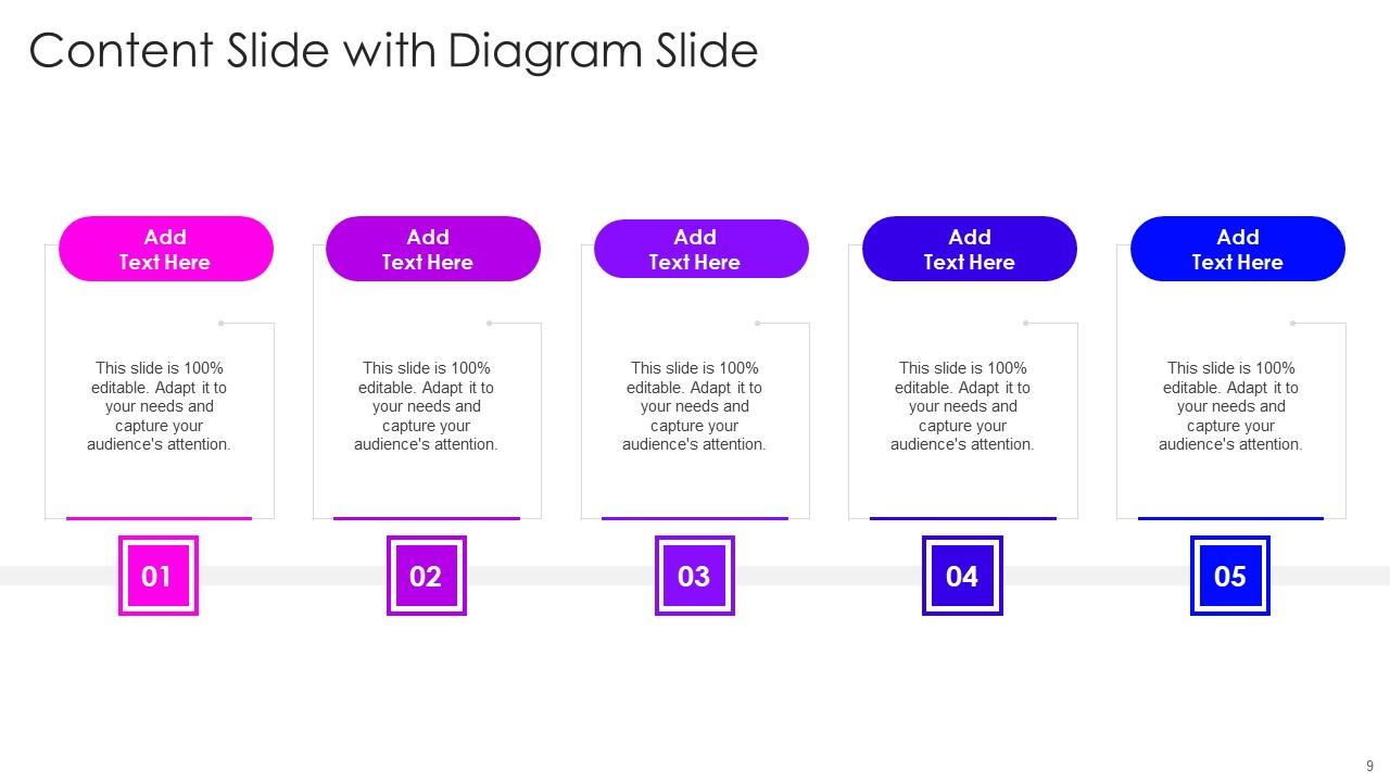
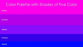
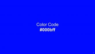
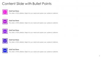
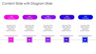
This color palette has a unique combination of five color shades including Magenta Fuchsia, Electric Violet, Electric Violet, Blue, Blue .You can use them for design inspiration, color themes, and much more.Magenta Fuchsia Electric Violet Electric Violet Blue Blue gives an aesthetic touch to graphics, illustrations, icons, or any other design idea you have in mind.

People who downloaded this PowerPoint presentation also viewed the following :

FAQs for Color Palette With Five Shade Magenta Fuchsia Electric Violet Electric

Ok so first thing - contrast is everything. Your text needs to pop against the background or people literally can't read it. I'd stick to maybe 3-4 colors tops because more than that looks like a rainbow threw up on your slides (learned that the hard way lol). Pick one main color and one accent, then use neutrals for your text. Also think about your audience - corporate folks want boring safe colors, creative types can handle more fun stuff. Oh and test your colors on whatever screen you're actually presenting on! Conference room projectors are weirdly dim and make everything look washed out. Coolors or Adobe Color are lifesavers for finding palettes that actually work together.

Colors totally matter for presentations - they actually change how people feel about your content. Red and orange pump up energy but can feel kinda aggressive if you go overboard. Blues and greens are way more calming and trustworthy. High contrast is your friend because nobody wants to squint at your slides. Oh, and different cultures see colors differently, so keep that in mind with diverse crowds. Honestly, I'd stick to just 2-3 colors max or it gets messy fast. Test it projected beforehand though - colors look totally different on screens vs. walls.

Look, contrast is what makes text actually readable - without it, you're basically torturing your users. Think gray text on darker gray... ugh, my eyes hurt just thinking about it. People with visual issues especially struggle with poor contrast. You can also use high contrast to make stuff stand out, like buttons or important info. The magic number is 4.5:1 for regular text. Oh, and definitely test your colors with accessibility tools first - learned that one the hard way when my client's site looked terrible to half their users.

Honestly, I'd start with what your brand actually *feels* like - trustworthy? Go blues and grays. More creative/energetic? Warmer colors work better. Pick one main color that's totally "you," then add 2-3 others around it. Oh, and that 60-30-10 rule is clutch for balance. Just don't forget accessibility stuff - test everything on different backgrounds so people can actually read it. I learned that the hard way once! Make a style guide with all the hex codes too, otherwise your team will use slightly different shades and it'll look messy.

Oh dude, Coolors.co is my go-to - it's stupidly fast for generating palettes. Adobe Color's solid too, especially when you want to pull colors from photos. For grabbing colors from websites, ColorZilla's clutch (it's a browser extension). iPhone has a built-in color picker now which is pretty neat, though I forget about it half the time. Paletton's worth checking out if you actually want to understand why certain colors work together. Honestly just pick one and mess around with it - you'll figure out what clicks for your workflow pretty quick.

Dude, colors are wild when you're presenting to different cultures. In China, red's totally lucky, but here it screams danger. White means purity to us, mourning in parts of Asia. Purple still feels fancy in Europe since it used to cost a fortune - though honestly, I'm not sure younger audiences even pick up on that anymore. Blues and greens are pretty safe bets if you don't know your crowd well. But really, just do a quick search on your specific audience's background. Or grab a local coworker to eyeball your slides beforehand. Way better than accidentally picking the color of death for your quarterly review, you know?

Honestly, the biggest trap is going overboard with colors - like 3-5 max or it gets chaotic. Also don't just yank colors from Pinterest because they're cute together lol. Check your contrast ratios too, accessibility matters. Colors that are too similar will make everything look muddy. The worst is when colors totally clash with your brand vibe - I've seen some real disasters there. Always test your palette in different lighting before you commit! I usually throw together a quick mockup with actual content. Saves me from realizing later that my "perfect" colors look terrible with real text.

Use gradients and textures as subtle background touches, not the main event. I made this mistake once and my slides looked like a Vegas casino - total disaster. Apply them sparingly on backgrounds or section breaks, but never over text where people actually need to read stuff. Stick with gradients in the same color family and keep textures super low-opacity. Your audience should feel the polished vibe without noticing the individual effects. Oh, and definitely test on your actual presentation screen first because colors can look way different.

Oh man, complementary colors will absolutely destroy your eyes if you use too much - learned that one the hard way last year lol. Pick one as your main color and just use tiny hits of the opposite for buttons or whatever needs attention. Analogous colors are way more forgiving since they actually like each other. I usually do like 60% main color, 30% analogous buddy colors, then maybe 10% of that punchy complement. Honestly though? Just throw some real content in there first and see how it feels.

Hey! So for your presentation colors, you'll want good contrast between text and background - like a 4.5:1 ratio minimum. Don't just use color alone to show info since tons of people (especially guys) can't distinguish certain colors. Red-green combos are the worst - I bombed a presentation once because half the room couldn't see my charts. Use patterns or labels too. There's this WebAIM contrast checker tool that's pretty helpful for testing stuff beforehand. Your audience will actually be able to read everything, which is kinda the point, right?

Honestly? Stick with 3-5 colors max. I learned this the hard way after spending forever tweaking like 15 different shades. Limited palettes make everything look more polished and your brand won't feel all over the place. Plus you'll actually be more creative with contrast when you can't just throw another color at the problem. Sure, bigger palettes give you flexibility, but they're a nightmare to keep consistent. I mean, you could expand later if you really need to, but trust me - you don't want to be digging through a million color swatches every time you design something.

Okay so for data stuff, you need colors that pop - blues, oranges, greens that really stand apart. Makes comparing numbers way easier. But narrative content? Totally different game. You can go softer and moodier since you're not worried about someone misreading a chart. I always think of it like this: data = clarity first, stories = vibes first. Honestly, the ugliest color combo might be perfect if it makes your data crystal clear. Just ask yourself - are people supposed to understand numbers or feel something? That'll tell you which way to go.

Yeah, color trends are way more chill now. Everyone's ditching those awful corporate blues for dusty blues, sage greens, warm terracotta - stuff that doesn't make your eyes bleed. Monochromatic schemes are everywhere, with maybe one accent color thrown in. Earthy neutrals feel so much more human, you know? Dark mode is obviously huge. But honestly, the biggest thing is making sure your colors actually work for people with different vision needs - high contrast combos that don't suck. Stick to 2-3 colors tops and definitely test them on a few different screens first. Trust me on that one.

Okay so this might sound random, but seasonal colors in presentations actually work pretty well. People just naturally connect certain colors with different times - like deep reds for fall or those soft pastels in spring. I use this trick mostly for client stuff or marketing decks when I want things to feel current. You don't have to redesign everything either. Just switching your accent colors or maybe the background can do it. Oh and Pantone's site is great for seeing what's trending if you're stuck on ideas.

Dude, Art Deco's gold and black combo? Still killing it in luxury branding. Bauhaus basically invented modern minimalism with those primary colors and clean neutrals. Those 70s burnt oranges and avocado greens are having another moment - seriously, why do we keep going back to that era? Mid-century pastels dominate everything from apartments to app designs. Even Victorian's moody burgundies show up in dark academia stuff now. When you're stuck on colors, dig into these movements. They've already done the psychological heavy lifting, plus there's tons of inspiration hiding there.

Ratings and Reviews

90% of 100
Review Form
Write a review
Most Relevant Reviews
  1. 80%

    by Joe Thomas

    My search for complete decks ended with SlideTeam. Such a surplus collection of HD PowerPoints. Moreover, their standard and widescreen formats have helped me in delivering bullseye presentations.
  2. 100%

    by Donald Peters

    No second thoughts when I’m looking for excellent templates. SlideTeam is definitely my go-to website for well-designed slides.

2 Item(s)

per page: