


Color Palette With Five Shade Saffron Ochre Flame Pea Tall Poppy Venetian Red




Try Before you Buy Download Free Sample Product
 Impress Your
 Audience
 100%
100% Editable
 Save Hours
 of Time


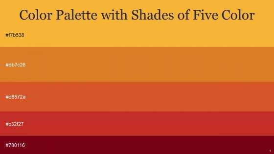
Heres a visually-pleasing color palette with Five Color Shades With Hex Code f7b538, db7c26, d8572a, c32f27, 780116. These colors are intuitively picked to ignite the spark of brilliance in your designs and creativity.
People who downloaded this PowerPoint presentation also viewed the following :
Color Palette With Five Shade Saffron Ochre Flame Pea Tall Poppy Venetian Red with all 14 slides:
Use our Color Palette With Five Shade Saffron Ochre Flame Pea Tall Poppy Venetian Red to effectively help you save your valuable time. They are readymade to fit into any presentation structure.







FAQs for Color Palette With Five Shade Saffron Ochre Flame Pea Tall
Honestly, just pick 3-4 colors max - trust me on this one. I've sat through way too many presentations that looked like a crayon box threw up everywhere. Start with your brand colors if you have them. Contrast is huge though - yellow text on white backgrounds makes me want to scream because nobody can read it. Think about where you're presenting too. Bright neon might work for a creative pitch, but it'll look weird in a boardroom. Oh, and test it on a projector first since they wash colors out like crazy. Your laptop screen lies to you about how things'll actually look.
Colors totally mess with people's heads in presentations. Red and orange pump up energy but can feel aggressive - I bombed a budget meeting once using bright red slides, yikes. Blues and greens are way safer since they scream "trustworthy." Green works for money stuff, blue for tech (seriously, every startup uses it). You want maybe 2-3 colors tops that actually match your vibe. Cool colors calm people down, warm ones get them hyped. Just test how they look on the actual screen first because projectors can be weird.
So contrast is just making sure people can actually read your text against whatever background you're using. Without good contrast, your content becomes invisible - especially bad for anyone with vision issues. WCAG says you need at least 4.5:1 ratio for regular text, 3:1 for bigger text. Honestly, I learned this the hard way after picking colors that looked great but were totally unreadable. There are free contrast checker tools online that'll save you from my mistake. Test your colors early or you'll be kicking yourself later when everything needs fixing.
Okay so here's the thing - when you use the same 3-4 colors in all your presentation templates, people's brains just automatically connect those colors to your company. It's weird but it works. Your slides look way more professional without you having to think about it much. Plus creating new presentations becomes super quick since you're not starting from scratch with colors every single time. I'd say pick your main brand colors and then just be really consistent with them. Like, don't deviate even when you're tempted to throw in that random purple you saw somewhere.
Honestly, subtle gradients are your best friend here. Don't go wild with crazy color combos - stick to colors that play nice together, like blues flowing into purples. I made this horrific neon green to hot pink thing once that literally hurt to look at lol. Dark-to-light works really well since you can use both light and dark text on it. Oh, and this should be obvious but make sure people can actually read your text against the background. Doesn't matter how pretty it looks if your content is invisible.
Oh man, colors are such a minefield when you're presenting internationally! Like, red screams good fortune in China but spells trouble in Western countries. White's the opposite - we think pure and clean, but it means mourning in parts of Asia. Don't even get me started on purple... Europe sees royalty, Latin America thinks death. Honestly, it's kind of fascinating how backwards everything gets. Blue and green are usually your friends for global audiences since they're pretty safe bets. But definitely run your color choices by someone from that culture first - or you might accidentally tell everyone you're dead or something.
Coolors.io is literally my addiction - I'll hit spacebar for like 20 minutes straight just watching color combos pop up. Adobe Color's solid too, especially if you want to pull colors from photos. Already using Figma? Their palette tools are pretty decent so you don't need another app. My strategy: pick one color you're obsessed with first, then let these tools do the heavy lifting around it. Way less guesswork that way. Oh and definitely run everything through Stark or WebAIM's contrast checker afterward - learned that lesson the hard way when someone couldn't read my "gorgeous" light gray text.
Honestly, just use 3-5 colors tops. I've sat through way too many presentations that looked like a unicorn exploded on the screen - not cute. Pick one main color for your headers and important stuff. Then grab one or two accent colors for highlights. The rest should be basic neutrals like black, white, gray for text and backgrounds. Oh, and if you already have brand colors, start with those obviously. This way everything looks put-together but you've still got enough variety to make things pop. Short version: less is definitely more here.
Okay so basically, don't rely just on color to show important stuff. Like 8% of guys are colorblind (way fewer women), and red-green is super common. Those red/green status dots? Useless for tons of people. Always add icons or text labels too. I learned this the hard way on a project once - thought I was being all sleek with my color coding. Test your colors with those colorblind simulator tools online, they're free and eye-opening. Short version: if your design completely breaks when you remove color, you've got problems. It's actually not that hard to fix once you think about it.
Okay so I learned this trick called the 60-30-10 rule after totally bombing a presentation that looked like someone threw up skittles on it. Most of your slides should be neutral colors - that's your 60%. Then add another neutral or muted color for 30%. Save the bright, punchy stuff for just 10% and use it strategically on buttons or key points you actually want people to notice. Your backgrounds and main text need to stay easy on the eyes. Here's what I do now - I squint at my slides and wherever the bright colors pop out should be exactly where I want eyeballs first.
Honestly, less is more with colors - stick to maybe 2-3 max or it'll look like a kid's birthday party exploded on your screen. Don't make color the only way to show important stuff since colorblind people exist (learned this the hard way once). Red text on green backgrounds? Please don't. Your audience will hate you. If your company has brand colors, use those - makes you look professional. But here's the thing nobody tells you: test everything on the actual projector first. I've seen gorgeous slides turn into muddy messes under conference room lighting. Colors are weird like that.
Bright colors against neutral backgrounds work really well - or flip it and go dark on light. Your main points should be bold while everything else stays muted. I never use more than two accent colors because honestly? More than that just looks chaotic. Try making your headlines one strong color (like deep blue) and subpoints lighter gray. Just double-check the contrast actually works for reading. Oh, and definitely test your slides on a different screen first - I learned that one the hard way when my "perfect" slides looked terrible on the projector.
Honestly, everyone's obsessed with earth tones right now - sage green, terracotta, those soft blues that don't make your eyes bleed. Way better than those awful corporate blues we've all been stuck with forever. Dark mode is everywhere too, especially if you're doing anything tech-related. Monochromatic stuff works great. Just pick one main color and maybe throw in an accent or two. Don't go crazy though - I sat through a presentation last week that looked like a rainbow exploded and it was painful. Start with something neutral and build from there.
Honestly, using fewer colors makes everything hit way harder. When you stick to like 2-4 colors max, each one actually means something instead of just being... there. Your brain doesn't have to work overtime sorting through a rainbow of chaos. Nike's basically built their whole brand on black, white, and that orange – and it works because it feels deliberate. Here's the weird part though: limiting yourself actually makes you more creative. You've got clear rules to play with instead of staring at infinite possibilities. Next time, pick your colors first and design around them. I swear your stuff will look way more polished.
TED Talks are gold for this - they use crazy color combos that shouldn't work but totally do. Apple's launches are clean AF with those perfect color pops, though they probably have like 20 designers obsessing over every shade. Netflix is smart about pairing their red with different colors depending on what they're promoting. Oh, and Spotify's yearly wrapped presentations? Chef's kiss with those gradients. Start screenshotting presentations in your field that made you stop scrolling. Then figure out why those palettes grabbed you - that's where the real learning happens.
-
Their products can save your time, effort and money. What else you need. All in one package for presentation needs!
-
Great experience, I would definitely use your services further.