

Color Palette With Five Shade Raw Sienna Salomie Brown Bramble Jaffa Vesuvius





Try Before you Buy Download Free Sample Product
 Impress Your
Audience
 100%
Editable
 Save Hours
of Time


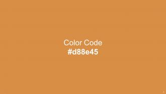
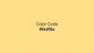
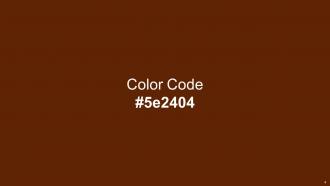
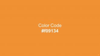
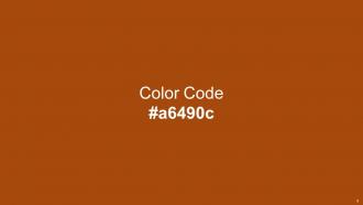
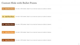
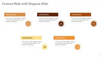
Heres a visually-pleasing color palette with Five Color Shades With Hex Code d88e45, fedf8a, 5e2404, f09134, a6490c. These colors are intuitively picked to ignite the spark of brilliance in your designs and creativity.
People who downloaded this PowerPoint presentation also viewed the following :
Color Palette With Five Shade Raw Sienna Salomie Brown Bramble Jaffa Vesuvius with all 14 slides:
Use our Color Palette With Five Shade Raw Sienna Salomie Brown Bramble Jaffa Vesuvius to effectively help you save your valuable time. They are readymade to fit into any presentation structure.







FAQs for Color Palette With Five Shade Raw Sienna Salomie Brown
Color psychology significantly influences audience perception, emotional response, and information retention in presentations, with specific colors triggering distinct psychological reactions like blue conveying trust and red creating urgency. Strategic color choices enhance message clarity, guide audience attention, and reinforce brand identity, with many organizations finding that psychologically-informed palettes increase engagement rates and improve comprehension across diverse professional settings.
Choose a color palette by analyzing your brand's personality, target audience, and industry context, while considering psychological associations like blue for trust or red for energy. Start with your logo colors as anchors, then expand using complementary or analogous schemes, with many businesses finding that consistent palette application across presentations, marketing materials, and digital platforms ultimately strengthens brand recognition and customer connection.
The best tools for selecting color palettes include Adobe Color, Coolors.co, Canva's Color Palette Generator, Paletton, and ColorHunt. These platforms streamline color selection by generating harmonious combinations, extracting palettes from images, and providing accessibility testing, with many design teams finding that strategic color choices enhance audience engagement and reinforce brand consistency across presentations.
Color contrast significantly impacts readability by determining how easily audiences can distinguish text from backgrounds, with high contrast ratios ensuring clear visibility across different lighting conditions and viewing distances. Poor contrast creates eye strain and comprehension difficulties, while strategic contrast choices enhance focus, guide attention to key points, and accommodate viewers with visual impairments, ultimately delivering more effective presentations.
Common color palette mistakes include using too many colors, choosing low-contrast combinations, ignoring brand guidelines, selecting colors that clash with content themes, and overlooking accessibility considerations for colorblind audiences. These missteps often result in presentations that appear unprofessional and difficult to read, with many organizations finding that streamlined, high-contrast palettes enhance audience comprehension and reinforce brand credibility more effectively.
Creating a cohesive look with a limited color palette involves selecting 2-3 complementary colors, using varying shades and tints of your chosen colors, and applying the 60-30-10 rule for distribution. This strategic approach streamlines design consistency across presentations, marketing materials, and brand communications, with many organizations finding that restrained palettes enhance visual impact while reducing decision fatigue and ensuring professional cohesion.
Navy blue, charcoal gray, forest green, burgundy, and deep teal create strong professional engagement while maintaining credibility and trust. These colors enhance readability, reduce visual fatigue, and convey authority across industries like finance, consulting, and healthcare, with many organizations finding that strategic color choices ultimately improve audience retention and presentation effectiveness.
Use contrasting colors to make critical data stand out, apply consistent color coding throughout slides, and limit your palette to three primary colors plus neutrals to avoid overwhelming audiences. Strategic color choices, such as red for urgent items or green for positive metrics, help guide viewer attention naturally while maintaining professional aesthetics, ultimately enhancing message retention and audience engagement.
Cultural differences in color perception significantly impact presentation effectiveness, as colors carry distinct meanings across cultures—red symbolizing luck in China but danger in Western contexts, white representing purity in America but mourning in some Asian cultures. These variations influence audience engagement, comprehension, and emotional response, with many global organizations finding that culturally-aware color choices enhance communication clarity and avoid unintended misinterpretations.
**INPUT**: How do I adjust my color palette for presentations viewed on different devices? **OUTPUT**: Adjusting color palettes for multi-device viewing involves using high-contrast combinations, avoiding pure whites and blacks, testing colors on various screen types, and selecting web-safe color codes. This approach ensures consistent visual impact across laptops, tablets, and mobile devices, with many presenters finding that strategic color choices enhance audience engagement and message clarity regardless of viewing platform. [Word count: 58 words]
Trending color palettes for presentations in 2024 include earthy naturals with sage greens and terracotta, bold minimalism featuring deep blues with bright accents, warm neutrals combining cream and soft browns, and tech-inspired gradients blending purple and teal. These palettes enhance audience engagement by creating visual harmony, supporting brand storytelling, and ensuring accessibility across digital platforms, with many organizations finding that strategic color choices significantly improve message retention and professional credibility.
Color gradients enhance slide visual appeal by creating depth, guiding viewer attention, and adding sophisticated transitions between elements. These techniques work particularly well in corporate presentations, marketing decks, and educational materials, where subtle gradients can highlight key data points, create professional backgrounds, and establish visual hierarchy, ultimately delivering more engaging presentations that maintain audience focus.
**INPUT**: What strategies can I employ to ensure color accessibility for all audiences? **OUTPUT**: Color accessibility strategies include high contrast ratios, colorblind-friendly palettes, alternative visual cues, accessibility testing tools, and WCAG compliance standards. These approaches enhance user experiences by ensuring readability across visual impairments, supporting inclusive design practices, and expanding audience reach, with many organizations finding that accessible color choices ultimately deliver broader market appeal and regulatory compliance. [Word count: 58 words]
Incorporate seasonal color trends by selecting palettes that reflect current fashion, design, and marketing cycles, using spring pastels, summer brights, autumn earth tones, or winter jewel tones strategically throughout slides. These seasonal approaches enhance audience engagement by creating timely, relevant visual experiences, with many marketing teams, retail organizations, and creative agencies finding that trend-aligned presentations deliver stronger emotional connections and memorable brand impressions.
Neutrals serve as visual anchors that prevent vibrant colors from overwhelming audiences, providing breathing space, enhancing readability, and creating sophisticated contrast through whites, grays, and muted tones. These strategic color choices enable presenters to highlight key information more effectively while maintaining professional credibility, with many organizations finding that balanced palettes improve audience engagement and message retention.
-
SlideTeam is very efficient when it comes to saving time. I am happy that I chose them for my presentation.
-
The templates are easy to get, and the chat customer support is excellent.