


Color Palette With Five Shade Pale Rose Pink Pink Pink Salmon Brink Pink




Try Before you Buy Download Free Sample Product
 Impress Your
 Audience
 100%
100% Editable
 Save Hours
 of Time


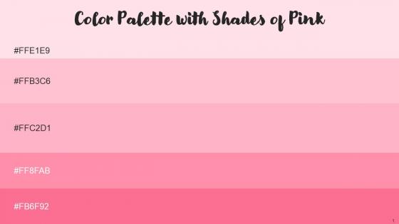
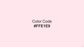
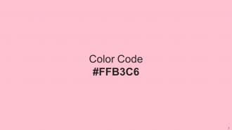
Heres a visually-pleasing color palette with Five Color Shades With Hex Code FFE1E9, ffc2d1, ffb3c6, ff8fab, fb6f92. These colors are intuitively picked to ignite the spark of brilliance in your designs and creativity.
People who downloaded this PowerPoint presentation also viewed the following :
Color Palette With Five Shade Pale Rose Pink Pink Pink Salmon Brink Pink with all 14 slides:
Use our Color Palette With Five Shade Pale Rose Pink Pink Pink Salmon Brink Pink to effectively help you save your valuable time. They are readymade to fit into any presentation structure.







FAQs for Color Palette With Five Shade Pale Rose Pink Pink Pink
Oh that color's perfect for the whole "soft life" vibe millennials are obsessed with right now! It hits different than regular bright pink - way more calming and sophisticated without losing that approachable feel. Luxury skincare brands absolutely nail this strategy. Makes people think wellness and quality but not in a scary expensive way, you know? Plus it somehow looks both trendy and classic at the same time, which honestly doesn't happen often. I'd definitely test it with some real customers first though - sometimes what looks good on paper doesn't translate how you'd expect.
Oh that's actually super fascinating! Pale rose pink hits this weird sweet spot - it feels both calming and luxurious at the same time. Beauty and wellness brands are obsessed with it because it makes their stuff seem more approachable but still premium. Like, you'll buy a $60 face cream in pale pink packaging when you'd never touch the same product in boring white. It triggers all these nurturing, romantic feelings that make us want to treat ourselves. Honestly, marketing psychology is kind of scary when you think about it. But yeah, if you're designing anything, that color's basically money.
Honestly, pale rose pink is such a game changer for accent walls! I did this in my bedroom last year and it completely transformed the vibe - way more calming than I expected. Don't go overboard though. Start small with maybe some throw pillows or curtains first, see how you feel about it. The trick is pairing it with creams and soft grays, plus some wood to keep it grounded. Oh and it's perfect for bedrooms since pink literally reduces stress (something about warm but muted tones). Trust me, a little goes a long way with this color.
Oh, pale rose pink? That's such a loaded color honestly. Western cultures totally link it to romance and that soft, feminine vibe - you know, baby rooms and cutesy Valentine stuff. But Asian cultures see it more as good health and prosperity, which I think is way cooler. Younger people don't really gender it anymore either, while our parents' generation still thinks "girl color." It's wild how the same shade hits so differently depending on who's looking at it. If you're designing something for everyone, maybe test it out first? Colors are trickier than we think.
Honestly, pale pink is all about what you pair it with. Black leather makes it edgy, navy or charcoal keeps it professional. I've literally seen it work in streetwear and blazers - wild, right? Athletic fabrics can make it feel younger too. Don't overthink the color itself. Focus on who you're designing for and match their vibe with the right textures and cuts. Like, a millennial CEO vs a Gen Z skater will want totally different styling. If you're nervous about going full pink, start with accessories and see how people respond.
Honestly, pale rose pink looks amazing with soft grays and cream - super clean and professional. Navy's great too if you want something that pops for headers. I'm obsessed with how it looks with sage green lately, though that might be too trendy? Gold accents are gorgeous if you're going upscale. Whatever you do, don't use bright reds or oranges with it - total disaster. Oh, and stick to gray/white as your base, then maybe one accent color max. You don't want it looking like a rainbow exploded on your slides.
Oh man, pale rose pink is such a pain for contrast! It's way too soft and just gets swallowed up by anything light. I'd go with deep navy or charcoal if you really need it to pop. Honestly, I've made this mistake before - used it thinking it would work and it just vanished completely. It's gorgeous for subtle touches though, like when you want something really gentle. Don't make it your main focus color. Play around with the opacity too, that usually helps me find what actually works.
Pale rose pink absolutely kills it for beauty and wellness stuff - skincare, cosmetics, spas, boutique fitness places. It just screams "gentle and premium" which is perfect for those brands. Fashion companies targeting millennial and Gen Z women are obsessed with it too. Bakeries use it a ton (honestly makes me think of macarons every time). Lifestyle brands pick it up, plus some tech startups wanting that friendly approachable feel. Even women's health practices love it. Just double-check your audience actually vibes with more feminine colors before you go all-in on it though.
Honestly, pale rose pink is so pretty and way more flexible than people think! I'd go with it in your flowers first - peonies and ranunculus look amazing in that shade. Then maybe add it to table runners or your bridesmaids' dresses. For colors, cream and gold gives you that timeless vibe, but sage green with ivory feels fresher if you're into that. Just don't go overboard or it'll get too sugary sweet, you know? Mix different textures and maybe a deeper blush somewhere. Oh, and start with one big thing like the bouquet, then everything else will kind of fall into place around it.
Honestly, pale pink has had such a glow-up! It went from being this super girly nursery color to actually sophisticated. Around 2016, that whole "millennial pink" thing really changed everything - suddenly it felt modern and cool instead of just feminine. Now you see it everywhere, even in minimalist spaces and corporate stuff. Luxury brands totally jumped on it too. The crazy part is how well it works with unexpected things like concrete and brass. Oh, and it's amazing with deep greens! If you're thinking about using it, don't get hung up on the old "baby girl" vibes. It's genuinely versatile now.
Pale rose pink is actually perfect for this! Use it as background color - way less distracting than white but still clean. Great for highlighting important stuff without that aggressive neon highlighter vibe (seriously, who decided yellow was a good idea?). Works amazing for worksheet borders or those little callout boxes. I've seen teachers use it for section dividers too. The soft tone helps kids focus better since it's not harsh on their eyes. Try it for headers in study guides or presentation accents. Your students will definitely notice the difference - it's surprisingly calming.
Dude, pale rose pink is literally everywhere on social media right now! It photographs amazingly well and works with basically any skin tone. The color hits this sweet spot - sophisticated but not pretentious, feminine without being too much. Brands are obsessing over it because it appeals to millennials and Gen Z. I mean, I get why - it's trendy but safe at the same time. Perfect for wellness or beauty brands. Just don't jump on it unless it actually fits your vibe, you know?
Honestly, just do some A/B testing - compare your current stuff against pale rose versions and see what happens. Track engagement, clicks, conversions, all that. Social media saves and shares are pretty telling too since people really do respond to softer colors. I'd also throw out some quick surveys about brand perception - like how trustworthy you seem now. Sales data is where you'll really see results though. Give it maybe 6 weeks? That should be enough time to know if it's actually working or if you're just overthinking color psychology lol.
Oh totally! Pale rose pink is everywhere right now. The "soft minimalism" people are obsessed with it - you know, pairing it with whites and grays for that super clean look. Also seeing it tons in the "dopamine design" thing where everything's supposed to make you happy (kinda cheesy but whatever). Gradient backgrounds too, especially those pink-to-white fades on landing pages. Beauty and wellness sites can't get enough of it. If you use it, try sage green or warm beige with it - keeps it fresh without being too trendy.
Oh, pale rose pink is *perfect* for spring stuff - it screams fresh flowers and new beginnings. Valentine's and Mother's Day are obvious wins since it's romantic but not as intense as hot pink. I've seen it work really well for summer lifestyle brands too, especially that whole dreamy sunset vibe. Actually, now that I think about it, wellness brands love this color for New Year campaigns. Something about "fresh start" energy, you know? Back-to-school works too. Just make sure your copy and visuals match whatever seasonal mood you're going for.
-
“Thanks to SlideTeam. Now I can make smart presentations in a fraction of time without any hassle.”
-
These stunning templates can help you create a presentation like a pro.