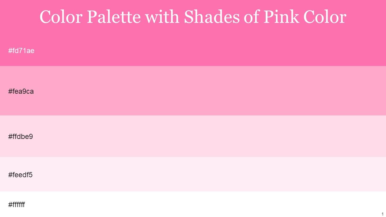
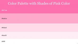
Color Palette With Five Shade Hot Pink Carnation Pink Pale Rose Remy White

Rating:
80%
Color Palette With Five Shade Hot Pink Carnation Pink Pale Rose Remy White
Slide 1 of 14

or

Favourites Favourites

Try Before you Buy Download Free Sample Product

Audience Impress Your
Audience
Editable 100%
Editable
Time Save Hours
of Time
The Biggest Sale is ending soon in
0
0
:
0
0
:
0
0
Rating:
80%
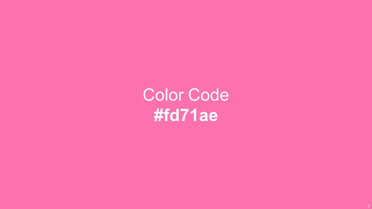
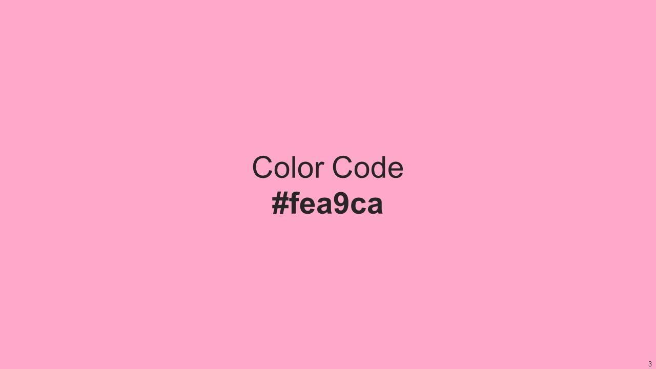
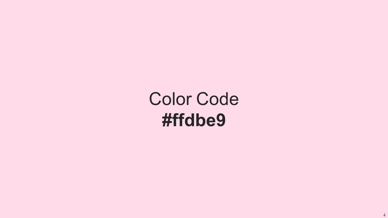
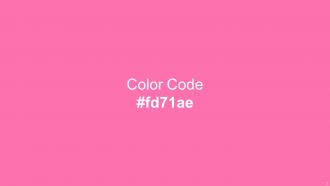
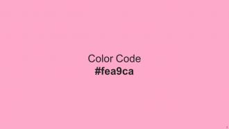
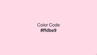
This color palette has a unique combination of five color shades including Hot Pink, Carnation Pink, Pale Rose, Remy, White .You can use them for design inspiration, color themes, and much more.Hot Pink Carnation Pink Pale Rose Remy White gives an aesthetic touch to graphics, illustrations, icons, or any other design idea you have in mind.

People who downloaded this PowerPoint presentation also viewed the following :

FAQs for Color Palette With Five Shade Hot Pink Carnation Pink Pale

Honestly, colors mess with people's heads way more than you'd think. Red and orange get everyone hyped up - learned that when I bombed a budget presentation with crazy bright slides. Blues and greens? Way better for serious stuff since they don't freak people out. Your audience literally feels something before they even read a word. Stick to maybe 2-3 colors that actually match what you're trying to say. Oh, and definitely test them on whatever screen you'll use - colors look totally different sometimes.

High contrast is a game changer for readability - your audience won't have to squint to figure out what you're saying. Dark text on light backgrounds (or the opposite) works best. Honestly, low contrast is just cruel to anyone trying to read your slides. Aim for at least a 4.5:1 contrast ratio, though 7:1 is better since people are viewing from all over the room. Here's my go-to test: squint at your slide. Can you still read it easily? Then you're good to go.

Honestly, just pick 2-3 colors and call it a day. I'd start with your brand colors if you've got them, otherwise grab one main color plus something neutral like gray. Trust me on this - I always want to throw in "just one more" fun color but it ends up looking like a rainbow threw up on my slides. Make sure people can actually read your text against whatever background you choose. Oh, and be consistent! All your headers should be the same color, all your callouts another color, etc. Here's something that's saved me tons of time: make a little color guide on a hidden slide so you can eyedrop those exact shades later instead of guessing.

Dude, definitely look up color meanings before presenting internationally - I learned this the hard way once. Red's lucky in China but screams danger in Western countries. White means purity here but mourning in parts of Asia. Green works for eco stuff mostly, though some cultures link it to jealousy (random, right?). Honestly, blue's your safest choice since it comes across as trustworthy pretty much everywhere. Just spend like 10 minutes googling "[country] color meanings" before you present. Trust me on this one.

Oh man, you'll love Coolors.io and Adobe Color - both let you generate from scratch or pull colors straight from photos you upload. Canva's palette tool is pretty solid too if you're already using their platform. I'm weirdly obsessed with Paletton lately, especially for work stuff since it actually shows you contrast ratios and accessibility info. Material Design's color tool does the same thing. Pro tip though - definitely test whatever colors you pick on a projector first if that's how you're presenting. Learned that one the hard way when my "perfect" blues looked completely washed out during my actual presentation.

Yeah totally! Just don't go crazy with them. I stick to neutrals like navy or charcoal for most of it, then throw in bright colors for the stuff I really want people to notice - charts, key points, whatever. Trust me, I once made slides that looked like a unicorn threw up everywhere and it was... not great. There's this 60-30-10 thing that actually works - mostly neutral, some supporting color, then just a little pop of the vibrant stuff. Your audience gets visual interest without their eyes bleeding, and you still look like you know what you're doing.

Colors are basically psychology tricks, honestly. McDonald's and Coke use reds/oranges because they make you feel energized and act fast. Blues and greens? Super calming - that's why every bank and hospital loves them. Purple screams expensive and creative. Black and white together just looks classy. Oh, and earth tones make everything feel natural and grounded. Patagonia, REI, all those outdoor companies are obsessed with them for obvious reasons. But here's where it gets tricky - red means good luck in China but screams danger here. So figure out what vibe you're going for first, then work backwards from there. Way easier than just picking colors you think look pretty.

Oh man, accessibility stuff really makes you think harder about colors! Like 8% of dudes are colorblind - red-green is the worst culprit. So you can't just slap red and green together and call it a day. You need good contrast ratios (4.5:1 for regular text) and always back up color coding with icons or labels or whatever. I swear some designers think everyone sees colors exactly like they do! Anyway, grab tools like Stark or Colour Contrast Analyser - they'll save you from making something half your users can't actually read.

Honestly, using your brand colors consistently is such a game-changer - it can bump up recognition by like 80%. People's brains process color way faster than text, so when they see those familiar hues, there's this instant connection. Coca-Cola's red, Tiffany blue - you know exactly what I mean. Your audience will start linking those specific colors to your company without even realizing it. I'd stick to maybe 2-3 colors max though, otherwise it gets messy. Use them for headers and key points. It's seriously one of the easiest ways to build trust through your presentations.

Honestly? Less is more with gradients. I'd stick to just 2-3 colors that actually work together - like different shades of blue or colors that sit next to each other on the color wheel. Those rainbow ones always look kinda tacky to me. Keep your transitions smooth too. Harsh jumps between colors will hurt people's eyes. Start subtle - maybe a low-opacity background gradient first. You can always amp up the intensity later where you actually need it. The direction matters too depending on what you're trying to highlight. But yeah, restraint is your friend here. Save the bold stuff for when it actually serves a purpose.

Bold colors are totally taking over - like, goodbye boring corporate grays! Gradients are huge right now, and dark mode is basically everywhere (seriously, once you try it you can't go back). Monochromatic schemes work great too if you want something clean. Oh, and people are finally using color to actually tell a story instead of just making things look pretty. My advice? Pick one really vibrant accent color and build everything else around it. Makes your presentations stick in people's heads way better than playing it safe.

So educational stuff goes crazy with bright colors - think primary colors, oranges, greens. Makes sense since they want kids engaged and energized. Corporate templates? Total opposite. They're all about those boring navy blues, grays, muted tones. Can't have the CEO getting distracted by hot pink during quarterly reports, right? Honestly, switching from school designs to corporate ones always feels like such a vibe shift. School colors can feel overwhelming when you're used to professional palettes. Just think about who's looking at it - students exploring new stuff or suits making business calls?

Start with color hierarchy - your main data gets the bold colors, background stuff stays neutral. Test if everything's readable, especially when people need to spot differences fast in charts. Honestly, I squint at my screen all the time to check if it still works when blurry! Pull accent colors straight from your key photos so nothing fights for attention. Don't forget about colorblind users and how it'll look printed. I'd stick to maybe 3-4 main colors plus grays to start. Way easier than trying to wrangle like 8 different shades.

Honestly, working with fewer colors is a game changer. You stop overthinking every single shade and just focus on making good design choices. It's like... you know when you have too many options at a restaurant and can't decide? Same thing happens with color. Stick to maybe 3-5 colors and everything starts looking way more professional automatically. Your designs will feel cohesive without even trying. Plus clients always seem to love that clean, put-together vibe. I used to waste so much time switching between colors – now I just pick my palette upfront and I'm done in half the time.

Dude, navy and white is my go-to for corporate stuff - can't go wrong there. For data presentations, stick with black/white/gray. Blue and orange gives off that trustworthy but energetic feel, which clients love. I'm probably guilty of using navy/white way too much but whatever, it works! Burgundy and gold look expensive if that's what you're going for. Oh, and green/cream is perfect for anything sustainability-related. Just don't use more than 2-3 colors or it'll look like a mess. Keep the same palette throughout your whole presentation for consistency.

Ratings and Reviews

80% of 100
Review Form
Write a review
Most Relevant Reviews
  1. 80%

    by Derrick Rice

    I am extremely pleased with these PPT slides that we used for our event. They were easy to modify and came out great in all aspects!
  2. 80%

    by Earle Willis

    Thank you SlideTeam for such an excellent service.

2 Item(s)

per page: