


Color Palette With Five Shade Cherub Pink Carnation Pink Pastel Pink Wewak




Try Before you Buy Download Free Sample Product
 Impress Your
 Audience
 100%
100% Editable
 Save Hours
 of Time


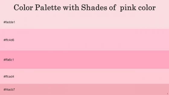
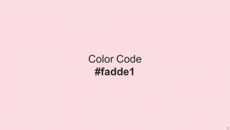
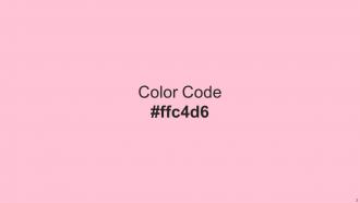
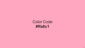
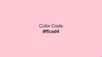
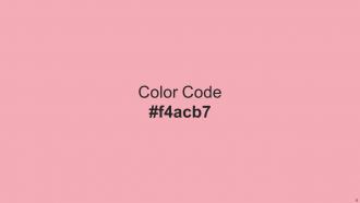
Heres a visually-pleasing color palette with Five Color Shades With Hex Code fadde1, ffc4d6, ffa6c1, ffcad4, f4acb7. These colors are intuitively picked to ignite the spark of brilliance in your designs and creativity.
People who downloaded this PowerPoint presentation also viewed the following :
Color Palette With Five Shade Cherub Pink Carnation Pink Pastel Pink Wewak with all 14 slides:
Use our Color Palette With Five Shade Cherub Pink Carnation Pink Pastel Pink Wewak to effectively help you save your valuable time. They are readymade to fit into any presentation structure.






FAQs for Color Palette With Five Shade Cherub Pink Carnation Pink
Honestly, contrast is your best friend here – nobody wants to squint at yellow text on white backgrounds. Stick to maybe 3-4 colors max or it'll look like a kid's art project gone wrong. If it's for a client, throw in their brand colors. Oh, and accessibility matters too since some people see colors differently than you do. I always test my slides on my phone first because hotel projectors are usually terrible. The bright conference rooms will wash out anything that's already hard to read. Keep it simple and you'll be fine!
Dude, colors can totally save or ruin your presentation. Red and orange pump up the energy but blue feels way more trustworthy - that's why banks love it. I once made this huge mistake using bright red for a budget meeting and everyone looked stressed! Blues and greens work better when you're throwing tons of data at people. Match your colors to what you're actually saying, you know? Like, don't go crazy vibrant if you're talking about serious financial stuff. Test it on someone first though - they'll tell you if your slide looks weird.
So monochromatic is just different shades of one color - simple but can look flat without good contrast. Analogous colors sit next to each other on the color wheel (like blue, teal, green) and honestly they're the easiest to work with. Everything just flows together nicely. Complementary is opposite colors that create crazy contrast - think orange and blue. It really grabs attention but can be overwhelming if you go 50/50 with both colors. I'd start with analogous schemes since they're basically foolproof. You can always add a tiny pop of complementary later if it needs more excitement.
Oh man, colors are tricky when you're presenting globally! In China, red means good luck, but we see it as danger. White's pure here but represents mourning in parts of Asia. Green usually works for growth stuff, though some places think it means you're inexperienced – weird, right? Honestly, just research your audience first and get local people to check your slides if possible. Blue and gray are pretty safe everywhere, then you can sprinkle in culturally appropriate colors. Way better than accidentally offending someone because you picked the wrong shade!
Okay so contrast is huge for readable text. You need enough difference between text and background colors or people literally can't read your stuff. WCAG says aim for 4.5:1 ratio for normal text, 3:1 for large text. Honestly, I've seen so many "aesthetic" sites with light gray on white that look fancy but are awful to actually use. Just grab any contrast checker online - paste your colors and it'll tell you if you're good. Way easier than guessing.
Okay so here's the thing - colors actually trigger emotions in people. Blues make you look trustworthy and professional, oranges feel energetic and fun. When you pick 2-3 colors and stick with them throughout your slides, everything looks way more polished instead of... well, like a rainbow exploded. I've literally watched boring presentations become decent just by fixing the color mess! Pick one main color that fits your vibe first. Then grab 1-2 others that work well together for highlights. Trust me, it makes such a difference.
Coolors.io is hands down my favorite - I get way too sucked into playing with it when I'm supposed to be working lol. Adobe Color's solid too if you want something more robust. Both let you pull colors from images and generate palettes. Already using Figma or Sketch? They've got decent color tools built right in. For accessibility stuff, WebAIM's contrast checker is clutch - you'll definitely need that. Stark and Colour Contrast Analyser are good for previewing how everything looks together. Start with Coolors though. It's free and super easy to figure out.
So accessibility is huge for color choices. You'll want that 4.5:1 contrast ratio between text and background - otherwise people with visual impairments can't read anything. Don't just use red for errors either, add icons or text too since about 8% of guys are colorblind (crazy how high that is). Test your palette with colorblind simulators before you get too attached to specific colors. WebAIM's contrast checker is solid, or grab the Stark plugin if you're working in design tools. Takes like two seconds to check.
Ugh, don't go crazy with colors - like 3 or 4 max. I've seen people use red text on green backgrounds and honestly it's painful to look at. Light text on light backgrounds is another nightmare. Also test your colors beforehand! I learned this the hard way when my "perfect" blue completely disappeared under those awful conference room lights. Oh and there are contrast checker tools online that'll tell you if people can actually read your text - super helpful since we're all terrible at judging this stuff ourselves.
Honestly, pick your 3-5 colors upfront and don't deviate. Save them as custom colors in your presentation software so you're not guessing at shades later - I can't tell you how many times I've seen presentations where the blue keeps shifting and it looks super amateur. PowerPoint and Google Slides both have theme color options that'll apply automatically across slides. Also this might be overkill but I screenshot my color palette and keep it open while I work. Way easier than constantly opening the color picker to double-check what shade I used three slides ago.
Honestly, don't just grab whatever color combo is trending on Pinterest this week. Pick stuff that actually makes sense for your audience - like, if you're pitching to some buttoned-up corporate client, maybe skip the hot pink and lime green everyone's using. I'd start small though. Try adding one or two trendy accent colors to whatever palette you already have going. Those moody jewel tones are pretty solid right now, or the whole earthy vibe if that fits your brand better. Test it out first before you commit to a full rainbow makeover.
Yeah totally! Gradients can make your colors way more interesting - they add depth without being crazy distracting. I honestly think flat design is kinda boring now, so subtle gradients between your brand colors are perfect. Textures work great too, especially on backgrounds. Just don't go overboard with it though. Start small and see what looks good. Oh and definitely check how they look on mobile since some gradients can get weird on smaller screens.
Yeah, so most industries have their own color "rules" if you will. Tech loves those clean blues and grays - trust and innovation vibes. Finance? Super conservative with blues and blacks because credibility matters. Healthcare goes for calming greens and blues, which honestly makes total sense when you think about it. Creative agencies can do whatever crazy colors they want (lucky them). But here's the thing - you've gotta know your audience. Don't roll up to a bank meeting with neon pink slides, you know? Check what competitors are doing first, then make it your own.
Okay so Adobe Color is definitely where I'd start - it's free and you can browse tons of palettes or make them from photos. Coolors.co is solid too, lets you lock in colors you love and generates matching ones. Pinterest is actually clutch for this stuff? Just search "color palette" plus whatever your vibe is. I waste way too much time scrolling through color combos on there lol. Oh and if you've got a logo already, upload it to a palette generator to pull colors that match. Adobe Color first though - it'll give you everything to get started.
Don't stress about chasing every trend honestly - updating every 2-3 years works fine. I've watched people go crazy trying to stay "current" and they end up looking dated super fast because they picked whatever was hot that month. Better question: do your colors still work for your brand and audience? If your slides feel fresh and don't scream "2019" (ugh, remember those ultra-minimalist grays?), you're good. The sweet spot is somewhere between timeless and contemporary. Just audit what you have now - does it feel relevant? Does it actually work across all your presentation formats? That'll tell you way more than any design blog.
-
The quality of the templates is as fine as it could get. It was a purchase well made!
-
The design is clean-cut, modern, and sleek, keeping the users' needs in mind. The multiple uses make this product worth every penny!