

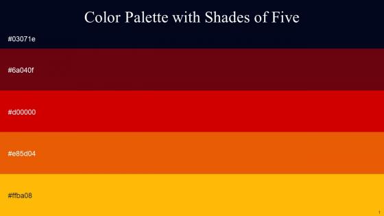
Color Palette With Five Shade Black Pearl Red Oxide Guardsman Red Trinidad Selective Yellow




Try Before you Buy Download Free Sample Product
 Impress Your
 Audience
 100%
100% Editable
 Save Hours
 of Time


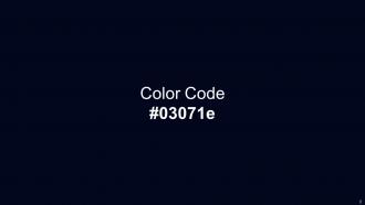
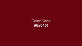
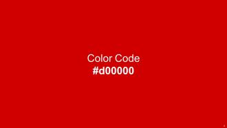
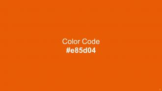
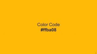
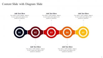
Heres a visually-pleasing color palette with Five Color Shades With Hex Code 03071e, 6a040f, d00000, e85d04, ffba08. These colors are intuitively picked to ignite the spark of brilliance in your designs and creativity.
People who downloaded this PowerPoint presentation also viewed the following :
Color Palette With Five Shade Black Pearl Red Oxide Guardsman Red Trinidad Selective Yellow with all 14 slides:
Use our Color Palette With Five Shade Black Pearl Red Oxide Guardsman Red Trinidad Selective Yellow to effectively help you save your valuable time. They are readymade to fit into any presentation structure.






FAQs for Color Palette With Five Shade Black Pearl Red Oxide Guardsman Red
Red and orange are solid for CTAs since they scream "click me!" - though too much will stress people out. Blue's the safe choice for trust (literally every tech company ever), green feels balanced and growth-y. Yellow's attention-grabbing but can be annoying tbh. Your audience trumps generic color rules though. Quarterly results? Blues and grays all day for credibility. Creative pitch? Go warmer and bolder. Oh and don't use more than three colors or it'll look like a kindergarten art project exploded on your slides.
Colors are seriously powerful - they mess with people's heads in ways they don't even realize. Warm tones make stuff feel welcoming, blues build trust, and high contrast just grabs attention. Your palette basically tells people where to look first and creates that visual flow that makes content way easier to read. Consistent colors across everything also builds brand recognition. I'd start with 3-4 colors that match your vibe, then actually test them with real people. Trust me, what looks good to you might totally flop with your audience.
Keep it simple - 3 or 4 colors tops. The 60-30-10 rule works great: main color dominates, secondary color fills about 30%, then pop in an accent for 10%. I'm awful at picking colors that actually look good together, so I just use Adobe Color or Coolors. Dark text on light backgrounds is boring but it works. Oh, and definitely test your slides on whatever screen you'll actually present on - I learned this the hard way when my "perfect" blues turned purple on their ancient projector. Colors can look completely different depending on the display.
Your color choices totally matter for brand perception. Blues and grays make you look professional and trustworthy. Reds and oranges? More energetic and friendly. It's weird how green automatically makes people think "money" or "environment" - like we're all programmed that way or something. Don't go crazy with neon colors though. Sure, they grab attention, but they'll give everyone a headache during long presentations. Stick with colors that actually match your brand's vibe and use them consistently. That's how people start recognizing your stuff instantly.
Definitely check out Coolors.co - I'm literally addicted to hitting spacebar and watching new color combos pop up. Adobe Color's solid too, plus you can upload photos to pull colors from them which is pretty neat. Canva has a palette tool if you're already messing around in there anyway. ColorHunt's good for browsing what other people made. Stick to maybe 2-3 main colors then throw in some grays or neutrals so your slides don't look like a rainbow exploded. Oh, and Paletton's there if you want something more technical, but honestly the others will do you fine.
Oh man, this is such a pain but super important! Like red screams "lucky!" in China but Western audiences think debt or danger. White's tricky too - Americans see purity, but it means mourning in parts of Asia. Green usually works since everyone thinks nature, though some places associate it with being sick (weird, right?). Honestly? Do your homework on who you're presenting to. I always run color choices past local teammates first - saves me from looking like an idiot. When you're not sure, play it safe with neutral combos.
Don't go crazy with colors - seriously, 2-3 max or it looks like a kid's art project. Red/green combos are terrible for colorblind people, they can't tell them apart. Light text on light backgrounds? Dark on dark? Happens way more than it should and makes everything unreadable. Check your contrast ratios, especially for text stuff. Bright neons might seem fun but trust me, they'll give everyone headaches during longer presentations. I learned this the hard way lol. Pro tip: print everything in grayscale first. If you can't read it then, your colors aren't working.
Honestly, contrast is everything - you want your text super readable from the back row. Dark text on light backgrounds works best, or flip it around. I've sat through way too many terrible presentations where they used gray on gray (seriously, why??). There's this 4.5:1 contrast ratio rule you can check with free online tools. Worth doing since projectors make everything look washed out anyway. Black on white is boring but it works. Navy on cream looks a bit classier if you're feeling fancy.
Dude, color accessibility matters way more than people think. Like 8% of guys are colorblind (crazy high, right?), plus some women too. I totally bombed a presentation once because my red/green charts looked identical to my colorblind coworker - super awkward. Don't just rely on color alone to show differences. Add shapes, patterns, or labels too. Also check that your text contrasts enough with backgrounds. Quick test: look at your slides in grayscale. If they still work, you're good to go.
Honestly, gradients and textures are perfect for this - they make your slides way more interesting without ruining the color harmony you've got going. Just don't go overboard though! I'd stick to maybe 1-2 subtle effects per slide tops. A light gradient from your main color to your secondary one works great as a background. You could also try adding some texture to text boxes using your accent colors. Oh, and section dividers look really nice with textured overlays too. I've definitely seen people get texture-happy and it ends up looking messy, so less is more here.
Okay so PowerPoint's got decent color schemes under Design > Variants - way better than the basic defaults which are kinda boring tbh. Google Slides has fewer choices when you go to Slide > Change theme, but they're pretty clean. If you want something that actually stands out though, check out Coolors.co or Adobe Color. You can grab the hex codes and make custom palettes. Just don't go crazy - stick to 3-4 colors max or it'll look messy. Oh and definitely test your palette on a sample slide first! I learned that the hard way when my text was totally unreadable.
Honestly, just pick 3-5 colors max and stick with them throughout the whole thing. I'd go with your main brand color, something neutral, and maybe one accent for highlights. Your presentation software probably has theme colors built in - use those instead of randomly picking colors each time. Trust me, I made this horrible rainbow mess once that looked like a kids' birthday party threw up on my slides. Oh, and write down your hex codes somewhere! Super annoying when you're switching between tools and can't remember what shade of blue you used.
So everyone's obsessed with earthy stuff right now - sage greens, terracotta, those soft browns. Way better than corporate blue hell we've been stuck in forever. Dark mode is everywhere too, probably because we're all basically nocturnal at this point lol. High contrast combos are getting big for accessibility (which, thank god, finally). Gradients are back but like, the good subtle ones - not that early 2000s rainbow madness. Oh and definitely test your colors on different screens first. Learned that one the hard way when my "perfect" palette looked terrible on the projector.
Dude, you should totally try matching your presentation colors to whatever season it is! People actually respond way better without even realizing it. Fall colors like deep oranges and reds make everything feel cozy and trustworthy. Spring greens and light blues? Super energizing. Winter's more about those classy deep blues and silvers, while summer screams bright and vibrant. I swear it works - I started doing this last year and people seem way more engaged. It's kinda crazy how something so simple can make such a difference. Definitely beats using the same boring template year-round.
So basically, your primary color is what people notice first - use it for buttons, headers, anything important. Secondary colors are more like backup dancers, they support the main show without stealing attention. I always tell people to think of it like music - you need that lead singer (primary) but the harmony (secondary) makes everything work together. Pick one bold primary that fits your brand, then grab 2-3 secondaries that play nice with it. Oh, and don't make them fight each other for attention - that's where most people mess up. Use secondaries for backgrounds and smaller accents.
-
I was really impressed with the presentation I created with their templates. I’ll be using their services moving forward.
-
No second thoughts when I’m looking for excellent templates. SlideTeam is definitely my go-to website for well-designed slides.