

Color Palette With Five Shade Black White Deep Sea Green Keppel Bermuda Lochinvar




Try Before you Buy Download Free Sample Product
 Impress Your
 Audience
 100%
100% Editable
 Save Hours
 of Time


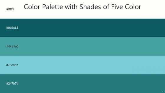
Heres a visually-pleasing color palette with Five Color Shades With Hex Code fffffa, 0d5c63, 44a1a0, 78cdd7, 247b7b. These colors are intuitively picked to ignite the spark of brilliance in your designs and creativity.
People who downloaded this PowerPoint presentation also viewed the following :
Color Palette With Five Shade Black White Deep Sea Green Keppel Bermuda Lochinvar with all 14 slides:
Use our Color Palette With Five Shade Black White Deep Sea Green Keppel Bermuda Lochinvar to effectively help you save your valuable time. They are readymade to fit into any presentation structure.







FAQs for Color Palette With Five Shade Black White Deep Sea Green
Honestly, just keep it simple - 2 or 3 colors tops. Dark text on light backgrounds is your friend for readability. Think about what vibe you're going for too... blue feels super corporate and trustworthy, warmer colors are more creative and fun. Oh, and definitely check how it looks on a projector first because those things wash everything out like crazy. I usually pick one solid accent color I love, then just build around it with grays and whites. Way less stressful than overthinking some complicated color scheme that'll probably look weird anyway.
Colors totally mess with how people feel about your presentation. Red and orange pump up energy - great for urgent stuff. Blues and greens? Super calming and trustworthy (literally why every boring bank uses blue lol). I'd go with cool colors when you're dumping lots of data on people, but warm tones work way better for calls to action. Use contrast to make important points pop. Here's what I do: pick 2-3 colors that actually match your vibe and don't stray from them. Seriously, resist the urge to go full rainbow unless you're teaching kindergarten.
Your brand identity should be calling the shots on every color choice you make. Think about it - a luxury company using neon green would be weird, right? The colors need to actually match your brand's personality and connect with your target audience. I always tell people to start by writing down their brand's main traits first. Then look into color psychology to see what aligns. Don't forget cultural stuff matters too - different colors hit people differently depending on their background. It's not just about what looks nice, but what actually reinforces your message and speaks to the right people.
Ugh, color meanings are SO different across cultures - you could totally mess up without realizing it. Like red screams "danger" to us but it's super lucky in China. And white? We think pure/clean, but it's mourning colors in parts of Asia. I bombed a Japan presentation once because of this stuff. Blue's pretty safe everywhere, green too mostly. My advice? Either research what colors mean to your specific audience first, or just play it boring with neutrals. Oh and definitely run your slides by someone local if you can swing it!
Oh man, I'm obsessed with Coolors.io - you can literally just hit spacebar and it generates new palettes forever (probably wasted hours doing this lol). Adobe Color's solid too, especially if you want to pull colors from photos you upload. If you're using Figma or Sketch already, they've got decent palette tools built right in. Dribbble's great for just browsing and getting inspired by what other designers are doing. My usual approach? Pick one color you really love first, then let these tools suggest 2-3 others that'll actually look good together instead of clashing horribly.
Okay so contrast is super important - you want at least 4.5:1 ratio between text and background. Dark text on light backgrounds is your safest bet for body text. Headers can handle light-on-dark better. Honestly, I learned this the hard way when someone told me my gray text was impossible to read lol. Always use a contrast checker tool because your eyes can trick you. Go with your brand's darkest and lightest colors for key text. Oh, and test everything in grayscale first - if it works there, you're golden.
Ugh okay so the worst thing you can do is go crazy with colors - like 3-4 max or it looks like a rainbow threw up. Also never pick colors that clash super hard together, and please don't use those neon ones that literally blind people (trust me on this). Similar colors end up looking muddy on screen which is annoying. You need good contrast between text and background so people can actually read your stuff. Oh and test it on different screens if you can! Always have a backup for black and white printing too because printers hate us.
So for business stuff, definitely go with navy, gray, or muted blues - they make you look trustworthy and professional. Educational presentations are totally different though! You can get away with way more fun colors like greens, oranges, purples. Keeps people awake, you know? I made the mistake of using neon yellow in a board meeting once... never again lol. Pick 2-3 main colors first, then throw in one accent color for the important stuff. Really depends on who you're presenting to and what vibe you're going for.
Ugh, learned this one the hard way after making a deck that looked like Skittles threw up everywhere! The 60-30-10 rule actually works though - keep most stuff neutral (60%), add one supporting color (30%), then hit 'em with bold accents (10%). Don't scatter the bright bits around randomly. Group them together so your audience's eyes get a break between the intense parts. Oh, and definitely test your colors on someone else first - what looks "perfect" to you might still blind everyone else. I always start way more boring than I think I need, then slowly turn up the volume.
Keep gradients super subtle - like 20-30% opacity max. Only use colors you've already got in your palette, don't add random new ones. I made some absolutely hideous rainbow monstrosities when I first started, so trust me on this lol. Try your primary color fading to a lighter version of itself. The whole point is people should *feel* the depth without actually noticing there's a gradient there. Works great on buttons and card backgrounds. Honestly, if someone's first reaction is "nice gradient!" you've probably overdone it. Start simple and see how it feels.
You definitely want to stick with the same 3-4 colors throughout your whole presentation. Otherwise people get distracted by all the visual chaos instead of actually listening to what you're saying. I've sat through presentations where every single slide looked like it came from a different deck - it was honestly painful to watch. Your brain has to keep readjusting when colors keep changing, which makes it way harder to focus on the content. Plus consistent colors just look more professional and polished. Pick your palette early on and don't get tempted to keep adding more colors later.
Honestly, start with function over pretty colors. Make sure your contrast ratios hit accessibility standards first - learned that lesson when our gorgeous blue palette completely bombed user testing lol. Colorblind users need to navigate too, so check those combinations early. After that foundation's solid, you can mess around with brand colors and hierarchy stuff. But here's the thing - test with real content, not those perfect mockups that never reflect reality. Short sentences work. Longer ones give you room to explain the nuances. Best designs? Users won't even think about the colors because everything just flows naturally.
Apple keynotes are *chef's kiss* - they stick to minimal palettes with tons of white space and maybe one accent color that matches their products. TED talks do this well too. Oh, and Airbnb presentations use these warm, travel-y colors that feel super welcoming instead of stuffy corporate vibes. The key thing? They never go rainbow crazy. Pick 2-3 colors max and actually stick with them. I'd definitely check out some Apple or Google I/O presentations - you'll see how they create that visual hierarchy using just brand colors plus strategic accent pops. Works every time.
Okay so everyone's ditching those awful corporate blues for warmer stuff - sage greens, terracotta, muted purples. Way better honestly. Gradients are back too (yeah I was surprised). High contrast combos are everywhere because of accessibility, which makes sense. Oh and monochromatic schemes with one accent color? Super clean looking on screens. You'll want to stick to 3-4 colors tops. Test them on your phone and laptop first though - colors look different everywhere and it's annoying when you find out last minute.
About 8% of guys and 0.5% of women can't see certain colors properly - usually red-green stuff. Don't use just red and green for important things like error messages. High contrast between text and background is clutch. I always throw in icons or labels too, not just colors. There's this tool called Stark that's pretty helpful for testing your palette. ColorBrewer works too. Run everything through a color blindness simulator first - saves you headaches later. Plus honestly? When you design for accessibility, it just looks better for everyone anyway.
-
“Immediate response, professional support, and effective solutions that were customized and immediately provided. Well done- Thank you!”
-
Excellent Designs.