


Color Palette With Five Shade Fern Chateau Green Forest Green Jewel Zuccini




Try Before you Buy Download Free Sample Product
 Impress Your
 Audience
 100%
100% Editable
 Save Hours
 of Time


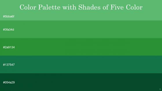
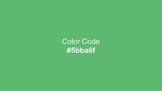
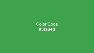
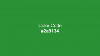
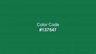
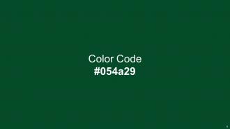
Heres a visually-pleasing color palette with Five Color Shades With Hex Code 5bba6f, 3fa34d, 2a9134, 137547, 054a29. These colors are intuitively picked to ignite the spark of brilliance in your designs and creativity.
People who downloaded this PowerPoint presentation also viewed the following :
Color Palette With Five Shade Fern Chateau Green Forest Green Jewel Zuccini with all 14 slides:
Use our Color Palette With Five Shade Fern Chateau Green Forest Green Jewel Zuccini to effectively help you save your valuable time. They are readymade to fit into any presentation structure.








FAQs for Color Palette With Five Shade Fern Chateau Green Forest
Oh totally, colors are huge for presentations! Red's great for grabbing attention but can come off aggressive. Blue builds trust (literally every tech company ever uses it lol). Green feels natural and positive. Purple screams creativity or luxury vibes. I learned the hard way that yellow energizes people but will absolutely murder their eyes if you go overboard. Orange is super friendly though. Just stick to 2-3 colors max - you want them backing up your message, not stealing the show. What's your presentation about?
Pick 2-3 colors that scream "you" and use them everywhere - headers, charts, all of it. People start recognizing your stuff instantly when they see those same colors pop up. Think about it like this: McDonald's yellow arches, right? Your brain just makes that connection automatically. Bold colors if you're energetic, calmer blues if you want trust - whatever matches your vibe. Then don't cheat on those colors! Use them in every single presentation you make. I swear consistency across all your materials is what builds that subconscious "oh, this is definitely their work" moment. It's honestly way more powerful than most people realize.
Honestly, just stick with black text on white - it's boring but works every time. White on black is solid too. If pure black feels too harsh, try dark navy (
-
SlideTeam makes creating presentations easy. Unlimited products, premium quality designs and affordable.
-
Excellent template with unique design.