


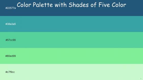
Color Palette With Five Shade Bay Of Many Keppel Emerald Pastel Green Gossip




Try Before you Buy Download Free Sample Product
 Impress Your
 Audience
 100%
100% Editable
 Save Hours
 of Time


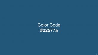
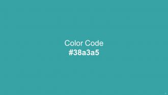
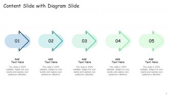
Heres a visually-pleasing color palette with Five Color Shades With Hex Code 22577a, 38a3a5, 57cc99, 80ed99, c7f9cc. These colors are intuitively picked to ignite the spark of brilliance in your designs and creativity.
People who downloaded this PowerPoint presentation also viewed the following :
Color Palette With Five Shade Bay Of Many Keppel Emerald Pastel Green Gossip with all 14 slides:
Use our Color Palette With Five Shade Bay Of Many Keppel Emerald Pastel Green Gossip to effectively help you save your valuable time. They are readymade to fit into any presentation structure.






FAQs for Color Palette With Five Shade Bay Of Many Keppel Emerald
Pastel green is honestly perfect for this - it makes people feel way more chill and trusting. Your audience won't feel attacked like they might with harsh reds or black backgrounds. There's something about soft green that screams "growth" and "balance," plus it reduces that visual stress that makes people zone out. They'll actually listen instead of getting distracted by overwhelming colors. You'll come across as super approachable too. Just watch out though - too much and you might bore everyone to death. Stick to backgrounds or small accents. It's basically like giving your presentation a visual xanax.
Pastel green works great as a background! Dark text like charcoal or black looks really crisp against it. I actually love using it in presentations because it won't strain people's eyes during those endless meetings. Just don't do light text on it - the contrast is awful. You can throw it in headers, borders, or use it to highlight important stuff too. Oh, and it makes good section dividers. The key is keeping your text dark and bold. Maybe test it on a few slides first? That way you'll know if it feels readable before you redo everything.
Oh definitely go with soft coral or warm peach - they look amazing with pastel green! Navy blue works too if you need something more professional looking. Muted lavender is another good option. I used to think pastels were too soft for work stuff, but honestly they keep people way more engaged than harsh colors. Cream backgrounds with pastel green accents are nice too. Just don't do bright orange or hot pink... trust me, it'll look terrible. Oh and test it on the actual projector first because sometimes pastels get washed out under weird lighting.
Oh totally! Healthcare and beauty brands use it constantly because it just feels calming and natural. Sustainable companies and organic food brands love it too - makes sense, right? Financial services is where it gets interesting though. I never expected that, but apparently it builds trust without being as intense as darker greens. Childcare and education sectors are obsessed with it since it's soothing but not boring. Honestly, if you're going for approachable rather than edgy, you should definitely test it out in your next campaign.
Yeah, pastel green is actually a solid choice for international stuff. Most cultures see it as growth and harmony - pretty safe bet. Asia especially loves green since it means prosperity there. Way better than red which gets weird depending on where you're presenting. The soft green feels fresh and trustworthy in Western markets too, not too in-your-face. One thing though - don't mix it with red for Chinese audiences because, I mean, nobody wants their presentation looking like a Christmas card lol. But honestly? Go for it. Super diplomatic and won't stress anyone out.
Pastel green can be tricky - it's so soft that text just vanishes if you're not careful. I'd go with darker greens or charcoal for readability. Cream and warm grays work great as neutrals so everything doesn't look totally washed out. Honestly, throw in some darker accent colors here and there to create hierarchy. Oh, and definitely test your colors on different screen brightness levels because what looks fine on your laptop might be invisible on someone's dim phone screen. Short version: contrast is your best friend with pastels!
Oh totally! Pastel green is everywhere because of the whole minimalist wellness thing happening right now. Designers are ditching those super bright colors for softer stuff that feels more chill. Works great if you're going for that "we care about sustainability" look too - which honestly feels a bit played out at this point, but whatever. The color photographs really well for social media posts, which is huge since everyone shares their decks online now. I'd say use it while it's trendy but throw in some unexpected accent colors. Otherwise your presentation will look like every other one out there.
Adobe Color and Coolors.io are honestly my favorites for this stuff - just pick your pastel green and they'll suggest colors that actually work together. Canva's got a palette tool too if you're already using it anyway. I always get distracted for like 20 minutes just messing around with different combos lol. Paletton's more advanced if you want to get fancy, or there's Google's Material Design thing. The key is finding colors that complement your green without making everything look like Easter threw up on your slides. Short version: start with any of these tools and you'll be good to go.
Oh, pastel green just hits different! It's got that nature thing going on - super calming but also feels like growth and renewal, you know? Way more grounding than pastel pink (too sweet) or lavender (kinda floaty). Brighter greens can feel aggressive, but this is gentle and optimistic. No wonder wellness brands are obsessed with it lol. Unlike pastel blue which feels distant, green actually feels nurturing. Perfect if you want that harmony/fresh start vibe in your project. Just don't use it for anything urgent - it's too chill for that energy.
Dude, don't use pastel green for your main text - learned that one the hard way when my slides looked invisible on the projector. Super embarrassing. Also skip pairing it with other pastels because everything just mushes together visually. Oh, and definitely don't use it for important stuff or buttons since it's too subtle to grab attention. Works way better as background color or little accent touches. Random tip but test your slides on the actual screen beforehand if you can!
Yeah, pastel green totally works for data viz! I'd use it for positive stuff - growth charts, success metrics, anything where green = good vibes. Perfect for backgrounds too since it won't assault people's eyeballs like those crazy bright colors some designers love. Just don't use it for urgent warnings or alerts because honestly, nobody's gonna notice pastel green when something's on fire. Make sure you've got darker colors nearby for contrast, and definitely test it with colorblind folks. Trust me on that last part.
Oh, pastel green is perfect for sustainability stuff, wellness talks, or anything about growth and new beginnings. People automatically think nature and health when they see it, which is great for environmental projects or personal development presentations. Works really well in healthcare and education too - I've noticed teachers love it. Just don't use it for serious financial reports or crisis stuff where you need that heavy, professional vibe. Oh, and stick with white or light gray backgrounds so your text doesn't get lost. Trust me on that one.
Honestly, pastel green shades can make or break your presentation depending on which one you pick. Mint greens are super chill - perfect for wellness stuff or when you want people to feel relaxed during brainstorming. Sage and gray-greens? Way more professional and trustworthy, so they work great for financial presentations. Yellow-greens are energizing but kinda risky - amazing for creative pitches but maybe too playful for serious business stuff. Oh, and definitely test your color on a sample slide first! I learned that the hard way once. You'll know right away if it matches the vibe you're going for.
Honestly, pastel green works great for corporate stuff - gives off that growth and sustainability vibe without being too in-your-face. Perfect for tech or healthcare companies who want to look innovative but still trustworthy. I've noticed it really softens those boring corporate presentations too. Just don't go overboard with it though. Use it as an accent instead of painting everything green (learned that one the hard way lol). Oh, and definitely test it with your actual content first - sometimes it looks weird with certain charts or data. But yeah, it's solid for making brands feel more approachable.
Dude, pastel green is perfect for giving people's brains a break between all your heavy content. I'd throw key quotes or takeaways on those soft green slides. Works great for transitions too - way better than cramming everything onto boring white backgrounds that make people zone out. The color keeps things chill but still looks professional. Oh, and try doing like 70% regular slides, 30% green ones for spacing. Trust me, your audience will actually absorb more when they're not getting visually overwhelmed the whole time.
-
The best and engaging collection of PPTs I’ve seen so far. Great work!
-
Excellent work done on template design and graphics.