


Color Palette With Five Shade Pink Pastel Pink Pale Rose




Try Before you Buy Download Free Sample Product
 Impress Your
 Audience
 100%
100% Editable
 Save Hours
 of Time


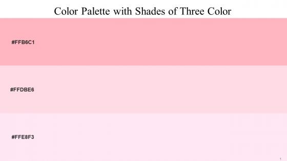
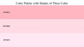
Heres a visually-pleasing color palette with Five Color Shades With Hex Code FFB6C1, FFDBE6, FFE8F3. These colors are intuitively picked to ignite the spark of brilliance in your designs and creativity.
People who downloaded this PowerPoint presentation also viewed the following :
Color Palette With Five Shade Pink Pastel Pink Pale Rose with all 15 slides:
Use our Color Palette With Five Shade Pink Pastel Pink Pale Rose to effectively help you save your valuable time. They are readymade to fit into any presentation structure.










FAQs for Color Palette With Five Shade Pink Pastel
Honestly, navy blue or charcoal gray work amazing with pink - they contrast really well without looking weird. Forest green is another solid choice if you want something a bit unexpected but still professional. White and cream are kinda obvious but they definitely keep things clean. Just avoid red or orange unless you're going for that whole Valentine's vibe lol. Oh, and definitely test whatever colors you pick on an actual projector first - colors always look different up there than on your laptop screen. Stick to max two accent colors total.
Pink totally changes how people react to your stuff. It makes things feel warm and approachable - way more nurturing than something like black or red would. People automatically think "feminine" and "gentle" when they see it, which honestly can work for or against you depending on what you're going for. Soft pinks are perfect for wellness or beauty brands, but if you want more energy, hot pink hits different. The psychological effect is pretty wild - just that one color choice makes viewers feel more relaxed and open to whatever you're saying. Definitely test different shades though, because your audience might surprise you with what they respond to.
Go with clean sans-serif fonts - Montserrat or Open Sans are solid choices. They look crisp against pink without competing for attention. Skip the decorative fonts unless you want it looking like a kid's birthday invite lol. For headers, Playfair Display adds some elegance if you need it. Dark gray text works way better than straight black, which can look super harsh. Navy's good too. Honestly, I'd throw together a few test slides first because what looks good in your head doesn't always translate. Trust me on this one.
Honestly, pink is such an underrated color for branding! It hits all these emotional notes - warmth, creativity, being approachable. Your audience connects better when they feel something, you know? Most brands are still scared of it, which is crazy because that means less competition for you. It works amazing for younger audiences or if you want to shake up a stuffy industry. Different shades do different things too - soft pink feels elegant, hot pink screams energy, dusty rose is more sophisticated. I'd say try some pink accents in your next campaign. You'll probably be surprised how it changes the whole vibe.
Pink's tricky in corporate stuff. Yeah, it screams creativity and approachability, but some old-school people still think it's not "serious" enough. Honestly depends on your industry though - works amazing for wellness or beauty brands. The whole nurturing/innovation vibe is actually becoming more valuable as companies get into emotional intelligence. But context matters big time. Hot pink in a boardroom? Probably not. Something like dusty rose might fly better. I've seen it work really well when done right, just gotta read your audience first.
So basically you want to go from light to dark - like blush, then rose, then deep magenta. Start light for highlights and backgrounds, then add the darker pinks for shadows and stuff you want to pop. Honestly pink gradients are so pretty when they work! Just make sure there's enough contrast or everything looks muddy. Oh and here's something I learned the hard way - cooler pinks (the ones with blue in them) make things recede, while peachy-warm pinks come forward. Definitely test it on a corner first though!
Oh definitely go with florals and sunset vibes - those feel so natural with pink. Beauty shots and romantic stuff work amazing too since pink just enhances that whole aesthetic. Cotton candy clouds? *Chef's kiss* Cherry blossoms are gorgeous with pink palettes. But here's where it gets fun - try pairing pink with gritty urban or industrial shots. The contrast is honestly so striking and unexpected. I always stick with warm-toned images as my go-to, but don't sleep on cooler subjects either. Sometimes that dramatic clash creates the most interesting results.
Honestly, the worst thing you can do is go crazy with saturation - like, too much bright pink will literally make people's eyes hurt. Also don't just slap pink everywhere without thinking about your other colors. It needs good contrast or it'll look amateur. Oh, and context matters SO much - hot pink works for beauty brands but imagine a law firm using it lol. Different shades hit totally different too. I'd test a few options and get feedback early because pink is super polarizing. What looks amazing to you might make others cringe.
Honestly, pink's tricky for global stuff because it means totally different things everywhere. Western audiences usually think femininity or luxury brands, but in Japan it's more about spring and renewal - which is actually pretty cool. Some Asian cultures see it as lucky and celebratory. Other places though? Could come across as unprofessional or just weird. I'd definitely run your color choices by someone local first, or at least do a quick Google search about cultural meanings. Way better than accidentally sending the wrong message to your audience.
Pink's everywhere right now and honestly, I get why. Brands are going for that whole warm, approachable vibe instead of being super corporate and cold. The minimalist thing works great with pink too—but like the dusty, muted versions, not that aggressive hot pink from the early 2000s (thank god). Also there's been this shift where pink isn't just "girly" anymore, which opened it up for business stuff. If you're thinking about using it, try dusty rose with cream or maybe sage green? That combo won't look dated in two years.
Okay so pink can totally overwhelm a space if you don't balance it out. That's where neutrals come in - white, gray, beige basically give your eyes somewhere to chill. Without them, pink just screams at you (and not in a good way). I swear by the 60-30-10 thing: neutrals should dominate like 60% of your room, pink takes up 30%, then save your brightest pink bits for just 10%. Honestly, I've seen too many spaces that look like Barbie exploded because someone skipped the neutral step. Trust me on this one!
Oh god, contrast is SO important with pink - I learned this the hard way on a project last year. Pink gets overwhelming super fast if you don't balance it right. Pair it with strong neutrals like deep gray, white, or black for your text. Light pink backgrounds need dark text, darker rose tones can handle lighter colors. Honestly seems obvious but people mess this up constantly! Test your combos on different screens because what looks fine on your laptop might be awful on mobile. Always keep a backup neutral ready just in case.
Okay so animations can totally make your pink palette pop! I'd go with gentle stuff - fade-ins, soft slides between sections. Harsh bouncy effects? Nah, they'll clash with pink's whole vibe. Try gradually revealing pink text with opacity changes, or do those smooth morphing transitions where shades blend together. Oh and honestly, less is more here - I've seen people go overboard and it just kills the aesthetic. Start simple with basic fades or slides first. See how they work with your specific pinks, then maybe add more later.
Honestly, just go with Canva if you want something super easy - they've got a bunch of pink templates ready to go. Adobe stuff like Photoshop or Illustrator gives you way more control over colors though, which is nice if you're picky about getting the exact shade. Figma's really good too, especially when you're working with other people since you can all see the same color codes. Oh and Sketch is solid for UI stuff. Whatever you end up using, definitely save those hex codes somewhere! I learned that the hard way when I couldn't match a pink I'd used before.
Pink's way more flexible than people think! Fashion can go bold with hot pinks or classy with blush. Tech companies are doing muted dusty pinks now - even "masculine" brands jumped on this trend (honestly didn't see that coming). Healthcare loves soft calming pinks, food brands use peachy tones for that fresh vibe. The trick is your secondary colors though. Pair with grays for tech, earth tones for wellness, metallics if you're going luxury. Figure out what emotion your industry needs first, then pick your pink shade from there.
-
It saves your time and decrease your efforts in half.
-
“One of the best experiences with SlideTeam for my presentation.Everything on time, communication is efficient and price is reasonable. All good in one place.”