


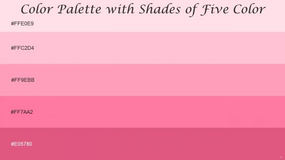
Color Palette With Five Shade Pale Rose Pink Carnation Pink Tickle Me Pink Cranberry




Try Before you Buy Download Free Sample Product
 Impress Your
 Audience
 100%
100% Editable
 Save Hours
 of Time


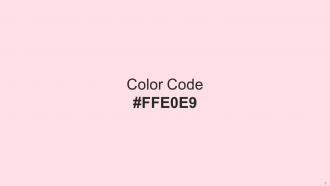
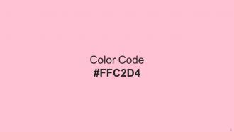
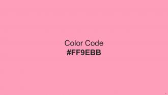
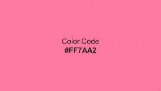
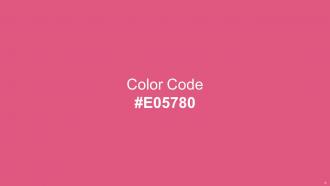
Heres a visually-pleasing color palette with Five Color Shades With Hex Code ffe0e9, ffc2d4, ff9ebb, ff7aa2, e05780. These colors are intuitively picked to ignite the spark of brilliance in your designs and creativity.
People who downloaded this PowerPoint presentation also viewed the following :
Color Palette With Five Shade Pale Rose Pink Carnation Pink Tickle Me Pink Cranberry with all 14 slides:
Use our Color Palette With Five Shade Pale Rose Pink Carnation Pink Tickle Me Pink Cranberry to effectively help you save your valuable time. They are readymade to fit into any presentation structure.

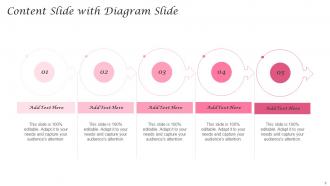





FAQs for Color Palette With Five Shade Pale Rose Pink Carnation Pink Tickle
Okay so color psychology is actually pretty huge for presentations. Red grabs attention fast but feels super aggressive if you go overboard. Blue's the safe choice - builds trust (literally why every tech company ever uses it lol). Green's calming and suggests growth. Orange has energy without red's intensity. Purple screams premium or creative vibes, and yellow brightens things up but honestly don't use it as background color because it'll hurt people's eyes. Black and gray look professional but can feel kinda cold. Stick to 2-3 colors tops and definitely test how your palette looks on different screens first!
Good color combos keep people focused on what you're actually saying instead of getting distracted by clash-y colors that hurt their eyes. I've totally been in presentations where the colors were so wild I completely lost track of the message! Cohesive palettes also make you look more professional - people subconsciously trust well-designed stuff more. Honestly, I'm terrible at picking colors myself, so tools like Coolors or Adobe Color are lifesavers for generating palettes. Just run it by a couple people first before your presentation to make sure it doesn't look weird on their screens.
Adobe Color's your go-to - free and you can either build from scratch or upload images to pull colors from. Coolors.co generates random palettes that you can mess around with (I get weirdly addicted to hitting the spacebar for new combos lol). If you're already in Canva, just use their palette suggestions. PowerPoint actually has a decent color picker too for sampling from images. Quick tip though - definitely test everything on an actual slide first. Colors look way different on white backgrounds than you'd expect.
Oh man, color psychology is wild depending on where you're presenting! Like red means danger here but it's super lucky in China - totally opposite vibes. I always look up the cultural background first because white seems clean to us but actually means mourning in some Asian countries. Even green can backfire - we think "go" but other places find it too aggressive or something. Honestly blue and gray are your safest bet for international stuff since they don't really offend anyone. Way less stressful than accidentally picking the wrong shade!
Okay so contrast is basically what makes people actually see your text. You need enough difference between your text and background colors - otherwise people in the back row are screwed. I can't tell you how many times I've sat through presentations with super light gray text on white. Like, why? Shoot for at least a 4.5:1 contrast ratio, though 7:1 is better if you want to be accessible. Dark text on light backgrounds is your safest bet. Here's a quick trick: squint at your slide. Can you still read it? You're golden.
So for school stuff, go with blues and greens - they're easier on the eyes and help people actually pay attention. Corporate meetings? Stick to navy, gray, boring professional colors basically. Students can handle brighter colors and more variety since you're fighting for their attention anyway. But corporate people want everything clean and consistent - one accent color tops. I made the mistake of using bright yellow in a presentation once... never again lol. Oh and definitely test your colors on the actual screen first - they always look different than on your laptop.
Honestly, the worst thing you can do is go crazy with colors - keep it to like 3-5 max or it'll look like a rainbow threw up. Also check those contrast ratios for accessibility! Don't just pick trendy colors either (learned that the hard way with some awful neon choices back in the day). Test everything on different screens since colors look weird under office fluorescents vs your home setup. Oh, and don't forget about colorblind users - that's a huge chunk of people. My advice? Make some mockups and sit with them for a couple days before committing. You'll know pretty quick if something feels off.
Hey! So contrast is huge - make sure your text actually stands out from the background. I used to think light gray looked super clean until I realized half my audience couldn't read it lol. Also, tons of guys are colorblind (like 8% I think?), so don't just use red and green to show important stuff. There's this WebAIM contrast checker tool that's pretty helpful for testing your colors. But honestly? Just add text labels or patterns alongside your color coding. Way easier than guessing if people can see what you're trying to show them.
Dude, navy and warm gold is everywhere right now - looks so much better than those boring navy-gray combos from before. Sage green with cream is having a moment too, super calming vibes. Oh, and deep forest green with copper accents! I'm honestly obsessed with that one. The trick is mixing one bold color with something softer so it doesn't feel overwhelming. Those sterile blue-gray palettes from a few years back were such a snooze fest. Maybe try switching out just one thing in your current setup? See how it feels before going all-in.
When you stick to just 2-3 colors, everything suddenly clicks better. Your audience isn't getting distracted by rainbow chaos - they can actually focus on your content. Plus (and this might sound weird) but limited palettes make you think harder about each choice, which weirdly makes the whole thing stronger. I used to go nuts with like 6 different colors and wondered why nothing looked right together. Now? Way more cohesive. People remember designs that feel unified. Honestly, try it on your next project - you'll be surprised how much cleaner everything looks when you're not second-guessing every color decision.
Okay so basically every industry has these unspoken visual rules everyone follows. Finance? Stick with boring blues and grays - anything flashy makes people think you're sketchy with their money. Tech gets to be way more experimental (honestly jealous), while healthcare does the whole calming blue and white thing. You'd look insane rolling up to a bank meeting with neon green slides lol. Creative fields can pretty much do whatever though. I'd peek at what your competitors are using first. Then you can find ways to stand out without looking totally out of place, you know?
Dude, gradients are tricky - I've seen so many decks that look like someone threw up a rainbow lol. Keep them super subtle! Use maybe 2-3 colors tops and stick to linear ones since radial can be distracting as hell. They work great for section backgrounds or making headers pop, but don't let them fight your actual content. Make sure you've got enough contrast so people can actually read your text. Oh and definitely check how they look on different screens - I learned that the hard way when my "subtle" gradient looked neon on the projector.
Think of your color palette as your brand's signature look. Pick 3-4 colors and use them religiously across every presentation you make. People will start connecting those colors to your company without realizing it – kinda like how everyone knows that Coca-Cola red, you know? I'd start with one main brand color, then add a couple that work well with it. The trick is actually sticking to them every single time. Once you nail down your colors, use them in your slides, headers, all your graphics. Honestly, consistency is what makes people remember you. It sounds simple but it really works.
Coolors.co is honestly my go-to - just hit spacebar and it generates random palettes, which is weirdly addictive lol. You can lock colors you like and keep tweaking from there. Adobe Color's solid too if you want something more robust, plus it pulls palettes from photos which is pretty cool. For browsing what other people made, Color Hunt's nice. Oh and Paletton if you're into the technical color theory stuff, though that one's a bit more intense. I'd definitely start with Coolors since it's free and super easy to use!
Bright colors are your friend here - make that important stuff pop against something neutral. Like when you highlight text, but for charts. I stick to max two accent colors or it gets chaotic fast. Nobody knows what to look at first. Your brand's main color works great for the big points, then maybe grab a complementary shade for the smaller data. Short sentences help too. People's eyes should hit your key numbers immediately. Oh, and seriously check the contrast - I've seen way too many presentations where the back row is squinting like they need glasses. You don't want that awkwardness.
-
Mesmerized with the fantastic collection! Super sleek, relevant infographics.
-
World-class PowerPoint designs that are fully customizable!