


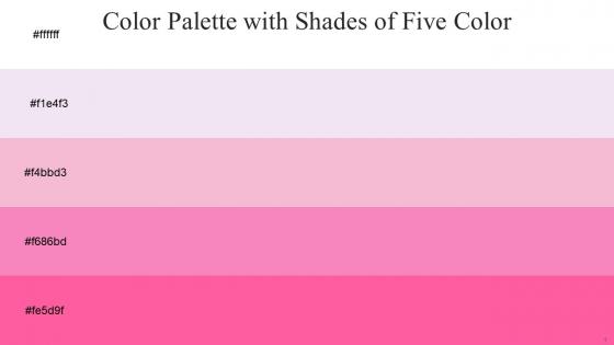
Color Palette With Five Shade White Snuff Azalea Persian Pink Hot Pink




Try Before you Buy Download Free Sample Product
 Impress Your
 Audience
 100%
100% Editable
 Save Hours
 of Time


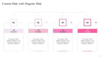
Heres a visually-pleasing color palette with Five Color Shades With Hex Code ffffff, f1e4f3, f4bbd3, f686bd, fe5d9f. These colors are intuitively picked to ignite the spark of brilliance in your designs and creativity.
People who downloaded this PowerPoint presentation also viewed the following :
Color Palette With Five Shade White Snuff Azalea Persian Pink Hot Pink with all 14 slides:
Use our Color Palette With Five Shade White Snuff Azalea Persian Pink Hot Pink to effectively help you save your valuable time. They are readymade to fit into any presentation structure.






FAQs for Color Palette With Five Shade White Snuff Azalea Persian
Key color theory principles for presentation palettes include complementary colors for contrast, analogous colors for harmony, the 60-30-10 rule for balance, and understanding warm versus cool temperature effects. These principles work together by creating visual hierarchy, enhancing readability, and supporting brand consistency, with many organizations finding that strategic color choices significantly improve audience engagement and message retention.
A well-defined color palette enhances audience engagement by creating visual hierarchy, improving readability, evoking appropriate emotional responses, and maintaining professional consistency throughout the presentation. Strategic color choices guide attention to key points, reduce cognitive load, and reinforce brand messaging, with many presenters finding that cohesive palettes increase audience retention and comprehension significantly.
Colors trigger distinct psychological responses, with blue conveying trust and stability, red creating urgency and energy, green suggesting growth and harmony, and yellow fostering optimism and creativity. Strategic color palette selection in presentation templates enhances audience engagement, reinforces brand messaging, and influences decision-making, with many organizations finding that consistent color psychology applications improve communication effectiveness and stakeholder buy-in.
Contrast plays a crucial role in color palette selection by ensuring text remains readable, important elements stand out, and content is accessible across different devices and lighting conditions. Effective contrast ratios enhance user experience in digital presentations, marketing materials, and brand communications, with many organizations finding that high-contrast palettes improve engagement rates and reduce eye strain for audiences.
Presenters can ensure accessibility by using high contrast combinations, avoiding problematic red-green pairings, incorporating patterns or textures alongside colors, and utilizing colorblind-friendly palettes with blues, oranges, and purples. These approaches enable clearer communication across diverse audiences, with many organizations finding that accessible design ultimately enhances comprehension for all viewers while demonstrating inclusive professionalism.
Trending color combinations for professional presentations in 2023 include sage green with cream, navy blue with coral, charcoal gray with gold accents, deep purple with silver, and warm terracotta with off-white. These strategic palettes enhance visual engagement and brand credibility by balancing professionalism with contemporary appeal, ultimately delivering stronger audience connection and memorable presentation experiences across corporate environments.
Cultural perceptions significantly influence color palette choices in global presentations, as colors carry different meanings across cultures, religions, and geographic regions. While red symbolizes prosperity in China but danger in Western contexts, and white represents purity in some cultures versus mourning in others, successful global presenters adapt their palettes strategically, ultimately ensuring cultural sensitivity while maintaining brand consistency and audience engagement.
Design tools for creating cohesive color palettes include Adobe Color, Coolors, Paletton, ColorHunt, and Canva's color wheel generator. These platforms streamline brand development by offering color harmony algorithms, accessibility testing, and export capabilities, with many marketing teams finding that consistent palette application across presentations, websites, and materials ultimately delivers stronger brand recognition and professional credibility.
A color palette reinforces brand identity by creating visual consistency, triggering brand recognition, and establishing emotional connections with audiences through strategic color associations. When businesses consistently apply their brand colors across presentations, marketing materials, and customer touchpoints, they enhance memorability, build trust, and differentiate themselves competitively, ultimately strengthening brand equity and customer loyalty.
Best practices for combining different shades and tones include establishing a dominant base color, incorporating 60-30-10 proportions, maintaining consistent undertones, using analogous or complementary relationships, and ensuring sufficient contrast for readability. These strategic combinations enhance visual hierarchy, create depth and sophistication, and deliver cohesive brand experiences, with many design teams finding that systematic tonal variation ultimately streamlines communication while maintaining aesthetic unity.
Balancing aesthetic appeal with information clarity requires selecting colors that enhance data comprehension while maintaining visual engagement, using high contrast ratios, colorblind-friendly palettes, and meaningful color associations. Strategic color choices streamline audience understanding by reducing cognitive load, highlighting key insights, and ensuring accessibility across diverse viewers, ultimately delivering more effective presentations that drive decision-making and stakeholder engagement.
Background color significantly influences audience perception and content retention by affecting readability, emotional response, cognitive load, and visual hierarchy within presentations. Strategic color choices enhance comprehension and memory retention, with many organizations finding that neutral backgrounds with high contrast text improve focus by 25-40%, while warmer tones increase engagement and cooler tones promote analytical thinking, ultimately delivering stronger audience connection and measurable presentation effectiveness.
Presenters can use varying shades, tints, and saturations of their core colors, strategic accent colors for emphasis, and different textures or patterns to create visual interest. Through thoughtful application of whitespace, typography variations, and selective color intensity, organizations like consulting firms and healthcare institutions maintain brand consistency while delivering engaging presentations, ultimately enhancing audience retention and professional credibility.
Common mistakes when selecting presentation color palettes include using too many colors, ignoring brand consistency, choosing low-contrast combinations, and selecting overly bright or distracting hues. These missteps often result in reduced readability, unprofessional appearance, and audience distraction, with many organizations finding that streamlined, accessible palettes ultimately enhance message clarity and brand credibility across presentations.
Color palette consistency is maintained by establishing a core set of 3-5 brand colors and systematically applying them across all slides through templates, master slides, and style guides. Professional presentations benefit from using consistent primary colors for headings, secondary colors for accents, and neutral tones for backgrounds, with many organizations finding that this strategic approach enhances visual cohesion and reinforces brand recognition throughout their communications.
-
What a stunning collection of customizable templates! Really a time-saver..
-
Extensive range of templates! Highly impressed with the quality of the designs.