


Color Palette With Five Shade White Remy Pastel Pink Cotton Candy Carnation Pink


Try Before you Buy Download Free Sample Product
 Impress Your
 Audience
Editable
of Time


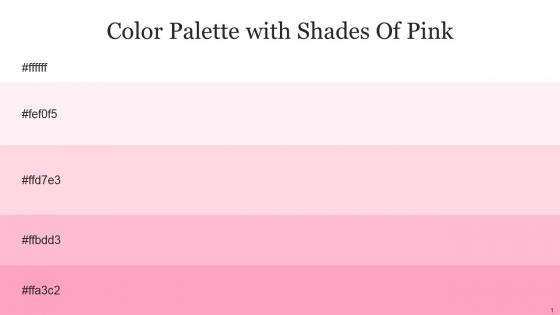
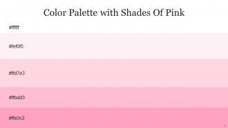
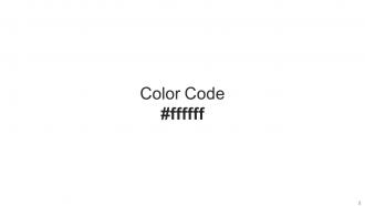
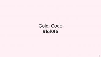
Heres a visually-pleasing color palette with Five Color Shades With Hex Code ffffff, fef0f5, ffd7e3, ffbdd3, ffa3c2. These colors are intuitively picked to ignite the spark of brilliance in your designs and creativity.
People who downloaded this PowerPoint presentation also viewed the following :
Color Palette With Five Shade White Remy Pastel Pink Cotton Candy Carnation Pink with all 14 slides:
Use our Color Palette With Five Shade White Remy Pastel Pink Cotton Candy Carnation Pink to effectively help you save your valuable time. They are readymade to fit into any presentation structure.


FAQs for Color Palette With Five Shade White Remy Pastel Pink Cotton
Honestly, pastel pink is pretty genius for presentations because it just makes people chill out. There's actual psychology behind it - the color hits people as comforting and approachable, so they're not sitting there all tense and defensive. Works amazing for wellness stuff, creative pitches, team building... though maybe skip it if you're presenting quarterly financials lol. Don't go crazy with it though - use it as an accent, not the main event. I usually pair it with grays or soft whites so it doesn't look like a baby shower exploded on your slides.
Cream, light gray, or white look amazing with pastel pink - super dreamy and cohesive. Other pastels work great too! Mint green, lavender, butter yellow all give it a playful vibe. I'm totally obsessed with pastel pink and sage green right now, it's such a good combo. For more contrast, navy or emerald are gorgeous but use pink as your accent so it doesn't get lost. Oh, and try the 60-30-10 thing - dominant neutral, then your pastel pink, then accent color. Trust me on this one!
Pastel pink's perfect for wellness, beauty, or fashion presentations - basically anything aimed at women. Creative industries love it too. Tech startups have been using it lately, which honestly caught me off guard at first. But skip it for corporate finance stuff or anything that needs to feel super serious and traditional. The whole point is matching soft colors to soft messages, you know? Oh, and here's a random tip - use cream or light gray text instead of black. Makes it look way less amateur. Just don't go overboard with the sweetness factor.
So here's the thing about pastel pink - it actually works because people feel more chill when they see it. Like, your brain processes stuff better when you're relaxed, and soft pink just hits different than harsh colors. It's kinda like talking in a gentle voice instead of yelling, you know? People don't tune out as fast. Plus it sticks in their memory without being annoying or distracting. Honestly, I was skeptical at first too. But try using it as a background or for accent stuff in your next presentation. You'll probably notice people staying focused way longer.
Definitely go with beauty, wellness, or fashion - pastel pink is basically made for those industries. Healthcare works great too, especially women's health or pediatrics since it feels so approachable. Creative agencies can pull it off easily, and honestly, even tech companies are using softer colors now to seem less robotic. Oh, and food brands love it - think dessert companies or fancy restaurants. Just one heads up though: make sure your data doesn't disappear into all that softness. You don't want people squinting at pale pink charts trying to figure out what you're actually saying!
Honestly, pastel pink works great when you're going for that approachable, warm vibe - like if you're doing wellness stuff, creative pitches, or anything aimed at younger people. It's got this naturally calming, optimistic feel that doesn't scream "corporate boardroom." I've noticed it really clicks for healthcare or educational presentations. But here's the thing - don't go crazy with it or you'll end up looking like a cupcake bakery (which might not be the vibe you want). Stick to using it as an accent with neutrals like cream or soft gray. That combo hits different.
Okay so with pastel pink, definitely go with neutrals - soft grays, cream, white. Trust me, I've sat through way too many presentations where someone went crazy with pink everywhere and my eyes were bleeding lol. Dark gray text works way better than black against pastels for contrast. Clean fonts are your friend here. Give yourself tons of white space to breathe. Maybe throw in some subtle textures if you're feeling fancy? But honestly, less is more - use the pink as an accent, not the main event. Oh and test it on different screens first because colors can look totally different!
Oh man, this is tricky! Pastel pink hits so differently depending on where you are. In most Western places it's pretty safe - comes across as calming and neutral. But I'd be careful in traditional business cultures, especially parts of Asia and the Middle East where it might seem too feminine or unprofessional. Japan's usually cool with pastels though. Places like Germany or Russia? They tend to prefer bolder colors for serious stuff. Honestly, I'd make backup slides with different colors just in case. Or better yet - ask a local colleague what they think first!
Dark charcoal or navy blue text looks way better than straight black - trust me on this one. Black just feels too harsh against pastel pink. I'd go with Montserrat or Open Sans for fonts since they're clean without being boring. Deep forest green is actually gorgeous too if you want something different (sounds weird but it totally works). Headlines can handle lighter grays, but keep body text dark enough to read easily. Oh, and definitely test everything at smaller sizes first - I've learned that lesson the hard way when things looked great big but were impossible to read tiny.
Honestly, pastel pink works way better than you'd think for corporate presentations. It feels approachable and trustworthy - warmer than those harsh reds everyone uses but still optimistic. Perfect for companies trying to show they actually care about customers, you know? Use it strategically though - accent colors in charts, highlighting important stuff, maybe subtle backgrounds. Don't go overboard with the whole cotton candy vibe. Gray or white alongside it looks clean and professional. Oh, and definitely test it on your actual projector first because colors always look weird compared to your laptop screen.
Oh god, don't put pastel pink text on white backgrounds - it literally vanishes and nobody can read it. Also skip pairing it with other pastels like mint or light yellow unless you're going for that baby shower aesthetic (which... probably not what you want). Use dark text if you're doing pink backgrounds. I'd honestly just stick to using it as small accents instead of making it the main color. And definitely check how it looks on different screens first - I learned that one the hard way when my slides looked completely washed out on the projector.
Honestly, use pastel pink for backgrounds and accents, not your main text - trust me on this one. Pair it with something darker like charcoal or navy for the important stuff so people can actually read it. I've seen way too many designs where everything just blends together in a pink mess! You can play with different pink shades to show hierarchy between sections. The squint test works great here - if your key info disappears when you squint, you need more contrast. Oh, and don't go overboard with the pastels everywhere.
Honestly, pastel pink is perfect for this! It gives you that warm touch without being too much. I'd use it sparingly though - maybe for headers or to highlight important stuff. Way better than those harsh bright colors that scream at people. Keep tons of white space around it, throw in some gray text, and you're golden. The key is restraint - thin lines, subtle backgrounds, that sort of thing. Don't go crazy and pink-ify everything or it'll look like a baby shower invite. But done right? Your slides will feel modern and friendly instead of boring corporate vibes.
Definitely try Canva first - they have so many cute pastel templates and the color editing is super easy. PowerPoint works too if you want more design control. Oh, and Google Slides is basically the same thing but free. Figma's incredible for custom stuff but honestly? It might be overkill unless you're already into design tools. I'd skip Adobe unless you use it regularly - way too complicated for this. Just search "pastel pink presentation" in Canva and you'll find tons of pretty templates. You can swap in your content right away without starting from scratch.
Oh man, pastels are everywhere right now! Pink especially has made digital design way softer and less scary for people to use. The whole vibe is just more welcoming, you know? Apps and websites are eating this trend up because it photographs amazingly for Instagram - which honestly probably matters more than we'd like to admit lol. It's perfect if you're going after younger users or just want your brand to feel more inclusive. Super effective for making interfaces feel human instead of that cold, corporate look. Worth considering for sure if you're designing anything user-facing!
-
I never had to worry about creating a business presentation from scratch. SlideTeam offered me professional, ready-made, and editable presentations that would have taken ages to design.
-
Keep doing the good work guys. Surpass the needs and expectations always!!