


Color Palette With Five Shade Cherry Pie Purple Flirt Flush Orange Blaze Orange


Try Before you Buy Download Free Sample Product
 Impress Your
 Audience
Editable
of Time


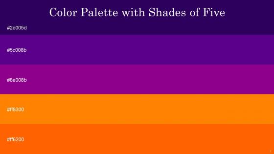
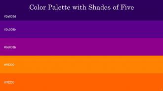
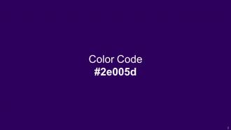
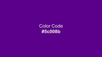
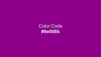
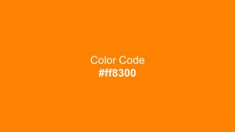
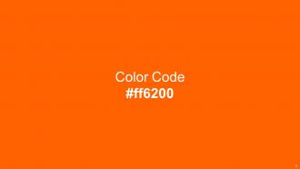
Heres a visually-pleasing color palette with Five Color Shades With Hex Code 2e005d, 5c008b, 8e008b, ff8300, ff6200. These colors are intuitively picked to ignite the spark of brilliance in your designs and creativity.
People who downloaded this PowerPoint presentation also viewed the following :
Color Palette With Five Shade Cherry Pie Purple Flirt Flush Orange Blaze Orange with all 14 slides:
Use our Color Palette With Five Shade Cherry Pie Purple Flirt Flush Orange Blaze Orange to effectively help you save your valuable time. They are readymade to fit into any presentation structure.


FAQs for Color Palette With Five Shade Cherry Pie Purple Flirt Flush
Honestly, just pick 3-4 colors max and call it good. I'd go with one main color for your big points, then maybe an accent color for stuff you want to pop. Gray or white work great for backgrounds - nothing fancy needed there. You know those presentations that look like someone threw up a rainbow? Yeah, don't be that person. Your audience will thank you. Make sure there's decent contrast so people can actually read what you wrote. Oh, and if you can, check how it looks on a projector or different laptop - sometimes colors get weird. The whole point is supporting your message, not making people squint.
So basically, pick like 2-3 colors and just stick with them throughout your whole presentation. Your audience will thank you for it. Blue for main points, red for warnings - whatever works, but be consistent so people catch on to the pattern. Also please don't do that thing where the text is impossible to read because there's no contrast (seriously, yellow on white is the worst). Colors set the vibe too, which is pretty cool when you think about it. Oh and it helps with branding if that matters for your situation. Keep it simple though - more colors just make things messy.
Dude, color psychology is no joke for presentations. Your brain literally reacts differently to different colors - red makes people feel urgent or excited, blue makes them trust you more. Pretty crazy stuff. So if you're pitching financial services, stick with blues and grays because they scream "reliable." Creative pitch though? Go warmer - oranges, yellows, that kind of thing gets people hyped. I used to just pick whatever looked nice but honestly, being strategic about it makes such a difference. Don't just go for pretty - think about what emotion you actually want.
Dude, you gotta make sure there's solid contrast between your text and background - like dark text on white or whatever. People sitting in back can't see gray-on-gray nonsense, and honestly neither can anyone else. It helps your important stuff actually stand out too. Your key points and buttons will pop way more when they contrast with everything around them. Oh, and here's a trick I learned - take a pic of your slide from across the room. Can't read it? Then your contrast sucks and you need to fix it before presenting.
Oh totally! So for corporate stuff, you'll want to stick with safe colors - navy, gray, white, maybe throw in some blue or green as an accent. But creative presentations? That's where you can actually have fun with it. I made the mistake once of using hot pink in a budget meeting... yeah, that didn't go over well lol. With corporate decks, boring colors = trustworthy vibes. Creative work lets you go crazy, just don't make it so wild that people can't read anything. Pro tip: try your color scheme on a few test slides first before you do the whole thing.
Honestly, you really need to think about cultural meanings before picking colors. Like, red screams "danger!" to most Americans but it's lucky in Chinese culture. And white? We think pure and clean, but in some Asian countries it means mourning - yikes for a product launch! Your audience will have gut reactions to colors before they even read your content. I'd definitely research who you're targeting first. Maybe run your color choices by a few people from those backgrounds if you can swing it. Colors hit way deeper than most people realize.
Oh definitely check out Adobe Color and Coolors.io - they're like the go-to ones everyone uses. You can either build palettes from scratch or just upload any image and it'll pull the colors for you. Paletton's pretty great too, super easy to figure out. I always end up getting way too into these tools when I'm supposed to be actually working lol. Pinterest has tons of color inspo if you want to browse around first. Just stick to 3-4 colors max though - trust me on that one, more gets messy fast.
Okay so accessibility is mostly about making sure people can actually see your stuff. Use a contrast checker online - they'll tell you if your text stands out enough from the background. Don't just rely on color alone for important info either. Like, some people can't tell red from green at all (honestly blew my mind when I first learned that). So instead of making error text just red, maybe add an icon or arrow too. Oh and test everything with one of those WCAG checkers before you present. Takes like two seconds but saves you from accidentally making slides nobody can read.
Ugh, don't go crazy with colors - like 3 or 4 max. I've sat through so many presentations where you literally can't read anything from the back. Your contrast is everything! Also make sure the colors actually fit what you're talking about. Oh and test it beforehand because projectors are weird and wash out certain shades. Random tip: squint at your slides. Can't read it easily? Fix the contrast. Trust me on this one - clashing colors will make people focus on how bad it looks instead of what you're saying.
Okay so definitely stick with your brand colors throughout the whole thing. Use your main colors for headings and important stuff, then your secondary ones for everything else. Don't get tempted by random colors just because they look cool - trust me on this one. People should know it's your company presenting even if they can't see the logo yet. Make yourself a little cheat sheet with the hex codes before you start so you're not eyeballing it. Oh and keep it to like 3-4 colors tops or it'll look messy.
Oh totally! Monochromatic is actually my go-to for presentations. You pick one color family and just use different shades of it - like light blue, regular blue, navy, whatever. It looks super clean and professional without being boring. Plus it's honestly hard to screw up since everything automatically goes together. The only thing you gotta watch is making sure your text has enough contrast against backgrounds so people can actually read it. Way better than those presentations where someone used every color in existence - you know the ones I'm talking about!
Color trends flip every 2-3 years, basically following whatever's happening in culture and design. We're in this earthy phase right now - sage green, terracotta, those "wellness" colors that make you feel calm just looking at them. Crazy how different it is from all those bright blues and oranges everywhere just a couple years ago. Instagram honestly drives half of this stuff now. Bold vs. minimalist palettes keep cycling back and forth too. I'd say update your colors once a year so you don't look dated, but don't chase every single trend or you'll go insane. Pick what actually works for your content.
Honestly, just throw your colors into some quick mockups and show them to real people - their feedback beats overthinking it every time. Test the contrast ratios with WebAIM or similar tools, especially for text (learned this the hard way once). Try viewing your palette on different screens and in various lighting. Print it out too if that's relevant. Oh, and don't get too attached early on because you'll probably need to tweak things. The whole point is catching issues before you're stuck with something that doesn't actually work in the real world.
Skip pure black - navy or charcoal gray looks way more sophisticated anyway. I'd go with muted colors that don't scream at you. Sage green, dusty blue, those warm terracotta shades? Perfect. The 60-30-10 thing actually works: most of your space stays neutral, then you add a secondary color, plus just a tiny pop of something bolder. Oh, and definitely test colors in different lighting first! I made that mistake once and my "calming blue" turned straight purple under my kitchen lights. Get some swatches or make a little mood board so you can see everything together before you commit.
Honestly, your color choices set the mood before you even open your mouth. Warm colors like red and orange pump up energy, while blues and greens feel way more trustworthy and chill. I once used this awful neon green for a budget meeting – looked so unprofessional lol. Dark colors scream sophisticated, bright ones say "we're fun and creative!" Pick 2-3 colors that match the vibe you're going for first. Then build everything else around those. It's kinda like picking an outfit – gotta match the occasion, you know?
-
Great combination of visuals and information. Glad I purchased your subscription.
-
Great combination of visuals and information. Glad I purchased your subscription.