


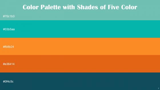
Color Palette With Five Shade Tradewind Persian Green Tree Poppy Tango Eden




Try Before you Buy Download Free Sample Product
 Impress Your
 Audience
 100%
100% Editable
 Save Hours
 of Time


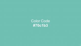
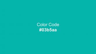
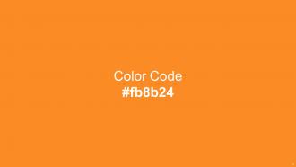
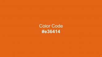
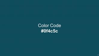
Heres a visually-pleasing color palette with Five Color Shades With Hex Code 70c1b3, 03b5aa, fb8b24, e36414, 0f4c5c. These colors are intuitively picked to ignite the spark of brilliance in your designs and creativity.
People who downloaded this PowerPoint presentation also viewed the following :
Color Palette With Five Shade Tradewind Persian Green Tree Poppy Tango Eden with all 14 slides:
Use our Color Palette With Five Shade Tradewind Persian Green Tree Poppy Tango Eden to effectively help you save your valuable time. They are readymade to fit into any presentation structure.







FAQs for Color Palette With Five Shade Tradewind Persian Green Tree
Effective color palette principles include establishing visual hierarchy, ensuring sufficient contrast for readability, maintaining brand consistency, limiting colors to 3-5 shades, and considering audience preferences. These strategies enhance presentation clarity by improving text legibility, guiding viewer attention, and creating professional cohesion, with many organizations finding that strategic color choices significantly boost audience engagement and message retention.
Color psychology enhances audience engagement by triggering emotional responses, improving information retention, and guiding visual attention through strategic hue selection. Through warm colors like red and orange for energy, cool blues for trust, and green for growth messaging, presenters create subconscious connections with their content, ultimately delivering more memorable and persuasive presentations.
Adobe Color, Coolors, Paletton, Canva Color Palette Generator, and brand style guides are essential tools for color palette selection. These resources streamline color harmony by offering complementary schemes, accessibility testing, and brand consistency checks, with many design teams finding that systematic palette tools ultimately enhance visual coherence and accelerate creative workflows.
Color palette choice significantly impacts presentation readability through contrast ratios, visual hierarchy, and cognitive processing, with high contrast combinations like dark text on light backgrounds reducing eye strain and improving comprehension. Strategic color selection enhances audience focus by guiding attention to key information, while poor palette choices can create accessibility barriers, with many organizations finding that consistent, well-contrasted color schemes ultimately deliver clearer communication and stronger audience engagement.
Contrast ensures visual accessibility by creating clear distinctions between text and backgrounds, enhancing readability for users with visual impairments, and meeting WCAG compliance standards. Through strategic color combinations, organizations streamline communication across diverse audiences, with many finding that high-contrast designs deliver improved comprehension rates, reduced eye strain, and ultimately broader audience engagement in professional presentations.
Cultural differences significantly influence color preferences through varying symbolic meanings, religious associations, and historical contexts that shape audience interpretation of visual messages. For example, while red symbolizes prosperity in Chinese culture, it can represent danger in Western contexts, and white signifies purity in some cultures but mourning in others, making cultural awareness essential for effective global business communications and audience engagement.
Best practices for combining complementary and analogous colors include using complementary pairs sparingly for emphasis, establishing analogous schemes as your foundation, maintaining consistent saturation levels, applying the 60-30-10 rule for balance, and ensuring sufficient contrast for readability. These approaches enhance visual hierarchy by creating focal points through strategic complementary accents, while analogous harmonies provide cohesive flow, ultimately delivering presentations that are both visually engaging and professionally polished.
Maintaining brand consistency through color palette requires using your established brand colors as primary elements, incorporating complementary secondary colors that align with brand personality, and applying consistent color ratios across all slides. This strategic approach ensures presentations reinforce brand recognition while enhancing visual cohesion, with many organizations finding that consistent color application strengthens audience trust and professional credibility.
Common mistakes include using too many colors, selecting low-contrast combinations that reduce readability, ignoring brand guidelines, choosing culturally inappropriate colors, and applying overly bright or distracting hues. These pitfalls can undermine professional credibility and audience engagement, with many organizations finding that strategic color restraint and accessibility considerations ultimately deliver clearer communication and stronger visual impact.
Color palette choices significantly influence audience emotions and message perception by triggering psychological responses, establishing brand consistency, and guiding attention flow throughout presentations. Strategic color combinations enhance professional credibility while supporting content comprehension, with many organizations finding that cohesive palettes strengthen audience engagement, reinforce key messaging, and ultimately deliver more memorable and persuasive presentation experiences.
Using a minimalist color palette in corporate presentations enhances visual clarity, strengthens brand consistency, reduces cognitive load, and projects sophisticated professionalism. These streamlined approaches enable presenters to highlight key messages more effectively, improve audience retention, and create memorable visual experiences, with many organizations finding that simplified color schemes ultimately deliver stronger stakeholder engagement and clearer communication outcomes.
Gradients and shades enhance presentation design by creating visual depth, establishing hierarchy, and adding sophisticated polish to slides, while poor implementation can distract audiences and compromise readability. When strategically applied, these elements guide viewer attention, reinforce branding consistency, and deliver professional aesthetics, though excessive use ultimately overwhelms content and reduces message clarity across business presentations.
Recent notable presentations have effectively used monochromatic blues for trust and professionalism, bold orange-navy combinations for energy and credibility, earth-tone palettes for sustainability messaging, minimalist black-white-accent schemes for tech launches, and warm purple-gold combinations for premium positioning. These strategic color choices enhance audience engagement by reinforcing brand identity, improving information hierarchy, and creating emotional connections, with many Fortune 500 companies finding that cohesive palettes increase presentation memorability and stakeholder buy-in.
Audience demographics significantly influence color palette choices through cultural associations, age preferences, industry expectations, and accessibility needs. Presentations for financial services often favor conservative blues and grays, while healthcare audiences respond well to calming greens and whites, with younger demographics embracing bolder colors and older audiences preferring traditional, high-contrast schemes that enhance readability.
Creating adaptable color palettes involves using high-contrast combinations, testing colors across multiple devices and lighting conditions, and selecting hues that maintain vibrancy in both digital displays and printed materials. Strategic approaches include incorporating neutral anchors, ensuring sufficient luminance differences between elements, and choosing colors that perform consistently across projection systems and screens, with many organizations finding that simplified palettes with bold contrasts deliver superior audience engagement regardless of presentation format.
-
Colors used are bright and distinctive.
-
“I always have a wonderful experience with SlideTeam. It's my ""go to"" when I need a template.”