

Color Palette With Five Shade Cornflower Eastern Blue Green Vogue Selective Yellow Flush Orange





Try Before you Buy Download Free Sample Product
 Impress Your
Audience
 100%
Editable
 Save Hours
of Time


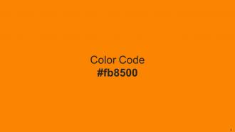
Heres a visually-pleasing color palette with Five Color Shades With Hex Code 8ecae6, 219ebc, 023047, ffb703, fb8500. These colors are intuitively picked to ignite the spark of brilliance in your designs and creativity.
People who downloaded this PowerPoint presentation also viewed the following :
Color Palette With Five Shade Cornflower Eastern Blue Green Vogue Selective Yellow Flush Orange with all 14 slides:
Use our Color Palette With Five Shade Cornflower Eastern Blue Green Vogue Selective Yellow Flush Orange to effectively help you save your valuable time. They are readymade to fit into any presentation structure.









FAQs for Color Palette With Five Shade Cornflower Eastern Blue Green Vogue Selective
Oh totally, colors mess with people's heads in presentations! Red screams "pay attention" but gets aggressive fast. Blue's the safe bet - builds trust, looks professional (literally every tech bro uses it lol). Green feels calm and growth-y, orange is energetic without being annoying. Yellow's weird though - super optimistic but hurts your eyes on screens. Purple says "creative" or "fancy." Black and gray look sophisticated but kinda cold. Just match it to your vibe, you know? Quarterly results? Go with blues and greens, not scary reds that make people think the company's dying.
Honestly, consistent colors are a game-changer for recognition. Your brain basically goes "oh hey, I know this brand" without thinking about it. Pick 3-5 colors and stick with them everywhere - slides, graphics, even your boring email signature. It makes everything look way more professional (trust me on this one). People feel more comfortable when things look familiar, and comfortable people actually stick around longer. I learned this the hard way after using random colors for months. Consistency just works better.
Honestly, just pick 3-5 colors tops. One main color for your content, another for highlights, maybe a third for backgrounds. I made some absolutely horrific rainbow messes when I started out - learned that lesson fast! Contrast is huge too. People need to actually read your text, right? Oh and definitely test everything on the real projector first. Colors look completely different on those things compared to your laptop screen. Trust me on that one.
Oh man, color choices can totally tank your presentation if you're not careful. Like, red screams good luck in China but looks super aggressive to Western audiences. White's pure and clean here but actually means mourning in parts of Asia - who knew, right? Do some quick research on your audience first. Mixed crowd? Blue's usually safe since it feels trustworthy everywhere. Green works too for that growth vibe. Honestly though, if you know someone from that culture, just ask them to peek at your slides. Way easier than guessing wrong.
Adobe Color and Coolors.io are both amazing for this. Coolors is weirdly addictive - I'll just sit there hitting spacebar for way too long generating random palettes lol. You can also upload images to pull colors from them, which is super helpful. Paletton's great if you want to actually understand color theory stuff. For inspiration, Color Hunt has some gorgeous combos people have made. Oh, and if you're doing anything public-facing, run it through a contrast checker so it's actually readable. Just pick one color you're obsessed with and build from there.
Honestly, contrast is everything for readability. Dark text on light backgrounds (or flip it) makes your words actually pop instead of disappearing. I made this mistake once with yellow text on white - nobody could read a damn thing and I felt like an idiot. Your audience shouldn't be squinting to figure out what you wrote. The brightness difference between text and background needs to be obvious. Quick test: step back from your screen. Can you still read it easily? If not, pump up that contrast. Also, definitely check how it looks on different monitors before you present.
Colors hit people emotionally before they even read your stuff. Red and orange feel urgent and energetic - blues make you seem trustworthy and calm. That's literally why every tech company goes blue, lol. Cool colors scream "professional" but warm ones make you more approachable. Here's the thing though - your colors are already doing this work whether you think about it or not. So be intentional! Pick based on how you want people to feel, not just what looks nice. It's kinda wild how much this actually matters.
Here's what works best - use your brand colors for headers and highlights, not the whole slide. Keep backgrounds neutral (white or light gray) so people can actually read your text. I made this mistake once and my presentation looked absolutely insane, like someone threw up a box of crayons. Stick with 2-3 brand colors max. The 60-30-10 rule is clutch: mostly neutral, then your main brand color, then one accent. Just make sure there's good contrast between text and background. Oh, and create a custom color palette in PowerPoint so you don't have to remember those annoying hex codes every time.
Ugh, don't go crazy with colors - maybe 3 or 4 tops. Yellow text on white backgrounds? Pure evil. I've sat through too many presentations where I couldn't read a damn thing. Red and green together will screw over colorblind people, so skip that combo. Your brand colors might look great on business cards but terrible projected on a wall - don't feel married to them for presentations. Oh, and definitely test everything beforehand on different screens. Trust me on this one.
Okay so here's the thing - about 8% of guys are colorblind, which is way more than I realized until recently! Don't just use red/green for good/bad data without adding other clues. Patterns, shapes, text labels - whatever works. Your contrast needs to be strong enough that people can actually read your text against the background. I always do this weird squint test on my slides (sounds dumb but it works). Or try converting everything to grayscale. If you can still tell what's what, you're golden. Otherwise people will be completely lost.
Honestly, monochromatic schemes are like a cheat code for good design. Pick one color you're obsessed with, then just use different shades and tints of it. Boom – instant sophistication without the headache of matching colors. It's weirdly freeing because you stop overthinking color combos and actually focus on the fun stuff like typography and spacing. Plus you literally can't screw it up, which is why I always recommend it to people starting out. Grab your base color and maybe 3-4 variations from light to dark. Trust me, it'll look way more elegant than you'd expect.
Gradients are like magic for making designs pop instead of looking totally flat. They add this depth that naturally pulls your eye where you want it to go. I've been using them on everything lately - backgrounds, buttons, even text sometimes. Start with colors that sit next to each other on the color wheel for smooth transitions. Want more punch? Try opposites, but honestly that can get messy fast. The direction matters too - vertical, diagonal, whatever fits your vibe. Just don't go crazy with it or you'll end up with something that screams 2005 MySpace profile.
Right now everyone's going crazy for earthy stuff - sage green, terracotta, those warm browns. Jewel tones are huge too, like emerald and sapphire. Oh, and that dusty blue thing? It's literally everywhere in presentations lately. Monochromatic schemes are surprisingly popular - just using different shades of one color. People are finally ditching those boring corporate blue-gray combos for warmer colors that actually feel human. Honestly, less is more though. Stick to 2-3 colors max throughout your whole deck. Your audience won't get visually overwhelmed and you'll look way more professional.
Corporate stuff? Stick with navy, gray, muted blues - boring but they work for serious business vibes. Creative presentations are where you can actually have fun with bold colors that pop. Tech startups can get away with way more than, say, a law firm would ever dream of. Your audience matters huge here. I honestly think most corporate palettes put me to sleep, but trust and stability apparently require beige, right? Ask yourself what emotion you're going for first, then pick colors your audience won't hate.
Don't just use red and green together - that's the most common type of colorblindness. My old boss literally couldn't tell the difference between my "good" and "bad" data points, which was... awkward. Pair colors with shapes or labels as backup. High contrast works way better than subtle shades - like dark blue with yellow instead of red with light green. There are tools like Colorbrewing that'll test your palette beforehand, which honestly saves you from those embarrassing moments. Short version: never rely on color alone to get your point across.
-
SlideTeam’s readymade presentations have landed my unique images with my bosses in the past and it continues to reward me.
-
Time saving slide with creative ideas. Help a lot in quick presentations..