


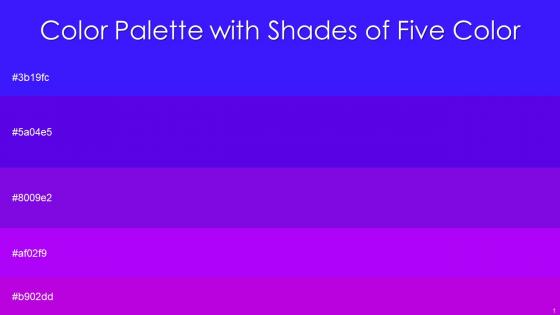
Color Palette With Five Shade Blue Violet Electric Violet Electric Violet Electric Violet




Try Before you Buy Download Free Sample Product
 Impress Your
 Audience
 100%
100% Editable
 Save Hours
 of Time


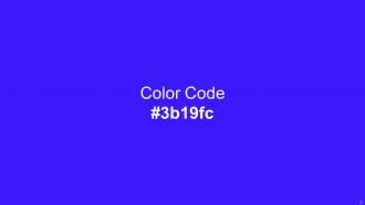
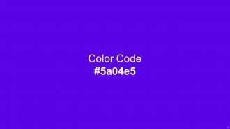
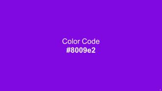
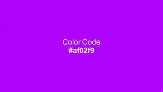
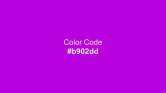
Heres a visually-pleasing color palette with Five Color Shades With Hex Code 3b19fc, 5a04e5, 8009e2, af02f9, b902dd. These colors are intuitively picked to ignite the spark of brilliance in your designs and creativity.
People who downloaded this PowerPoint presentation also viewed the following :
Color Palette With Five Shade Blue Violet Electric Violet Electric Violet Electric Violet with all 14 slides:
Use our Color Palette With Five Shade Blue Violet Electric Violet Electric Violet Electric Violet to effectively help you save your valuable time. They are readymade to fit into any presentation structure.






FAQs for Color Palette With Five Shade Blue Violet Electric Violet Electric
Oh man, color choices can totally make or break your presentation! Blue's the safe bet - builds trust, keeps people calm. That's literally why every tech company on earth uses it. Red grabs attention like crazy but don't go overboard or you'll seem aggressive. Green says "growth" and feels balanced. Yellow's energizing but honestly? It hurts my eyes after a while. Purple screams luxury or creativity, orange feels friendly (maybe too casual though). Black and gray look sophisticated but kinda cold. Just pick 2-3 colors that actually match your vibe and what your audience expects.
Honestly, a good color palette just makes everything look way more professional. Like, you know when something looks "off" but can't pinpoint why? It's usually the colors clashing. I'd stick to maybe 3-5 colors tops – pick one main one, throw in a couple accent colors, and add some neutrals so it doesn't get too crazy. Your eyes will thank you later! It really does guide people through your content better too. Nobody wants their template looking like a kid went wild with crayons, right? The whole thing just feels more intentional when the colors actually work together.
Okay so definitely start with your company's brand colors - that part's obvious, you can't really mess with those. I'd add maybe 2-3 colors that actually complement them and make sure everything's readable. Keep it under 5 colors max though, because I've seen presentations with like 8 different colors and they just look insane. Oh and test it on both light and dark backgrounds! You never know what projector situation you'll walk into. Stay consistent throughout - don't randomly switch up your palette halfway through because you got bored. Save it as a template so you don't have to rebuild the whole thing next time.
Okay so this is actually huge for design work. White means purity here but in parts of Asia it's literally for funerals - imagine that disaster on a wedding site! China loves red for luck while we see it as warning signs or urgency. Blue's tricky too. Americans trust it but warmer cultures think it feels distant and cold, which honestly makes sense when I think about it. You really gotta dig into what colors mean in your target area first. Maybe run some focus groups locally before you commit to anything major.
Adobe Color is probably your best bet - extracts colors from photos and generates palettes automatically. Coolors.co is ridiculously addictive though, I always end up spending way too long playing with it. If you're doing anything public-facing, Colorbrewer has accessibility built in which is clutch. Material Design and Tailwind have solid presets too if you don't want to think about it. Oh, and Paletton's good for traditional color wheel stuff. Stick to 3-5 colors max or it'll look messy. Test everything in context first - colors look totally different on actual backgrounds vs. those clean tool interfaces.
You want your text to actually be readable, right? Use contrasting colors - dark text on light backgrounds or the other way around. Those red-on-green disasters will give everyone a headache. I made that mistake once and people literally couldn't look at my presentation. High contrast helps folks with visual issues too. Just make sure there's enough difference so the colors don't blur together. Here's what I do: step back from your screen and see if you can still read it easily. If yes, you're good to go.
Okay so basically, color harmony is just keeping your presentation colors consistent - like how you instantly recognize Netflix's red or Apple's clean white/gray thing. Pick 2-3 main colors that match your brand's vibe (bold vs. professional, whatever) and stick with them in every deck you make. Your primary brand color comes first, then find accent colors that actually work together. I mean, clashing colors are honestly distracting and make you look amateur. When people see your presentations, they should immediately think "oh that's definitely from [your company]" just from the color scheme alone. It builds trust and makes everything look way more polished.
Honestly, color trends change every couple years - it's wild how fast they shift. We went from those hideous neon gradients (ugh, 2019 was rough) to all these earthy sage greens now. Corporate stuff always lags behind by like 6 months though, so you can kinda predict what's next by watching social media and web design. I'd refresh your template colors once a year. Maybe keep 2-3 versions with different palettes so you don't look outdated? The cycles are pretty predictable - bold colors, then minimalist, then back again.
Start with contrast ratios - you'll want at least 4.5:1 between text and background to hit WCAG standards. Here's the thing though: around 8% of guys are colorblind, so never use color alone for important stuff. I made this mistake with red/green status indicators once and our colorblind users were basically screwed! Patterns or icons work way better alongside colors. Oh, and WebAIM's contrast checker is honestly a lifesaver - bookmark that thing. Also grab a colorblind simulator to test your palette. Trust me on this one.
Bright colors grab attention instantly, so save those for your main points or calls-to-action. For background stuff that's not super important? Go with muted tones. I made slides once that looked like Skittles exploded everywhere—total disaster. Keep backgrounds neutral so your key content actually pops. Honestly, less is more here. Stick to maybe 2-3 colors max. Here's a weird trick: squint at your slides when you're done. Whatever catches your eye first is exactly what your audience will zero in on too.
Honestly, the biggest mistake is going color-crazy - like seriously, stick to 2-3 colors max or your slides will look insane. Yellow text on white backgrounds? Nobody wants to squint through that mess. Don't just pick colors because they're your favorites either. Red and green combo screws over colorblind people, and neon colors are brutal in those dark conference rooms. Oh, and test your colors on different screens first - I learned that one the hard way. Always have a backup plan for black and white printing too.
Oh totally! People definitely pick up on seasonal vibes even in presentations. Fall = warm oranges, reds, golden yellows. Spring's all about fresh greens and pastels. Winter? Go with cool blues, silvers, whites. Summer's your excuse to use bright, fun colors. It's basically like dressing your slides for the weather lol. The timing matters though - if they're seeing it in December, don't hit them with hot pink and lime green. Makes your stuff feel way more current and put-together. Honestly took me forever to figure this out!
Yeah totally! Monochromatic stuff looks really clean when you nail it. Basically you're using one color but mixing up the shades and tints to keep things interesting. The key is making sure you've got enough contrast - otherwise everything just mushes together and looks flat. I always start with the lights and darks first, then mess around with how saturated different parts are. It's perfect for minimal designs, plus it makes your text or photos really pop since they're not competing with crazy colors. Honestly though, pick a color you actually like because you'll be staring at it a lot.
Honestly, you can't go wrong with navy blue or charcoal gray - they just scream "I know what I'm talking about." Deep blues are perfect because they're confident but not aggressive. Whatever you do, don't use pure black backgrounds though. Trust me on this one - they look awful under those harsh projector lights. White or light gray text pops really well against darker colors. Maybe throw in one accent color like muted gold or forest green if you want some visual interest. Keep it to 3-4 colors total, and definitely test everything on the actual screen beforehand.
Oh totally! Kids stuff needs those super bright, in-your-face colors that make them go "ooh shiny." But corporate people? They want those boring sophisticated colors that say "we're serious about business" lol. Healthcare always goes with blues and greens - probably because it feels calm and trustworthy. Financial companies love deep blues too (stability and all that), while creative agencies can get away with wild color combos. I'd honestly just look at what other successful stuff in your field is doing color-wise first.
-
The designs are super attractive. Me and my team love using SlideTeam’s presentations.
-
“Superb. What a great finding. Thankful for SlideTeam. We were paying people to make slides which went all in vain. We are so happy to have found you.”