


Color Palette With Five Shade Anakiwa Chetwode Blue Purple Heart Persian Indigo Violet




Try Before you Buy Download Free Sample Product
 Impress Your
 Audience
 100%
100% Editable
 Save Hours
 of Time


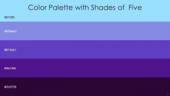
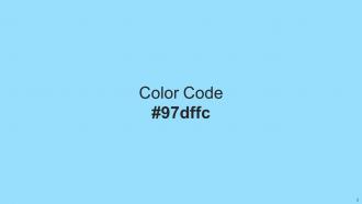
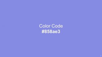
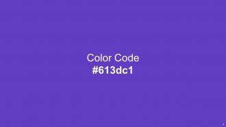
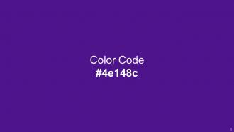
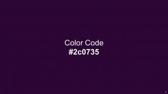
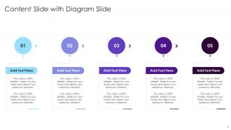
Heres a visually-pleasing color palette with Five Color Shades With Hex Code 97dffc, 858ae3, 613dc1, 4e148c, 2c0735. These colors are intuitively picked to ignite the spark of brilliance in your designs and creativity.
People who downloaded this PowerPoint presentation also viewed the following :
Color Palette With Five Shade Anakiwa Chetwode Blue Purple Heart Persian Indigo Violet with all 14 slides:
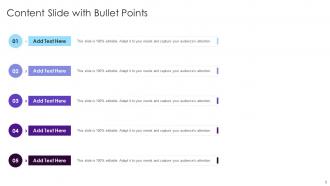
Use our Color Palette With Five Shade Anakiwa Chetwode Blue Purple Heart Persian Indigo Violet to effectively help you save your valuable time. They are readymade to fit into any presentation structure.






FAQs for Color Palette With Five Shade Anakiwa Chetwode Blue Purple Heart
Color theory enhances presentation design by establishing visual hierarchy, evoking emotional responses, ensuring readability, and maintaining brand consistency across slides. Through strategic color combinations, designers create templates that guide audience attention, convey appropriate messaging tone, and deliver professional credibility, with many organizations finding that well-planned color schemes significantly improve audience engagement and information retention.
Different color palettes significantly influence audience perception by evoking specific emotions, enhancing comprehension, and directing attention to key messages through strategic contrast and harmony. Professional presentations using cohesive color schemes, such as blue tones for trust in financial services or green palettes for sustainability in environmental sectors, ultimately deliver stronger engagement and message retention, with many organizations finding that thoughtful color choices streamline communication effectiveness.
Best practices for choosing a corporate presentation color palette include aligning with brand guidelines, ensuring accessibility through high contrast ratios, limiting to 3-5 complementary colors, and considering cultural associations. These approaches streamline visual consistency, enhance readability across different viewing conditions, and reinforce professional credibility, with many organizations finding that strategic color choices significantly improve audience engagement and message retention.
Contrasting colors enhance readability by creating visual hierarchy, separating key information from supporting details, and reducing eye strain during extended viewing sessions. Through strategic color combinations, presenters achieve clearer text visibility, improved audience focus on critical data points, and enhanced comprehension rates, with many organizations finding that high-contrast slides deliver more effective communication and stronger audience engagement.
Warm colors like red, orange, and yellow stimulate energy, urgency, and emotional engagement, making them effective for motivational presentations, sales pitches, and calls-to-action. Cool colors such as blue, green, and purple promote trust, professionalism, and calm focus, with many organizations finding that these hues enhance credibility in financial reports, healthcare presentations, and strategic planning sessions.
A color palette reflects brand identity by incorporating the company's signature colors, emotional associations, and visual hierarchy throughout presentation elements like backgrounds, headers, and accent details. Through strategic color choices, organizations can reinforce brand recognition, convey their core values and personality, and create consistent visual experiences across all communications, ultimately strengthening brand recall and professional credibility.
**INPUT**: What tools or resources are available for selecting harmonious color palettes? **OUTPUT**: Color palette selection tools include Adobe Color, Coolors, Paletton, ColorHunt, and brand-specific generators that streamline design workflows through automated harmony algorithms. These platforms enhance creative processes by offering real-time previews, accessibility compliance checks, and export capabilities, with many design teams finding that strategic palette tools ultimately deliver consistent brand experiences and accelerated project timelines. [Word count: 58 words]
Cultural differences significantly influence color interpretation through varying symbolic meanings, religious associations, and historical contexts across different societies. For instance, while white represents purity in Western cultures, it symbolizes mourning in many Asian cultures, and red signifies prosperity in China but danger in Western contexts, making cultural awareness essential for global presentations and international business communications.
Color plays a crucial role in organizing presentation information by creating visual hierarchy, grouping related content, guiding audience attention, and establishing clear navigation patterns. Through strategic color coding, presenters can differentiate between data categories, highlight key insights, and streamline complex information flows, ultimately delivering more intuitive slide experiences and enhanced audience comprehension.
Creating a minimalist color palette involves selecting 2-3 harmonious colors with strategic use of neutrals, focusing on high contrast ratios, and incorporating varying tones and saturations within your chosen hues. This approach streamlines visual communication while maintaining engagement, with many design teams finding that strategic color limitation enhances brand recognition, reduces decision fatigue, and ultimately delivers cleaner, more impactful presentations across industries.
Common mistakes include using too many colors, selecting colors with poor contrast, ignoring brand guidelines, choosing colors that clash or compete for attention, and failing to consider colorblind accessibility. These pitfalls often result from not testing combinations beforehand, with many presenters finding that limiting palettes to three primary colors, ensuring sufficient contrast ratios, and maintaining consistency throughout slides ultimately delivers clearer messaging and enhanced audience engagement.
Gradients and shades can enhance presentations by creating visual depth, smooth transitions between sections, and sophisticated emphasis on key elements. However, overuse disrupts cohesion by creating visual noise, competing focal points, and reduced readability, with many designers finding that strategic, limited gradient application maintains professional aesthetics while excessive use undermines message clarity.
Color accessibility in presentation templates can be addressed through high contrast ratios, colorblind-friendly palettes, alternative text indicators, consistent color coding, and avoiding color-only information conveyance. These approaches enhance inclusivity by incorporating universal design principles, testing with accessibility tools, and providing multiple visual cues, ultimately delivering broader audience engagement and professional compliance standards.
Color trends evolve through cultural shifts, technological advances, seasonal influences, and industry innovations, with social media and digital platforms accelerating their adoption across design communities. These evolving palettes significantly influence presentation designs by establishing visual credibility and audience connection, with corporate presentations increasingly adopting contemporary color schemes to enhance brand perception, improve audience engagement, and maintain competitive relevance in professional communications.
Maintaining color palette consistency across slides requires establishing a master template with defined primary, secondary, and accent colors, using style guides that specify exact hex codes, and leveraging design software's color picker tools. These strategies streamline presentation creation by ensuring brand alignment, enhancing visual cohesion, and reducing design time, with many organizations finding that standardized palettes ultimately deliver more professional presentations and stronger brand recognition.
-
Excellent work done on template design and graphics.
-
SlideTeam is my go-to resource for professional PPT templates. They have an exhaustive library, giving you the option to download the best slide!