


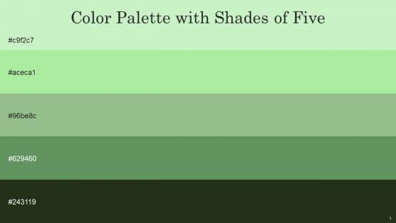
Color Palette With Five Shade Tea Green Madang Norway Highland Black Olive




Try Before you Buy Download Free Sample Product
 Impress Your
 Audience
 100%
100% Editable
 Save Hours
 of Time


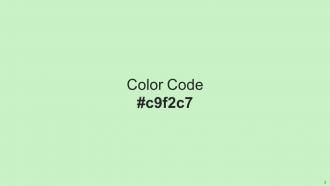
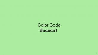
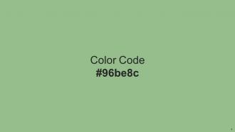
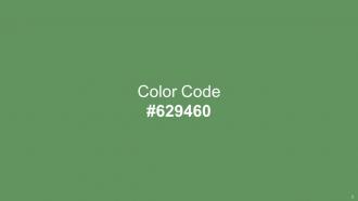
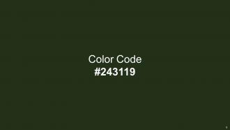
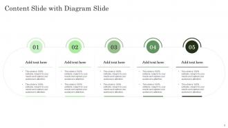
Heres a visually-pleasing color palette with Five Color Shades With Hex Code c9f2c7, aceca1, 96be8c, 629460, 243119. These colors are intuitively picked to ignite the spark of brilliance in your designs and creativity.
People who downloaded this PowerPoint presentation also viewed the following :
Color Palette With Five Shade Tea Green Madang Norway Highland Black Olive with all 14 slides:
Use our Color Palette With Five Shade Tea Green Madang Norway Highland Black Olive to effectively help you save your valuable time. They are readymade to fit into any presentation structure.






FAQs for Color Palette With Five Shade Tea Green Madang Norway
Colors significantly influence audience perception, with blue conveying trust and professionalism, red creating urgency and energy, green suggesting growth and stability, while yellow enhances optimism and creativity. These psychological responses enable presenters to strategically reinforce their messaging, with many organizations finding that aligned color choices enhance audience engagement, improve information retention, and ultimately deliver more persuasive presentations across industries.
Strategic color palettes enhance information retention by creating visual hierarchies, reducing cognitive load, and establishing emotional connections that aid memory formation. Through consistent color coding, contrasting elements, and psychologically appropriate hues, organizations can increase comprehension rates by up to 73%, with educational institutions and corporate training programs finding that thoughtful color choices significantly improve audience engagement and recall.
Best practices for selecting corporate presentation color palettes include aligning with brand guidelines, ensuring accessibility through sufficient contrast, limiting to 3-5 primary colors, considering audience demographics, and testing visibility across different devices. These strategic choices enhance professional credibility, improve information retention, and strengthen brand recognition, with many organizations finding that consistent, thoughtfully selected palettes ultimately deliver more impactful presentations and stronger audience engagement.
Contrasting colors enhance visual hierarchy by directing attention to key elements, creating clear information levels, and improving content readability through strategic color placement. Through high-contrast combinations, presenters can emphasize critical data points, separate different content sections, and guide audience focus seamlessly, with many corporate presentations finding that bold color contrasts increase message retention and engagement significantly.
Tools for creating cohesive presentation color palettes include Adobe Color, Coolors.co, Paletton, Canva's color palette generator, and PowerPoint's built-in design ideas feature. These platforms streamline color selection by generating harmonious combinations, extracting palettes from images, and ensuring accessibility compliance, with many designers finding that consistent color schemes enhance brand recognition and audience engagement across corporate presentations.
Cultural differences significantly influence color interpretation through varying symbolic meanings, religious associations, and historical contexts across regions. Red symbolizes prosperity in China but danger in Western cultures, while white represents purity in America but mourning in some Asian countries, making cultural sensitivity essential for global presentations to avoid miscommunication and enhance audience engagement.
Color establishes emotional connections, reinforces brand identity, communicates values, and creates memorable visual associations that differentiate companies from competitors. Strategic color implementation in presentation templates ensures consistent brand recognition across all communications, with financial services often using blues for trust, healthcare organizations leveraging greens for wellness, and technology companies choosing bold colors, ultimately delivering cohesive brand experiences.
Color palettes evoke emotions through strategic combinations of warm colors like red and orange for energy, cool blues and greens for trust and calm, and neutral tones for professionalism and sophistication. These psychological associations enable presenters to reinforce their message's intent, with many business professionals finding that consistent color choices enhance audience engagement and strengthen brand credibility.
Common pitfalls include using too many colors, insufficient contrast between text and backgrounds, ignoring brand guidelines, choosing colors that clash or distract from content, and neglecting accessibility considerations. These mistakes can overwhelm audiences, reduce readability, and undermine professional credibility, with many presenters finding that strategic color restraint and accessibility-focused choices ultimately enhance message clarity and audience engagement.
A limited color palette significantly enhances presentation clarity by reducing visual distractions, establishing consistent hierarchy, and directing audience focus to key information. Through strategic color constraints, presenters create cohesive visual narratives that improve comprehension rates, minimize cognitive overload, and strengthen brand recognition, with many organizations finding that simplified palettes deliver more memorable and persuasive presentations.
Monochromatic schemes deliver visual harmony, consistency, sophistication, and easier implementation, while complementary schemes provide high contrast, visual interest, dynamic energy, and attention-grabbing elements. Monochromatic approaches work exceptionally well for corporate presentations and professional materials where cohesion matters, while complementary palettes excel in marketing campaigns and creative projects, with many designers finding that strategic combination ultimately enhances audience engagement and brand memorability.
Adapting an existing color palette involves adjusting hue saturation, brightness levels, and accent colors while maintaining core brand consistency and visual hierarchy principles. Strategic modifications like shifting warm tones to cool for technology themes, or incorporating industry-specific accent colors, enable presenters to maintain professional cohesion while enhancing audience engagement and topic relevance across diverse presentation contexts.
Financial services often favor blue and gray for trust and stability, while healthcare presentations utilize calming blues and greens, and technology companies embrace modern palettes with vibrant blues, oranges, and minimalist whites. These industry-specific color choices enhance credibility by aligning with audience expectations, ultimately delivering more persuasive presentations that resonate with sector-specific psychological associations and professional standards.
Gradients and textures integrate into color palettes by creating visual hierarchy, adding dimensionality, and establishing subtle transitions between primary colors through layered effects, shadow variations, and surface treatments. This strategic combination enhances brand sophistication and user engagement, with many design teams finding that textured gradients deliver more memorable visual experiences while maintaining color consistency across digital and print applications.
**INPUT**: What are some examples of successful presentations that utilize innovative color palettes effectively? **OUTPUT**: Successful presentations include Apple's minimalist white and gray schemes, Netflix's bold red and black branding presentations, and Spotify's vibrant green-focused visual narratives. These strategic color choices enhance audience engagement, strengthen brand recognition, and improve message retention, with many organizations finding that innovative palettes increase presentation effectiveness by up to 40% while delivering memorable experiences. **Word count: 58 words**
-
I was mind-blown by the services that SlideTeam provided me. Thanks a ton!
-
Excellent design and quick turnaround.