


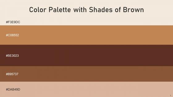
Color Palette With Five Shade Merino Twine Irish Coffee Potters Clay Cameo




Try Before you Buy Download Free Sample Product
 Impress Your
 Audience
 100%
100% Editable
 Save Hours
 of Time


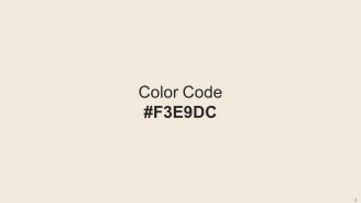
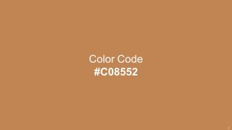
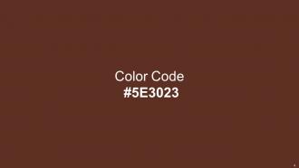
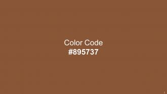
Heres a visually-pleasing color palette with Five Color Shades With Hex Code f3e9dc, c08552, 5e3023, 895737, dab49d. These colors are intuitively picked to ignite the spark of brilliance in your designs and creativity.
People who downloaded this PowerPoint presentation also viewed the following :
Color Palette With Five Shade Merino Twine Irish Coffee Potters Clay Cameo with all 14 slides:
Use our Color Palette With Five Shade Merino Twine Irish Coffee Potters Clay Cameo to effectively help you save your valuable time. They are readymade to fit into any presentation structure.







FAQs for Color Palette With Five Shade Merino Twine Irish Coffee
Different colors in presentations evoke distinct psychological responses, with blue conveying trust and professionalism, red creating urgency and excitement, green suggesting growth and stability, while yellow stimulates creativity and orange promotes enthusiasm. These color choices significantly influence audience perception and engagement, with many organizations finding that strategic color combinations enhance message retention, emotional connection, and ultimately deliver more persuasive presentations that drive desired actions.
A cohesive color palette enhances presentation aesthetics by creating visual harmony, establishing professional credibility, and reinforcing brand consistency throughout all slides. This strategic approach streamlines audience focus, reduces visual distractions, and strengthens message retention, with many organizations finding that unified color schemes ultimately deliver more polished presentations and enhanced audience engagement.
**INPUT**: What tools can be used to create and test color palettes effectively? **OUTPUT**: Color palette tools include Adobe Color, Coolors, Paletton, ColorBrewer, and Canva's palette generator, offering features like color harmony generation, accessibility testing, and brand integration. These platforms streamline design workflows by enabling rapid palette creation, contrast validation, and collaborative sharing, with many marketing teams and design agencies finding that systematic palette testing ultimately delivers consistent brand experiences and enhanced visual communication across digital platforms. *Word count: 60 words*
Cultural perceptions significantly influence presentation design through color symbolism, emotional associations, and aesthetic preferences that vary across regions and audiences. Understanding these cultural nuances enables designers to create more effective, respectful presentations, with many international organizations finding that culturally-adapted color choices enhance audience engagement, improve message reception, and ultimately deliver stronger communication outcomes across diverse markets.
Color contrast significantly impacts readability by ensuring text stands out against backgrounds, while simultaneously driving audience engagement through visual hierarchy, accessibility compliance, and emotional response. Strategic contrast choices enhance comprehension rates, reduce eye strain, and guide viewer attention across content, with many organizations finding that high-contrast designs deliver improved user experiences and broader audience reach.
Select a color palette by incorporating your brand's primary and secondary colors, considering your audience demographics, industry context, and emotional messaging goals. Start with your logo colors as anchors, then expand with complementary shades that enhance readability and visual hierarchy, ensuring consistency across all presentation materials while maintaining professional contrast ratios for accessibility.
Common color palette mistakes include using too many colors, insufficient contrast between text and backgrounds, ignoring brand guidelines, choosing colors that clash or compete for attention, and failing to consider colorblind accessibility. These oversights can undermine professional presentations by reducing readability, creating visual chaos, and weakening brand consistency, with many organizations finding that strategic color discipline significantly enhances audience engagement and message clarity.
Color palettes can be adapted for accessibility by incorporating high contrast ratios, using patterns or textures alongside colors, avoiding problematic red-green combinations, and implementing colorblind-friendly alternatives like blue-orange schemes. These approaches enhance usability across presentations, websites, and marketing materials, with many organizations finding that accessible design ultimately delivers broader audience reach, improved user experiences, and stronger brand inclusivity in an increasingly diverse marketplace.
**INPUT**: What resources are available for finding trending color palettes for presentations? **OUTPUT**: Trending color palette resources include Pantone's annual color forecasts, Adobe Color's trending collections, Coolors.co's popular palettes, Behance design showcases, and industry-specific style guides from major brands. These platforms streamline palette selection by offering curated combinations, seasonal trends, and accessibility-compliant options, with many presentation designers finding that strategic color choices enhance audience engagement and reinforce brand consistency across corporate communications. [Word count: 59 words]
Creating a unified color palette requires selecting colors with sufficient contrast ratios, testing hex codes in CMYK conversion, and choosing versatile hues that maintain vibrancy across mediums. Many design teams find that limiting palettes to 3-5 core colors, incorporating neutral anchors, and avoiding RGB-only bright colors ensures consistency, ultimately delivering professional presentations that maintain brand integrity whether viewed on screens or printed materials.
Professional business presentations typically utilize navy blue, charcoal gray, deep green, and burgundy to convey trust, stability, and authority, while creative presentations leverage bright orange, vibrant purple, emerald green, and bold yellow to inspire innovation and energy. These strategic color choices enable organizations to align visual messaging with presentation objectives, with many companies finding that tailored palettes enhance audience engagement and reinforce brand positioning.
Simplify your color palette by limiting it to 2-3 primary colors, using neutral backgrounds like white or light gray, and reserving bold colors exclusively for critical elements like headlines, call-to-action buttons, and key data points. This strategic approach eliminates visual competition and guides audience attention directly to your most important content, with many presenters finding that simplified palettes increase message retention and audience engagement significantly.
Effective complementary color combinations for slide design include blue and orange, red and green, purple and yellow, teal and coral, and navy and gold. These pairings create visual contrast while maintaining readability, with many presentation designers finding that strategic color combinations enhance audience engagement, improve information retention, and deliver more professional, memorable presentations.
Seasonal trends significantly influence presentation template color choices by aligning visual aesthetics with audience expectations, marketing cycles, and psychological associations tied to specific times of year. Companies across retail, hospitality, and consumer goods industries strategically adapt their presentation palettes to match seasonal moods, with spring pastels enhancing fresh product launches while autumn earth tones reinforce stability messaging, ultimately delivering greater audience engagement and brand resonance.
Gradients create visual depth and modern sophistication, while solid colors deliver clarity and professional simplicity in slide presentations. Gradients work effectively for creative industries and tech companies seeking dynamic appeal, whereas solid colors enhance readability in corporate settings, financial presentations, and educational materials, with many organizations finding that strategic color choices significantly improve audience engagement and message retention.
-
SlideTeam makes creating presentations easy. Unlimited products, premium quality designs and affordable.
-
“The presentation template I got from you was a very useful one.My presentation went very well and the comments were positive.Thank you for the support. Kudos to the team!”