

Color Palette With Five Shade Frangipani Whiskey Driftwood Sepia Skin Millbrook




Try Before you Buy Download Free Sample Product
 Impress Your
 Audience
 100%
100% Editable
 Save Hours
 of Time


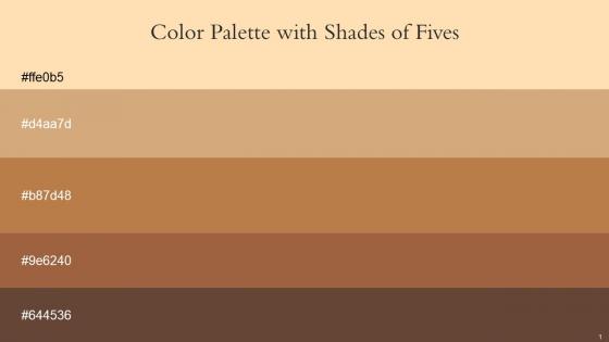
Heres a visually-pleasing color palette with Five Color Shades With Hex Code ffe0b5, d4aa7d, b87d48, 9e6240, 644536. These colors are intuitively picked to ignite the spark of brilliance in your designs and creativity.
People who downloaded this PowerPoint presentation also viewed the following :
Color Palette With Five Shade Frangipani Whiskey Driftwood Sepia Skin Millbrook with all 14 slides:
Use our Color Palette With Five Shade Frangipani Whiskey Driftwood Sepia Skin Millbrook to effectively help you save your valuable time. They are readymade to fit into any presentation structure.







FAQs for Color Palette With Five Shade Frangipani Whiskey Driftwood
Oh totally, colors mess with people's heads way more than you'd think! Blue's your safe bet - builds trust and keeps things chill (hence every boring corporate logo ever). Red's attention-grabbing but can come off pushy. Green feels balanced, yellow's energizing but honestly gets annoying fast in big chunks. Purple screams luxury or artsy vibes. I learned this the hard way after some truly ugly presentations lol. Stick with blues for serious stuff, throw in red only when something's urgent, and definitely check your contrast so people can actually read it.
Think about what vibe you want first - trustworthy? Go with blues and grays. Fun and energetic? Bright oranges work great. I'd check out brands doing similar stuff for ideas (just don't straight-up copy them lol). Your colors need to play nice together too, so test the contrast between them. Honestly, keeping it simple is key - maybe 2-3 main colors plus some neutrals. Oh, and write down those exact hex codes! Your team will thank you later when everything actually matches across your website, business cards, whatever.
Coolors.co is my absolute favorite - just hit spacebar and it generates new palettes. Super addictive honestly. Adobe Color works great too, especially if you upload an image to pull colors from it automatically. Paletton's good when you need more control over color relationships. Oh and definitely check contrast ratios for accessibility stuff. I usually start browsing on Coolors for ideas, then jump to Adobe Color to tweak things. Sometimes I get way too into the spacebar thing on Coolors and lose like 20 minutes lol. But yeah, those three cover pretty much everything you'll need.
Honestly, contrast is make-or-break for presentations. People literally can't read your slides without it. I aim for at least 4.5:1 ratio, but the squint test works too - if you can't read it squinting, neither can your audience. Dark on light or white on dark are your safest bets. Those light gray fonts everyone loves? Absolute disaster from the back row. I learned this the hard way during a conference last year. Bright meeting rooms make it even worse, so stick with high contrast combos. Your audience won't have to strain their eyes, and you'll look way more professional.
Honestly, you can't mess up with navy and white - classic for a reason. Dark gray works great too with lighter backgrounds. Blues are your best friend here, they just look so professional and clean. Deep teal with cream is nice if you want something a little different, or just stick with different shades of the same color. Whatever you do, avoid those neon combos that'll make everyone's eyes water. Oh, and red text on green is basically impossible to read. Keep it to 2-3 colors tops. Test everything on an actual projector first though - colors look totally different projected than they do on your laptop screen.
Colors are crazy different across cultures, seriously. Red screams "danger" to us but it's lucky in China. White? We think pure and clean, but some cultures associate it with death and mourning. I learned this the hard way on a project once - oops. Green usually feels natural and fresh here, but elsewhere it can mean jealousy or being inexperienced. If you're designing for people worldwide, definitely check what colors mean to your actual users first. Test with real people from those backgrounds before you go live. Trust me, it'll save you major headaches later.
So color is basically your secret weapon for controlling where people look. Use bright or contrasting colors for your key points and calls-to-action, then keep everything else neutral. Think of it like being a visual puppeteer - you're creating a hierarchy that guides them through your content exactly how you want. Bright stuff pops forward on dark backgrounds, while similar colors just blend together. Oh, and here's what I've learned works really well: save your brand's accent color only for the most important things you want them to actually remember later.
Honestly, just pick 3-4 colors tops. Go with one main color, an accent, and some neutrals like gray or white for backgrounds. I always choose colors that are either opposite on the color wheel or right next to each other - they just look better together naturally. Adobe Color's pretty good for this, or Coolors.co if you're stuck. Then here's the key part: actually stick to your palette! Use your main color for headers, the accent for highlights, neutrals for regular text. I see so many people mess this up by adding random colors halfway through. Consistency's what makes it look like you didn't throw it together last minute.
Ugh, the worst thing you can do is go crazy with colors - maybe 3-4 tops. Also avoid red/green combos since colorblind people can't tell them apart (learned that one the hard way). Make sure there's enough contrast or nobody will be able to read your text. Clashing colors are just painful to look at. Oh, and don't use random colors that don't fit your topic - like neon pink for banking stuff unless that's literally your brand. Colors look super different on various screens too, so test it out. Quick contrast check before you're done and you'll be good!
So contrast ratios are huge - aim for 4.5:1 with normal text, 3:1 for large stuff. WebAIM's checker is clutch for this. Here's the thing though: don't just use color alone since like 8% of people see colors differently than you do. Pair it with icons or text labels instead. I swear, this should be design 101 but whatever. Try running your palette through Stark or one of those colorblind simulators - you'll be shocked how different it looks. Oh, and test early! Way easier than fixing everything later. That covers most of the important accessibility stuff.
Honestly, everyone's going crazy for those moody earth tones right now - terracotta, sage green, warm beiges. Digital Lime is everywhere too, especially when you pair it with neutrals. There's this whole "dopamine color" trend that's actually pretty fun - basically bright combos that just make you happy. Pantano's Viva Magenta is still popular if you want something really bold, though I'm kinda over it personally. Oh and definitely check out Coolors.co or Adobe Color to mess around with these combos. Way easier than trying to figure it out yourself.
So finance and consulting are all about blues, grays, whites - you know, that whole "trust me with your money" look. Healthcare goes for calming blues and greens which honestly makes total sense. Tech companies? They're doing bold stuff - bright blues, oranges, sometimes even neon because they want to scream innovation. Creative agencies basically throw the rulebook out and use whatever wild color combos they want. My advice? Look up what others in your industry are doing first. Then maybe add one small thing that'll make people remember your presentation, but don't go too crazy with it.
Honestly, sticking to just 3-5 colors is a game changer. Your design won't look like a rainbow exploded on it. I learned this the hard way after making some truly hideous flyers in college lol. Pick one main color, throw in an accent, maybe add a neutral. It forces you to actually think about what you're doing instead of just randomly picking pretty colors. The whole thing ends up looking way more professional. Plus people will actually remember your brand instead of getting overwhelmed by all the chaos. Trust me on this one.
Your color choices totally set the mood before people even read a slide. Reds and oranges pump up energy, blues feel trustworthy and calm. I once made this huge mistake using neon green for a budget meeting - looked so unprofessional! Dark colors come across serious, bright ones seem more upbeat. People react to this stuff subconsciously, which is kinda wild if you think about it. Don't just go with what's pretty - match the vibe you're actually going for. Trust me on this one.
A/B testing is your best bet - swap out colors on buttons or headers and see what converts better. Focus groups work great if you've got the budget, especially when targeting specific age groups or whatever. Social media polls are super quick for feedback too, or just send surveys to people on your email list. Honestly, showing color swatches by themselves is pretty useless. You need context - mock up how people will actually see the colors on your site or design. Quick social posts with different versions can give you solid insights without spending much.
-
Great work on designing the presentation. I just loved it!
-
Design layout is very impressive.