


Color Palette With Five Shade Indian Khaki Sandrift Pine Cone Makara Congo Brown




Try Before you Buy Download Free Sample Product
 Impress Your
 Audience
 100%
100% Editable
 Save Hours
 of Time


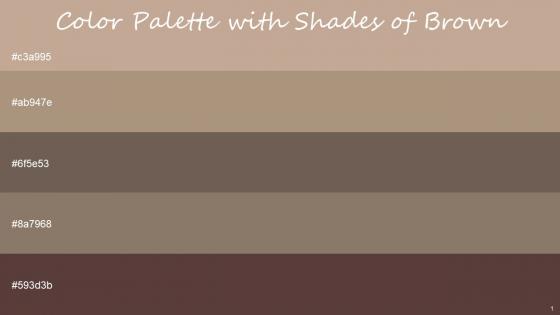
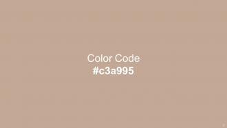
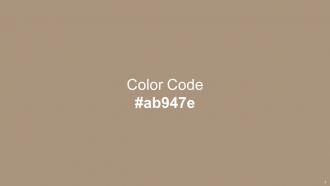
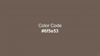
Heres a visually-pleasing color palette with Five Color Shades With Hex Code c3a995, ab947e, 6f5e53, 8a7968, 593d3b. These colors are intuitively picked to ignite the spark of brilliance in your designs and creativity.
People who downloaded this PowerPoint presentation also viewed the following :
Color Palette With Five Shade Indian Khaki Sandrift Pine Cone Makara Congo Brown with all 14 slides:
Use our Color Palette With Five Shade Indian Khaki Sandrift Pine Cone Makara Congo Brown to effectively help you save your valuable time. They are readymade to fit into any presentation structure.







FAQs for Color Palette With Five Shade Indian Khaki Sandrift Pine Cone
Different colors evoke distinct psychological responses, with red stimulating urgency and energy, blue conveying trust and professionalism, green suggesting growth and calm, while yellow promotes optimism and creativity. These color associations enable presenters to strategically influence audience emotions and engagement, with many organizations finding that aligned color choices enhance message retention and create stronger connections with viewers.
A cohesive color palette enhances audience engagement by creating visual consistency, reducing cognitive load, reinforcing brand identity, and guiding attention to key information effectively. Through strategic color combinations, presenters streamline message delivery, improve information retention, and maintain professional credibility, with many organizations finding that consistent visual branding ultimately delivers stronger audience connection and more memorable presentations.
Best practices for selecting corporate color palettes include aligning with brand guidelines, ensuring high contrast for readability, limiting to 3-4 primary colors, considering cultural associations, and testing across different devices. These strategic choices enhance professional credibility and audience engagement by creating visual consistency, improving information hierarchy, and reinforcing brand recognition, with many organizations finding that cohesive color schemes significantly boost presentation effectiveness and stakeholder trust.
Cultural perceptions of color significantly influence global presentation design through varying symbolic meanings, emotional associations, and business contexts across regions. While red signifies prosperity in Chinese markets, it can represent danger in Western contexts, with many international organizations adapting their color strategies by region, ultimately ensuring cultural sensitivity and enhanced audience engagement.
Tools for creating effective presentation color palettes include Adobe Color, Coolors.co, Canva's color palette generator, ColorHunt, and Paletton, along with built-in design tools in PowerPoint and Google Slides. These resources streamline color selection by offering pre-tested combinations, accessibility checks, and brand-consistent schemes, with many organizations finding that systematic color tools enhance visual cohesion and audience engagement across their presentations.
A presentation palette should typically include 3-5 primary colors to maintain visual clarity and professional consistency, with many design experts recommending a strategic combination of one dominant color, two supporting colors, and neutral tones. This approach streamlines visual communication by ensuring adequate contrast, reducing cognitive overload, and enhancing audience focus, while enabling presenters to create cohesive, memorable presentations that deliver clear messaging across diverse business contexts.
Contrast enhances readability, establishes visual hierarchy, guides attention to key elements, and ensures accessibility across different viewing conditions and devices. Strategic contrast ratios between text and backgrounds, complementary color combinations, and varying brightness levels create compelling presentations that communicate effectively, with many organizations finding that high-contrast palettes significantly improve audience engagement and comprehension rates.
Color theory enhances presentation storytelling by establishing emotional context, guiding audience attention, creating visual hierarchy, and reinforcing narrative themes throughout slides. Through strategic color combinations, presenters can evoke specific moods, highlight key messages, and maintain visual consistency, with many organizations finding that thoughtful color choices significantly improve audience engagement and message retention.
Common mistakes include using too many colors, ignoring brand guidelines, selecting low-contrast combinations that reduce readability, choosing overly bright or distracting hues, and neglecting audience preferences or cultural color associations. These missteps can undermine professional credibility and message clarity, with many presenters finding that streamlined, accessible palettes ultimately deliver stronger audience engagement and more effective communication outcomes.
Businesses can align brand colors with presentation design by establishing a consistent color hierarchy, using brand colors for headers and key elements, and incorporating complementary accent colors that enhance readability. This strategic approach strengthens brand recognition, creates professional visual cohesion across all materials, and reinforces brand identity, with many organizations finding that consistent color application significantly enhances audience engagement and brand recall.
Trending 2023 presentation color palettes include vibrant coral and sage green combinations, sophisticated navy and gold pairings, warm terracotta with cream accents, and bold jewel tones like emerald with rose gold. These strategic color combinations enhance visual hierarchy, improve audience engagement, and create memorable brand impressions, with many organizations finding that thoughtfully curated palettes significantly elevate their professional presentation impact.
Gradients enhance presentation color palettes by creating visual depth, establishing smooth transitions between sections, and adding modern sophistication to slide designs. Strategic gradient application in backgrounds, data visualizations, and accent elements helps maintain audience engagement while reinforcing brand consistency, with many organizations finding that subtle gradients significantly improve visual hierarchy and professional presentation impact.
Color-blind-friendly palettes significantly expand audience reach by ensuring approximately 8% of men and 0.5% of women with color vision deficiencies can fully engage with content. These inclusive design choices enhance accessibility across presentations, marketing materials, and digital platforms, while demonstrating corporate social responsibility, ultimately delivering broader market penetration and improved brand perception among increasingly diversity-conscious consumers.
Subtle shade variations enhance visual hierarchy by creating natural eye movement patterns, establishing clear information layers, and guiding audience attention without overwhelming contrast. Through strategic gradients and tonal differences, presenters can emphasize key points, separate content sections, and maintain visual cohesion, with many organizations finding that nuanced color approaches improve audience comprehension and retention.
Successful presentations utilizing effective color palettes include Apple's product launches with minimalist whites and grays, IBM's corporate presentations using their signature blue palette, and TED Talks employing bold contrasts for maximum visual impact. These strategic color choices enhance audience engagement, reinforce brand identity, and improve message retention, with many organizations finding that consistent palette application across presentations delivers stronger brand recognition and more memorable communications.
-
Awesomely designed templates, Easy to understand.
-
SlideTeam just saved my project! Thank you so much. The variety of templates helped me showcase multiple perspectives easily.