

Color Palette With Five Shade Black Brown Pod Cedar Wood Finish Brown Burnt Orange





Try Before you Buy Download Free Sample Product
 Impress Your
Audience
 100%
Editable
 Save Hours
of Time


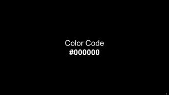
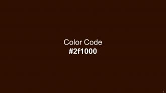
Heres a visually-pleasing color palette with Five Color Shades With Hex Code 000000, 2f1000, 621b00, 945600, c75000. These colors are intuitively picked to ignite the spark of brilliance in your designs and creativity.
People who downloaded this PowerPoint presentation also viewed the following :
Color Palette With Five Shade Black Brown Pod Cedar Wood Finish Brown Burnt Orange with all 14 slides:
Use our Color Palette With Five Shade Black Brown Pod Cedar Wood Finish Brown Burnt Orange to effectively help you save your valuable time. They are readymade to fit into any presentation structure.








FAQs for Color Palette With Five Shade Black Brown Pod Cedar Wood Finish
Honestly, keep it simple - stick to 2-3 colors max plus your basics like white or gray. Pick a main color that fits your vibe, then use an accent color for the important stuff. I've sat through so many presentations that looked like someone threw up a rainbow... total nightmare! Make sure people can actually read your text - good contrast between your font and background is key. Oh, and here's something most people forget: tons of people are colorblind, so don't make color the only way to show something's important. Quick tip - always test how it looks on different screens first. Trust me on this one.
Dude, colors totally mess with people's heads during presentations. Red and orange pump up the energy - great for getting people hyped. Blues and greens? Way more chill and trustworthy. I went overboard with yellow once and everyone looked like they had a headache lol. People judge you based on your color choices without even realizing it. Financial stuff needs blues and grays to look legit. But if you're pitching something creative, warmer colors will get them excited. It's weird how much this stuff actually matters, but trust me - it does.
So I usually pick colors based on who I'm presenting to and what vibe I'm going for. Blues and grays work great for business stuff - they just look professional. But if you're doing something creative? Go wild with oranges or teals. Oh, and never use red for financial presentations - people automatically think "bad news" when they see it. Stick to 2-3 colors tops so it doesn't look like a rainbow exploded. Make sure your text actually stands out too, especially if you're presenting in weird lighting. I'd test a few slides first before you commit to the whole thing.
Dude, you need contrast so people can actually read your stuff without going blind. Dark text on light backgrounds works great - or flip it around. I've sat through so many presentations where some genius used light gray text on white. Absolute nightmare if you're not in the front row. Your eyes need that separation to process things quickly. Plus it helps people with vision issues or colorblindness follow along. Here's what I do: step back from your screen and squint at it. Can you still read everything? Then you're good to go.
Honestly, just stick with your brand colors - it's way easier than you think. Grab those hex codes from your brand guidelines and use them as your main palette. I see so many presentations that look totally random, like someone just picked whatever looked pretty. Build your supporting colors around your main brand ones for charts and backgrounds. That way people automatically think "oh this is definitely from [your company]" without even realizing it. Don't overthink it though. Your slides should feel like they actually belong to your brand, not some template you downloaded five minutes before the meeting.
So basically, monochromatic schemes work because there's no color clashing - everything just flows together naturally. Your brain processes it way easier, which is why it feels so clean and put-together. I swear it's like cheating for good design lol. The trick is mixing up your lights and darks so it doesn't get boring. Use your lightest shades for backgrounds, then go darker for the stuff you want people to notice. Play around with saturation too - some muted, some vibrant. It's honestly foolproof once you get the hang of it.
Coolors.io is honestly my go-to for this stuff - it's free and you can just hit the spacebar to generate new palettes until something clicks. Adobe Color's pretty solid too, especially when you upload an image and it pulls colors from it. Oh, and if you're already using Canva, their palette generator works well enough. I've definitely gone down rabbit holes with Paletton when I want more control over the technical stuff. My recommendation? Start with Coolors since it's the easiest, then just copy those hex codes straight into PowerPoint or whatever you're using.
Honestly, high contrast is your best friend here. Bright colors pop like crazy against neutral backgrounds - it's like a magnet for people's eyes. I made the mistake once of going full rainbow on a design and it was complete chaos lol. Stick to your brand's accent color but only use it for the really important stuff - CTAs, key data points, that kind of thing. Reds and oranges grab attention naturally while blues kinda fade back. Keep about 80% neutral and save the bold colors for impact. Pick your top 3 priorities and give those the spotlight.
Ugh, don't go overboard with colors - 3 to 5 max or it'll look like a rainbow exploded. Check your contrast ratios too, especially for accessibility stuff. The worst thing? Picking colors just because they're "pretty" without thinking if they actually work together. I've definitely been guilty of that before lol. Also make sure they match your brand vibe and won't send weird messages. Test everything in different lighting first - colors can look totally different on various screens. Honestly, just use a palette generator to start, then tweak from there. Way easier than building from scratch.
Oh man, this is actually super important! Red means luck in China but screams danger here in the West. White? Pure and clean to us, but it's literally the color of mourning in parts of Asia. I thought blue was safe until I learned it can mean sadness in some cultures - who knew, right? Your international audience might totally misread your whole vibe. Maybe do a quick Google search on your main colors first? Or just go neutral if you're feeling lazy about it. Colors are weirdly loaded.
Honestly, good color harmony just stops people from getting distracted by awful color combos that make their eyes bleed. You'll look way more professional when your slides actually flow together visually. It's like wearing clothes - nobody's throwing on neon orange with hot pink unless they're trying to blind someone, right? Plus harmonious colors create this natural hierarchy thing where people automatically know what to focus on first. I always tell people to max out at 3-4 colors and grab a color wheel tool online. Trust me, it's so much easier than guessing and ending up with something that looks like a unicorn exploded.
Match your colors to what each audience actually wants. Corporate folks love those "trust me with your budget" vibes - navy, charcoal gray, muted greens. Educational stuff is completely different though. Bright blues and warm oranges work way better since you want people to feel welcome, not intimidated. Kids' content? Go even more vibrant. Honestly, I'd research your specific audience first because even within these categories there's variation. Then test a few options - sometimes what you think will work totally doesn't. Colors are weirdly powerful for setting the right tone.
So everyone's doing these earthy vibes right now - sage greens, terracotta, muted blues. Way more chill than those crazy bright colors we had everywhere a couple years back (thank god). Dark mode stuff is everywhere too with those high-contrast combos that really pop. Oh, and monochromatic is big - you basically pick one color and just use different shades of it. Super clean look. I'd stick with 2-3 colors max for your deck. Just make sure you test how they look on both light and dark backgrounds first because some colors get weird when you switch.
Okay so white space is basically what makes your colors actually work together instead of fighting each other. It's like - imagine trying to have a conversation at a concert, you know? Too much color without breaks just becomes overwhelming. I always start by picking my main focal points first, then give them plenty of breathing room. Short bursts work better than cramming everything together. The white space creates this natural hierarchy that pulls people's eyes exactly where you want them. Honestly, it's probably the most underrated part of any design. Your palette will look way more professional and intentional once you nail the spacing.
Definitely save your colors as a custom palette first thing - trust me on this one. I once spent like 20 minutes trying to recreate "that exact green" from my title slide lol. Primary color goes on headings, secondary for accents, then pick one neutral for all your body text. Don't get fancy with multiple grays or whatever. If you're working with other people, just make a quick doc with the hex codes so everyone's on the same page. Oh and flip to grayscale view sometimes to check contrast. Saves you from that awkward "can anyone actually read this?" moment.
-
I want to thank SlideTeam for the work that they do, especially their customer service.
-
I’m not a design person, so I couldn’t make a presentation to save my life. Thankfully, they have all kinds of templates that I regularly use for my work.