


Color Palette With Five Shade Irish Coffee Clinker Jacko Bean Wood Bark Creole




Try Before you Buy Download Free Sample Product
 Impress Your
 Audience
 100%
100% Editable
 Save Hours
 of Time


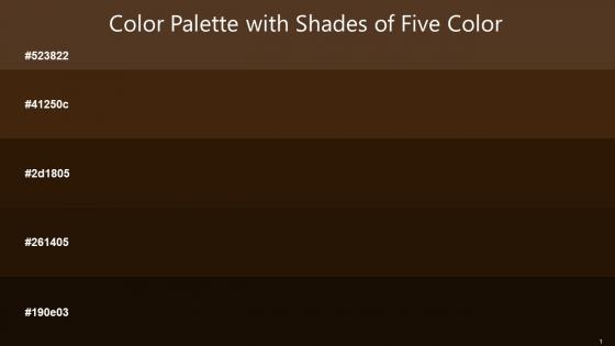
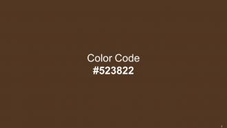
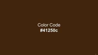
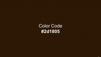
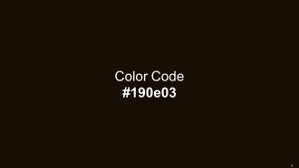
Heres a visually-pleasing color palette with Five Color Shades With Hex Code 523822, 41250c, 2d1805, 261405, 190e03. These colors are intuitively picked to ignite the spark of brilliance in your designs and creativity.
People who downloaded this PowerPoint presentation also viewed the following :
Color Palette With Five Shade Irish Coffee Clinker Jacko Bean Wood Bark Creole with all 17 slides:
Use our Color Palette With Five Shade Irish Coffee Clinker Jacko Bean Wood Bark Creole to effectively help you save your valuable time. They are readymade to fit into any presentation structure.











FAQs for Color Palette With Five Shade Irish Coffee Clinker Jacko Bean
Different colors evoke distinct psychological responses, with blue conveying trust and professionalism, red creating urgency and excitement, green suggesting growth and stability, and yellow promoting optimism and creativity. These color associations significantly influence audience perception and engagement, with many corporate presentations leveraging blue for financial data while healthcare organizations often incorporate green to emphasize wellness and reliability.
Choose a color palette by analyzing your brand's personality, target audience, and industry context, then selecting 3-5 colors that reflect these attributes through psychological associations and cultural meanings. Consider how financial institutions often use blues for trust, while healthcare brands leverage greens for wellness, ensuring your palette differentiates you from competitors while resonating with your audience's expectations and emotional responses.
Color palette tools include Adobe Color, Coolors.co, Canva's color wheel, Paletton, and brand guideline generators, along with accessibility checkers like WebAIM. These resources streamline design consistency by offering complementary color suggestions, brand alignment features, and readability verification, with many presentation designers finding that systematic palette tools ultimately deliver more professional visual impact and faster slide development.
Color contrasts significantly impact slide readability by enhancing text visibility, reducing eye strain, and ensuring accessibility for diverse audiences, including those with visual impairments. Effective contrast ratios, particularly between background and text colors, enable presenters to deliver clearer messages across various lighting conditions and display devices, ultimately improving audience engagement and comprehension in professional settings.
Popular business presentation color combinations include navy blue with white and gold accents, charcoal gray with teal highlights, deep green with cream and copper touches, burgundy with silver elements, and classic black with strategic blue accents. These professional palettes enhance credibility and readability while maintaining visual interest, with many organizations finding that consistent, sophisticated color schemes significantly improve audience engagement and reinforce brand authority across corporate communications.
Cultural perceptions of color significantly influence audience engagement by triggering emotional responses, cultural associations, and behavioral reactions that vary across different societies and demographics. While red symbolizes prosperity in Chinese culture but danger in Western contexts, blue conveys trust globally, with many international brands finding that culturally-adapted color strategies enhance local market penetration and customer connection rates.
Data visualization color best practices include using high contrast combinations, limiting palettes to 3-5 colors, ensuring accessibility with colorblind-friendly schemes, maintaining consistency across charts, and selecting colors that align with brand guidelines. These approaches enhance readability by reducing cognitive load, improving comprehension rates, and delivering clearer insights, with many organizations finding that strategic color choices significantly boost audience engagement and data retention.
Effective limited color palettes maintain visual interest through strategic use of varying shades, tints, and saturations of your core colors, complemented by thoughtful contrast ratios and strategic accent placement. By leveraging texture variations, typography hierarchy, and whitespace balance, organizations across industries like retail branding and corporate presentations find that constrained palettes actually enhance brand recognition while delivering cleaner, more professional visual experiences.
Color plays a crucial role in establishing visual hierarchy by guiding viewers' attention through contrast, saturation, and strategic emphasis techniques. Bright or contrasting colors naturally draw focus to key elements like headlines or call-to-action buttons, while muted tones support secondary information, with many presentation designers finding that this approach enhances audience comprehension and message retention.
Accessibility considerations significantly influence color palette choices through contrast ratios, color blindness accommodations, and readability requirements across different visual abilities. Organizations in healthcare, education, and financial services increasingly prioritize accessible design, finding that high-contrast palettes and colorblind-friendly combinations enhance user experiences while ensuring regulatory compliance, ultimately delivering broader audience reach and inclusive brand positioning.
**INPUT**: What are some trends in color palettes for presentations in 2023? **OUTPUT**: Current presentation color trends include earthy naturals, vibrant gradients, monochromatic schemes, warm minimalism, and bold accent combinations that enhance visual hierarchy and audience engagement. These palettes streamline brand consistency, improve readability across digital platforms, and create memorable experiences, with many organizations finding that strategic color choices ultimately deliver stronger audience retention and more impactful business communications.
Virtual presentations benefit from higher contrast colors, bolder fonts, and simplified palettes due to screen compression and lighting variations, while in-person presentations allow for subtle gradients and nuanced color combinations. Many organizations find that maintaining brand consistency across both formats through strategic color adaptations enhances audience engagement and message clarity, ultimately delivering more effective communication outcomes.
Common presentation color mistakes include using too many colors, selecting low-contrast combinations, ignoring color blindness accessibility, choosing colors that clash with branding, and applying overly bright or distracting hues. These missteps often result in reduced readability, professional credibility loss, and audience disengagement, with many organizations finding that strategic color discipline significantly enhances message clarity and viewer retention.
Incorporating gradients and textures with clean color palettes requires using subtle tonal variations within your core colors, applying textures sparingly as accent elements, and maintaining consistent saturation levels. Through strategic layering and restrained application, organizations achieve sophisticated visual depth while preserving brand clarity, with many design teams finding that limiting gradients to 2-3 palette colors ultimately delivers professional aesthetics without overwhelming complexity.
When designing presentation slides, consider complementary colors for contrast, analogous colors for harmony, the 60-30-10 rule for balance, and color temperature for mood setting. These principles enhance readability and visual appeal by creating hierarchy, maintaining consistency, and supporting your message's emotional tone, with many presenters finding that strategic color choices significantly improve audience engagement and information retention.
-
The designs are very attractive and easy to edit. Looking forward to downloading more of your PowerPoint Presentations.
-
Professional and unique presentations.