


Color Palette With Five Shade Red Orange Flamenco Sea Buckthorn Midnight Blue Midnight




Try Before you Buy Download Free Sample Product
 Impress Your
 Audience
 100%
100% Editable
 Save Hours
 of Time


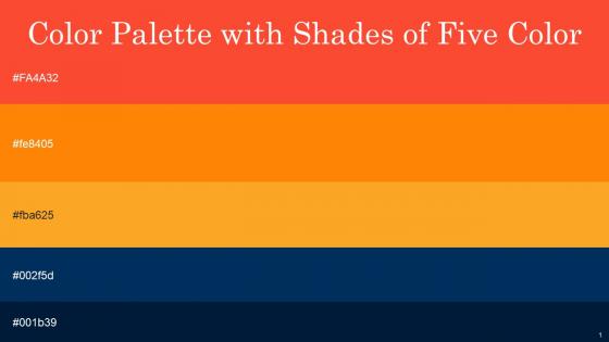
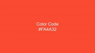
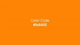
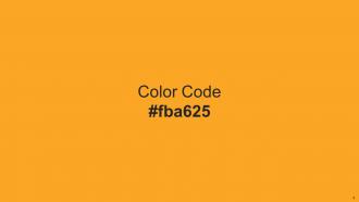
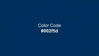
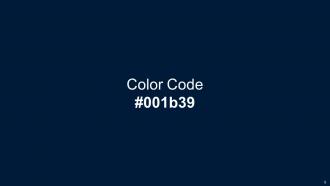
Heres a visually-pleasing color palette with Five Color Shades With Hex Code FA4A32, fe8405, fba625, 002f5d, 001b39. These colors are intuitively picked to ignite the spark of brilliance in your designs and creativity.
People who downloaded this PowerPoint presentation also viewed the following :
Color Palette With Five Shade Red Orange Flamenco Sea Buckthorn Midnight Blue Midnight with all 14 slides:
Use our Color Palette With Five Shade Red Orange Flamenco Sea Buckthorn Midnight Blue Midnight to effectively help you save your valuable time. They are readymade to fit into any presentation structure.






FAQs for Color Palette With Five Shade Red Orange Flamenco Sea Buckthorn
Different colors evoke distinct psychological responses, with red increasing urgency and energy, blue building trust and professionalism, green suggesting growth and harmony, yellow enhancing creativity and optimism, and purple conveying luxury or innovation. These color associations significantly influence audience engagement and message retention, with many presenters finding that strategic color choices enhance credibility, emotional connection, and ultimately deliver more persuasive, memorable presentations.
A cohesive color palette enhances presentation messages by creating visual harmony, reinforcing brand identity, guiding audience attention, and establishing emotional connections with content. Through strategic color consistency, presenters can highlight key information, improve comprehension rates, and maintain professional credibility, while ensuring audiences retain critical messages more effectively, ultimately delivering stronger business outcomes and competitive advantage.
Color palette tools include Adobe Color, Coolors, Paletton, ColorHunt, and Canva's palette generator, along with accessibility checkers like WebAIM and Colour Contrast Analyser. These platforms streamline design workflows by enabling rapid palette generation, real-time collaboration, and comprehensive accessibility testing, with many design teams finding that integrated testing tools ultimately deliver faster project completion and improved user experiences.
Color contrast significantly impacts readability by ensuring text remains clearly visible against backgrounds, preventing eye strain, and maintaining audience engagement throughout presentations. Strong contrast ratios enable viewers to quickly process information from various distances and lighting conditions, with many organizations finding that high-contrast slides deliver more effective communication and improved comprehension rates.
Cultural significance fundamentally shapes color interpretation across global audiences, as colors carry different meanings, emotions, and associations in various cultures and regions. For multinational brands, understanding these cultural nuances enables more effective communication, deeper audience connection, and stronger market penetration, with many companies finding that culturally-informed color strategies significantly enhance brand acceptance internationally.
A limited color palette creates minimalist design by eliminating visual clutter, establishing clear hierarchy, and directing viewer attention to essential elements through strategic contrast and consistency. This approach streamlines brand recognition, enhances readability across digital platforms, and delivers sophisticated visual communication, with many organizations finding that restrained palettes ultimately strengthen message clarity and professional credibility.
**INPUT**: What are the best practices for selecting colors based on the target audience? **OUTPUT**: Best practices for selecting audience-based colors include researching cultural associations, analyzing demographic preferences, considering industry standards, testing emotional responses, and evaluating accessibility requirements. These strategic approaches enhance brand resonance by aligning with audience expectations, cultural sensitivities, and psychological triggers, with many organizations finding that targeted color choices significantly improve engagement and conversion rates.
Brand colors serve as the foundational framework for presentation templates, dictating background choices, accent elements, text hierarchy, and visual consistency across all slides. These strategic color selections enhance brand recognition, create emotional connections with audiences, and ensure professional cohesiveness, with many organizations finding that consistent brand color implementation significantly strengthens their corporate identity and audience engagement.
**INPUT**: What color combinations work best for data visualization in presentations? **OUTPUT**: Effective data visualization color combinations include high-contrast pairs like blue-orange, green-red alternatives for accessibility, sequential blues or greens for gradual data, and monochromatic schemes with varying saturation levels. These strategic palette choices enhance audience comprehension by ensuring clear differentiation between data points, maintaining readability across various presentation formats, and ultimately delivering more impactful insights that drive informed decision-making in business contexts.
Maintaining color consistency across multiple slides requires establishing a master color palette, using presentation software's built-in theme functions, and creating custom color schemes with specific hex codes. Through PowerPoint's design themes or Google Slides' master templates, presenters can automatically apply consistent colors to backgrounds, text, and graphics across all slides, while brand guidelines ensure professional cohesion, ultimately delivering polished presentations that reinforce visual identity.
Common color palette mistakes include ignoring brand consistency, using too many competing colors, neglecting accessibility standards, following trends over timeless appeal, and failing to test across different devices and lighting conditions. These oversights can undermine visual hierarchy, reduce readability, and weaken brand recognition, with many designers finding that strategic restraint and systematic testing ultimately deliver more cohesive, professional results.
Complementary colors enhance presentation visual appeal by creating dynamic contrast, guiding audience attention, and establishing clear information hierarchy through strategic color placement. These opposing hue combinations, like blue-orange or red-green, help presenters distinguish key data points, emphasize critical messages, and maintain viewer engagement, with many organizations finding that balanced complementary schemes deliver more memorable and professionally impactful presentations.
Trending color palettes for the upcoming year emphasize warm earth tones, vibrant digital blues, soft sage greens, rich burgundies, and optimistic coral shades. These palettes enhance brand recognition and customer engagement by creating emotional connections, improving visual accessibility, and reflecting sustainability values, with many organizations finding that strategic color choices ultimately deliver stronger market differentiation and enhanced user experiences.
Strategic color application guides audience attention through contrast, hierarchy, and progressive disclosure techniques that emphasize key points while maintaining visual flow. By using bold accent colors for critical data, neutral backgrounds for supporting content, and consistent highlighting systems, presenters create clear visual pathways that direct focus naturally from slide to slide, ultimately enhancing message retention and audience engagement.
Shades and tints significantly alter a color palette's emotional impact and visual hierarchy, with darker shades conveying sophistication, authority, and depth while lighter tints suggest approachability, freshness, and spaciousness. These variations enable designers to create nuanced brand experiences, with many retail and hospitality brands finding that strategic shade-tint combinations enhance customer engagement and reinforce brand positioning.
-
Great templates that you can use in your next keynote or conference. They are perfect for quick and visually-engaging delivery.
-
SlideTeam offers so many variations of designs and topics. It’s unbelievable! Easy to create such stunning presentations now.