

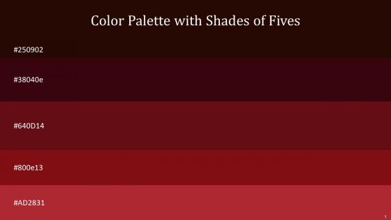
Color Palette With Five Shade Kilamanjaro Burnt Maroon Dark Tan Tamarillo Tall Poppy




Try Before you Buy Download Free Sample Product
 Impress Your
 Audience
 100%
100% Editable
 Save Hours
 of Time


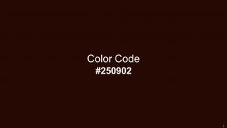
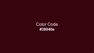
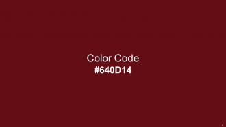
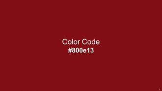
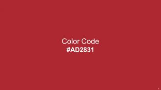
Heres a visually-pleasing color palette with Five Color Shades With Hex Code 250902, 38040e, 640d14, 800e13, ad2831. These colors are intuitively picked to ignite the spark of brilliance in your designs and creativity.
People who downloaded this PowerPoint presentation also viewed the following :
Color Palette With Five Shade Kilamanjaro Burnt Maroon Dark Tan Tamarillo Tall Poppy with all 14 slides:
Use our Color Palette With Five Shade Kilamanjaro Burnt Maroon Dark Tan Tamarillo Tall Poppy to effectively help you save your valuable time. They are readymade to fit into any presentation structure.






FAQs for Color Palette With Five Shade Kilamanjaro Burnt Maroon Dark Tan
Yeah, colors totally mess with people's heads in presentations. Red's super attention-grabbing but feels kinda aggressive - perfect for those "act now!" moments though. Blue makes everyone chill and trust you (banks are obsessed with it for a reason). Green screams nature and growth, yellow gets creative juices flowing but honestly hurts my eyes after a while. Here's the thing - warm colors like red and orange pump people up, while cool ones help them focus. I'd go with blue for boring data stuff and save red for when you actually want them to do something.
Honestly, colors are huge for grabbing attention - like the difference between someone stopping to look or just scrolling right past your stuff. Warm colors feel welcoming, blues build trust, that whole psychology thing actually works. I've watched presentations go from boring to engaging just by ditching basic black text for a real color scheme. Pick 3-4 colors that match your vibe and use them everywhere. Consistency is what makes people remember your brand. Oh, and stick to your palette religiously once you choose it - I learned that the hard way!
Oh man, contrast is SO important for readability! Dark text on light backgrounds? Perfect. Your eyes don't have to strain to figure out what you're looking at. I made this awful mistake once using gray text on white - looked "minimalist" but nobody could read it lol. Bad contrast literally forces people to squint and work harder just to understand your content. Plus you're totally shutting out users with vision issues. Always shoot for at least 4.5:1 contrast ratio. Those online contrast checker tools are lifesavers - I use them religiously now before I finalize anything.
Oh man, this is so important! Red screams danger here but means good luck in China. White? Pure and clean to us, but it's for funerals in some Asian cultures - awkward. I'd definitely look up your audience first because even green can backfire (growth vs. jealousy depending where you're from). Honestly, I usually just go with blues when I'm unsure. They work pretty much everywhere and you won't accidentally offend anyone's grandma.
Pick a color you're obsessed with first, then use the 60-30-10 thing - 60% main color, 30% secondary, 10% accent. Lighting is huge btw, colors look totally different under various lights so definitely test that. Keep it to 3-5 colors tops or it'll look like a rainbow exploded. Coolors is amazing for finding combinations that actually work together. You can also steal palettes from photos you love (I do this all the time). Make sure there's good contrast so people can actually read your stuff. Test everything on real content before you finalize - trust me on this one!
Look at your industry first - healthcare goes with calming blues and greens because trust matters. Tech companies do that sleek gray thing with bold accents. Red and orange literally make people hungry (wild, right?), so food brands love those. Finance sticks to boring but safe blues and greens. Creative fields can get away with whatever crazy combos they want. It's all about what emotions you're trying to hit. Check out what your competitors are doing, then test a few options with real users. Colors mess with people's heads more than you'd think, so don't just pick what looks pretty.
Honestly, I always go straight to Adobe Color - it's free and you can build palettes from scratch or pull them from photos. Coolors.co is addictive too (I've definitely lost hours clicking that spacebar to randomize colors). You can lock the ones you like and shuffle the rest. If you need inspiration, Colour Lovers has tons of community stuff. Oh, and don't forget to run your final palette through something like Stark or WebAIM to check contrast ratios - learned that one the hard way. Test everything in context before you commit though.
Dude, you're missing out on a huge chunk of your audience if you don't think about color accessibility. Like 8% of guys and 0.5% of women have color blindness - that's millions of people who can't tell your red/green status buttons apart. I learned this the hard way on a project last year. Good contrast ratios help everyone though, not just people with vision issues. Ever tried reading your phone outside on a sunny day? Yeah, exactly. Plus it makes your stuff work better on crappy old monitors. Honestly just grab a color blindness simulator and test your designs - takes like 5 minutes and you'll immediately see what I mean.
Honestly, the worst thing you can do is skip accessibility testing - low contrast text will lock out tons of users. Don't just pick colors because you like them either. Think about your actual brand and who's using it. Too many colors? Yeah, that's a recipe for visual chaos. I learned this the hard way once. Your gorgeous purple might look like mud on someone's old laptop, so test on different devices. Also check how it looks under various lighting - what works in your bright office might fail everywhere else. Run everything through accessibility checkers before you call it done.
Look, contrasting colors are your best friend here. Blue and gray slides? Hit 'em with orange or red for anything important. I once did yellow text on white backgrounds and wanted to crawl under a rock lol. Stick to max two accent colors though - more than that and suddenly everything's "important" which defeats the point. Oh, and be consistent! Always use the same bright color for your main points throughout. Here's my favorite trick: squint at your slide. Can't spot the key stuff immediately? Your contrast sucks and needs work.
Honestly, those sterile grays are finally dying out - thank god. Warm tones are everywhere now: terracotta, sage greens, those cozy browns that actually feel inviting. People are calling them "dopamine colors" which sounds kinda silly but whatever, the bright mood-boosting thing works. There's also this weird trend toward colors that look natural but somehow work better on screens? Anyway, I'd start with warmer neutrals as your foundation. Then either go bold with really saturated accents or keep it soft with dusty pastels. Depends on your vibe really.
Honestly, yes - use your brand colors as the foundation for your slides. Pick your 2-3 main brand colors and build everything around those. Headers, key points, callouts - that's where your primary colors shine. Then sprinkle in your secondary colors for accents. I've seen so many presentations that look totally random compared to the company's actual branding, and it's such a missed opportunity. You don't need to go crazy though - neutral grays and whites are perfect for backgrounds and body text. The goal is just making sure your core brand colors show up consistently throughout. It's probably the easiest way to look professional without much extra work.
Oh man, ColorBrewer is going to save your life here. Sequential palettes work best for progression stuff - you know, light blues to dark blues. When you've got a clear midpoint in your data, go with diverging ones like blue-white-red. Rainbow palettes are honestly terrible (I know they look pretty but they mess with people's heads). Start simple with one color family, then maybe throw in an accent color if you really need something to pop. Trust me, your audience will actually understand what you're showing them this way.
Okay so basically you want to create visual hierarchy without making everything clash, right? Think of it like lighting in movies - not every single thing needs to scream for attention. What works really well is taking your main brand color and using it in maybe 3-4 different intensities. Your darkest shade for headers, medium tone for body text, lighter version for backgrounds. It guides people's eyes naturally through your content instead of overwhelming them. Way better than stark contrasts everywhere (which honestly just looks amateur). The subtle approach gives you actual depth.
Honestly, pick like 3-4 colors and just stick with them throughout the whole thing. Random colors everywhere make presentations look super messy - I learned this the hard way lol. Your audience won't get distracted by weird design choices, and everything flows better when it actually matches. It creates that visual hierarchy thing too, so people know what's important. Oh and it makes you look way more professional, like you didn't just throw it together last minute. Consistent colors = polished presentation that doesn't hurt people's eyes.
-
Delighted to see unique and eye-catching PowerPoint designs that are so easy to customize.
-
My search for complete decks ended with SlideTeam. Such a surplus collection of HD PowerPoints. Moreover, their standard and widescreen formats have helped me in delivering bullseye presentations.