

Data Science And Analytics Transformation Toolkit Powerpoint Presentation Slides




Try Before you Buy Download Free Sample Product
 Impress Your
 Audience
 100%
100% Editable
 Save Hours
 of Time


Data analytics is capturing, processing, cleansing, and modeling organizational data to find hidden patterns for optimizing business operations. Grab our completely designed Data and Analytics Transformation Toolkit template. It deploys the data analytics suite to convert the organizations raw data into actionable information. Our DA Transition toolkit presents details of the data analytics software desired by the firm and multiple vendors providing such suites. The user can use these templates to pick and choose the best analytics solution to achieve the business goal. The data analytics program checklist and training plan templates are also included in this PowerPoint presentation, which may be used to instruct staff members on how to use the data analytics solution. With better planning, deployment, and monitoring of data analytics solutions within the company, the project manager can make better decisions, run more effectively, and gain a competitive advantage. Request a free demo from our knowledgeable team and receive a 100 percent editable data science ppt.
People who downloaded this PowerPoint presentation also viewed the following :
Content of this Powerpoint Presentation
Slide 1: This slide introduces Data Science and Analytics Transformation Toolkit. Commence by stating Your Company Name.
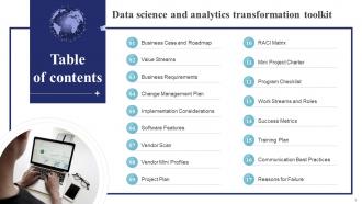
Slide 2: This slide incorporates the Table of contents.
Slide 3: This slide highlights the Title for the Topics to be covered further.
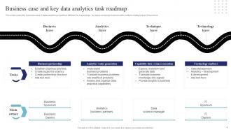
Slide 4: This slide covers the business case of data analytics project that defines the major steps, key tasks and project owners with multiple strategic layer of business.
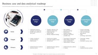
Slide 5: This slide illustrates a detailed roadmap covering the key stages, priority tasks and action plan for the data analytics project.
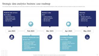
Slide 6: This slide translates the data strategy into action plan of initiatives to achieve the business results.
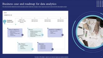
Slide 7: This slide shows the detailed document covering the problem statement, company’s vision, key processes and outcomes for the data analytics project.
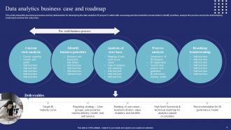
Slide 8: This slide reveals the business processes and key deliverables for developing the data analytics BI project.
Slide 9: This slide mentions the Heading for the Components to eb discussed further.
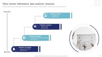
Slide 10: This slide deals with the Value stream information data analytics structure.
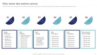
Slide 11: This slide emphasizes on the Value stream data analytics process.
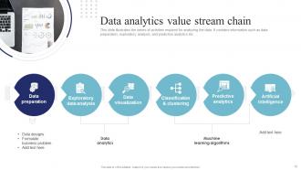
Slide 12: This slide illustrates the series of activities required for analyzing the data.
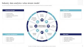
Slide 13: This slide represents the Industry data analytics value stream model.
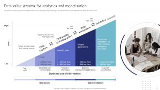
Slide 14: This slide focuses on the Data value streams for analytics and monetization.
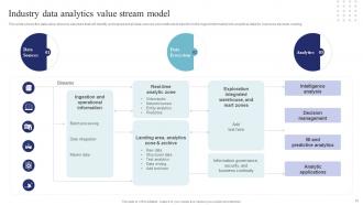
Slide 15: This slide exhibits the Industry data analytics value stream model.
Slide 16: This slide incorporates the Title for the Ideas to be discussed in the upcoming template.
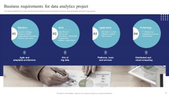
Slide 17: The slide specifies the key requirements for data analytics project covering the business, data, application and technology aspects.
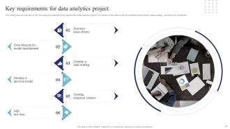
Slide 18: The slide gives an overview of key business elements that are required for data analytics project.
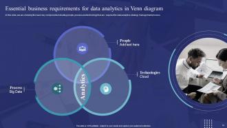
Slide 19: This slide portrays the Essential business requirements for data analytics in Venn diagram.
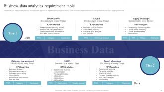
Slide 20: This slide showcases the Business data analytics requirement table.
Slide 21: This slide elucidates the Heading for the Components to be discussed further.
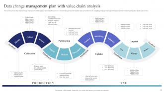
Slide 22: This slide reveals the Data change management plan with value chain analysis.
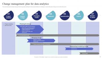
Slide 23: This slide displays the data management change plan starting from the project initiation to strategize, implementing the change and monitors the same.
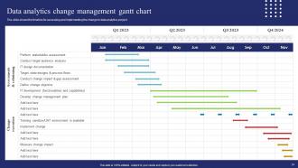
Slide 24: This slide presents the Data analytics change management gantt chart.
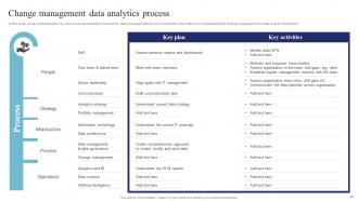
Slide 25: This slide showcases the Change management data analytics process.
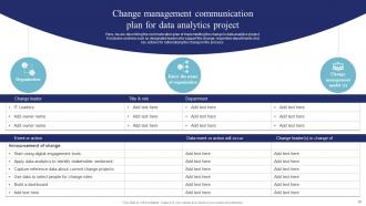
Slide 26: This slide describes the communication plan of implementing the change in data analytics project.
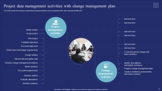
Slide 27: This slide shows how change management and project activities can be integrated in the data management lifecycle.
Slide 28: This slide mentions the Heading for the Components to be covered in the upcoming template.
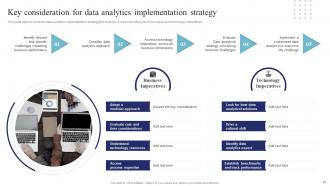
Slide 29: This slide depicts a holistic data analytics implementation strategy that includes a roadmap with a mix of business and technology imperatives.
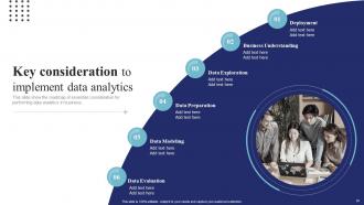
Slide 30: This slide elucidates the Key consideration to implement data analytics.
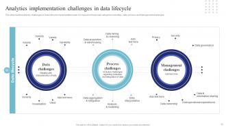
Slide 31: The slide mentions the key challenges in Data Lifecycle implementation plan.
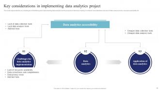
Slide 32: This slide represents the key challenges of identifying and implementing data analytics for the purpose of decision making.
Slide 33: This slide highlights the Title for the Topics to be discussed next.
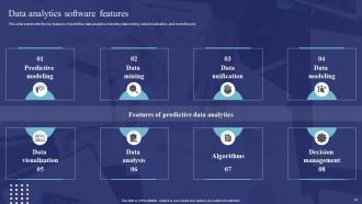
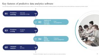
Slide 34: This slide portrays the key features of predictive data analytics including data mining, data visualization, and modelling etc.
Slide 35: This slide shows broad range of data analytics features that help businesses to draw data driven decision.
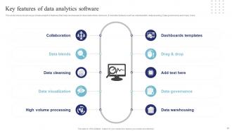
Slide 36: This slide exhibits the Key features to implement data analytics software.
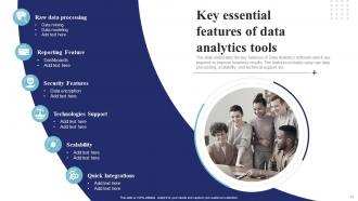
Slide 37: The slide outlines the key features of Data Analytics software which are required to improve business results.
Slide 38: This slide represents the characteristics of predictive data analytics software.
Slide 39: This slide presents the Title for the Ideas to be covered further.
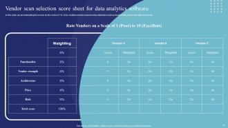
Slide 40: This slide depicts the Vendor scan selection score sheet for data analytics software.
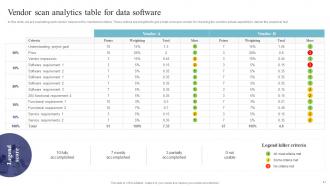
Slide 41: This slide shows the Vendor scan analytics table for data software.
Slide 42: This slide mentions the Heading for the Contents to be discussed next.
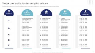
Slide 43: This slide represents the list of vendors along with accompanying information including the key features, pros and cons of each vendor software.
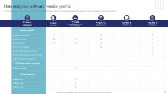
Slide 44: This slide portrays the Data analytics software vendor profile.
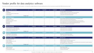
Slide 45: This slide deals with the Vendor profile for data analytics software.
Slide 46: This slide incorporates the Heading for the Contents to be covered next.
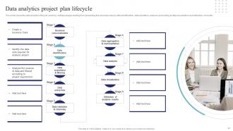
Slide 47: This slide shows the data analytics lifecycle covering multiple stages starting from presenting the business case to data identification, data validation, analysis and ending at data visualization and utilization of results.
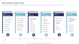
Slide 48: The slide outline the key steps for data analytics methodology.
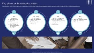
Slide 49: This slide reveals the Key phases of data analytics project.
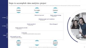
Slide 50: The slide illustrates the key fundamental steps of a data analytics project that helps to realize business value from data insights.
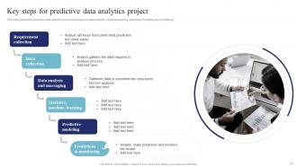
Slide 51: This slide states the Key steps for predictive data analytics project.
Slide 52: This slide indicates the Title for the Ideas to be discussed further.
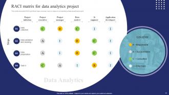
Slide 53: The slide shows the RACI grid that maps out every task or steps in completing a data analytical project.
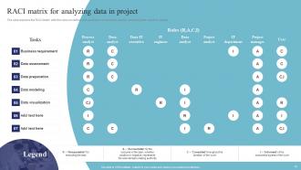
Slide 54: The slide explains the RACI Matrix with the roles on vertical axis and tasks on horizontal axis for executing data analytics project.
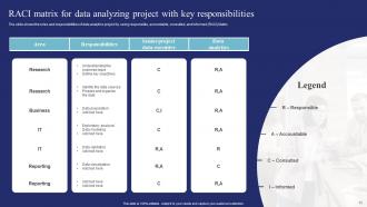
Slide 55: The slide indicates the roles and responsibilities of data analytics project by using responsible, accountable, consulted, and informed (RACI) Matrix.
Slide 56: This slide portrays the Heading for the Components to be covered in the upcoming slide.
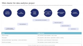
Slide 57: This slide focuses on Mini charter for data analytics project.
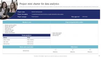
Slide 58: This slide deals with the Project mini charter for data analytics.
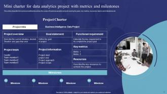
Slide 59: This slide presents the Mini charter for data analytics project with metrics and milestones.
Slide 60: This slide highlights the Heading for the Ideas to be discussed next.
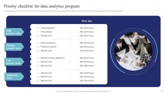
Slide 61: This slide elucidates the Priority checklist for data analytics program.
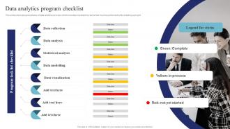
Slide 62: This slide shows progress status of data analytics process which includes important key tasks that must be performed while initiating a project.
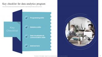
Slide 63: This slide contains the list of skills that are required for implementing the data analytics process.
Slide 64: This slide displays the Title for the Components to be covered in the forth-coming slide.
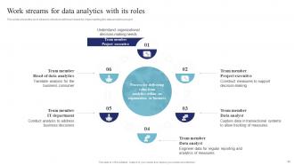
Slide 65: This slide exhibits the work streams structure with team head for implementing the data analytics project.
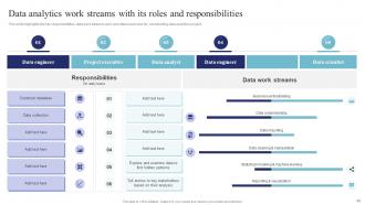
Slide 66: This slide highlights the key responsibilities, data work streams, data head roles, etc.
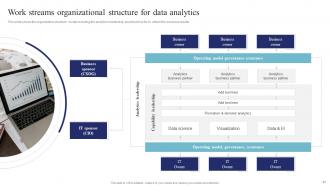
Slide 67: This slide mentions about the Work streams organizational structure for data analytics.
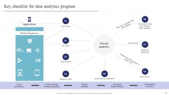
Slide 68: This diagram illustrates the Stream Analytics pipeline, showing how data is ingested, analyzed, and then sent for presentation or action.
Slide 69: This slide incorporates the Heading for the Topics to be covered further.
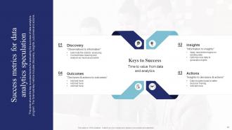
Slide 70: This slide shows the key success factors for evaluating the success of data analytics program.
Slide 71: This slide elucidates the Title for the Components to be discussed next.
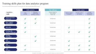
Slide 72: This slide illustrates the training plan by analyzing the key skills required data analytics project.
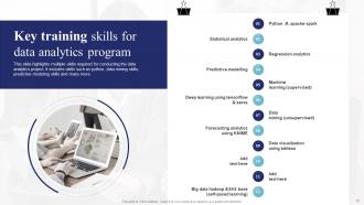
Slide 73: This slide portrays multiple skills required for conducting the data analytics project.
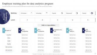
Slide 74: This slide shows the cross training employee assessment chart based on the key skill levels with respective responsibilities.
Slide 75: This slide indicates the Title for the Topics to be discussed next.
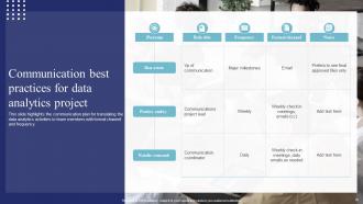
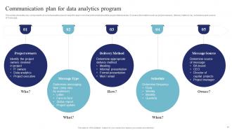
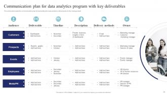
Slide 76: This slide represents the communication plan for translating the data analytics activities to team members with formal channel and frequency.
Slide 77: This slide shows the key components of communication plan to keep the team members informed about the project deliverables.
Slide 78: This slide elaborates the communication plan for translating the data analytics deliverables to the management.
Slide 79: This sldie mentions the Heading for the Ideas to be covered in the next template.
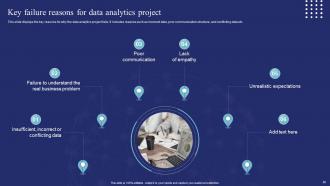
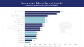
Slide 80: This slide displays the key reasons why the data analytics project fails.
Slide 81: This slide shows the graph highlighting key reasons for the failure of data management project.
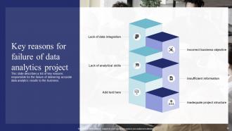
Slide 82: This slide describes a list of key reasons responsible for the failure of delivering accurate data analytics results to the business.
Slide 83: This is the Icons slide containing all the Icons used in the plan.
Slide 84: The purpose of this slide is to elucidate Additional information.
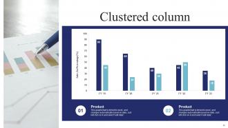
Slide 85: This is the Clustered column chart.
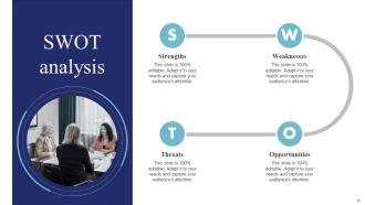
Slide 86: This slide represents the SWOT analysis.
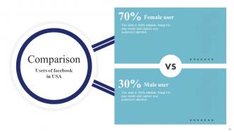
Slide 87: This slide is used for the purpose of Comparison.
Slide 88: This is Meet our team slide. List the information related to your team members here.
Slide 89: This slide showcases the Company Timeline.
Slide 90: This is the Venn diagram slide.
Slide 91: This is the Thank You slide for acknowledgement.
Data Science And Analytics Transformation Toolkit Powerpoint Presentation Slides with all 96 slides:
Use our Data Science And Analytics Transformation Toolkit Powerpoint Presentation Slides to effectively help you save your valuable time. They are readymade to fit into any presentation structure.









FAQs for Data Science And Analytics Transformation Toolkit
Start with Python, SQL, and Jupyter notebooks - seriously, nail those three first. You can handle most projects once you've got them down. For viz stuff, Tableau's nice but honestly? Matplotlib and seaborn do the job just fine. Pandas handles data manipulation, scikit-learn covers machine learning basics. Oh and Git for version control (trust me on this one). Cloud platforms like AWS help but aren't day-one priorities. Excel sounds lame but stakeholders love their spreadsheets, so... yeah. Don't overthink it - those core three will get you surprisingly far.
Honestly, both are great but for different reasons. Python's more versatile - you can do web scraping, machine learning, deploy stuff into production systems. The syntax is pretty straightforward too. But R? God, it's incredible for stats and visualization. ggplot2 will blow your mind. Most research/academic folks swear by R, while Python dominates in industry. I'd probably start with Python since you can transfer those skills to other programming areas later. Though honestly you'll want both eventually if you're serious about data science. Makes you way more marketable.
Honestly, viz tools are a game changer. You'll spot patterns and weird outliers that you'd never catch scrolling through endless spreadsheets - I once spent hours doing that and wanted to throw my laptop out the window. Your stakeholders will actually understand what you're talking about instead of glazing over at numbers. Pick the right chart for your audience though. Tableau's great, matplotlib works, Power BI too. Start basic then add complexity. The whole point is turning data chaos into something that tells a clear story.
Oh dude, ML libraries are total game-changers. You get pre-built algorithms so you don't have to write everything from scratch – like, who wants to code a random forest by hand? Not me lol. Scikit-learn, TensorFlow, pandas... they handle data cleaning, modeling, all that stuff. The optimization and error handling alone would take you forever to build yourself. Plus expert communities keep updating them constantly. I'd say start with scikit-learn – super friendly for beginners and covers most algorithms you'll actually use. Seriously saves so much time.
Honestly, cloud platforms are a game changer - no more dealing with server headaches and you can just spin things up when needed. You're only paying for what you actually use, which saves a ton compared to buying everything upfront. The ML tools they offer are pretty sick too, way cheaper than building that stuff yourself. Plus your whole team can jump into the same notebooks from wherever. Oh and the security/backup stuff is already handled, which is nice because who has time for that? I'd say pick one project and try it on AWS or Azure first - don't go crazy migrating everything at once.
So basically ETL tools handle all that annoying data prep stuff automatically. You don't have to write scripts to pull from different sources, clean everything up, then load it into your warehouse. Just set up visual workflows and boom - it runs itself. Built-in scheduling, error handling, monitoring, the works. Plus you can transform data as it moves through without extra processing steps. Honestly, I wish I'd discovered them sooner because I used to waste so much time on data plumbing. Now I actually get to analyze stuff instead. Try Talend or Pentaho first - they're pretty solid starting points.
Data wrangling is basically where you turn messy real-world data into something usable. Honestly, you'll probably spend like 70-80% of your time here - way more than anyone expects going in. But here's the thing: crappy data = crappy results, regardless of how fancy your models are. You're cleaning up missing values, fixing formats, dealing with weird outliers. Sometimes reshaping the whole structure because nothing matches up. My biggest tip? Don't rush through this part. I learned that the hard way on my first project. Take time to get your wrangling process solid and everything after will flow so much better.
Honestly, Git is a lifesaver for team projects. Everyone can work on the same code without totally screwing each other over. It tracks who changed what and when - super helpful for notebooks and datasets too. Branching is where it gets cool though. You can mess around with new models on a side branch without breaking anything important. Your teammates review stuff before merging, which catches bugs early. Oh and merge conflicts are still the worst, no getting around that. Just commit changes daily and don't write garbage commit messages. Future you will thank you.
Honestly, you'd be shocked how many people just grab whatever data they can find without thinking if it actually answers their question. Start with what you're trying to solve, then find data that fits - not the other way around. Make sure it's recent enough to matter and has a decent sample size. Missing variables will bite you later, trust me. I always check for gaps in the data and think about collection bias. Quality over quantity, seriously. Also... can you even work with the format? There's nothing worse than finding perfect data you can't actually use. Document your goal first, then hunt for datasets that'll genuinely help.
So basically you just swap out the generic stuff for tools that actually fit your industry. Healthcare? Grab SimpleITK for medical imaging and anything that handles patient data properly. Finance people need time series packages and risk modeling tools - plus all that boring compliance crap that somehow takes forever to set up. The trick is figuring out what data types you're actually working with daily, then what regulations you can't ignore. I'd start by making a list of the specialized tools everyone in your field uses constantly. Build around those first, then add the nice-to-haves later.
Yeah, there are tons of great free alternatives now. R kicks SAS and SPSS's ass for stats work, and Python with pandas is way better than MATLAB anyway. For visualizations, try Plotly or Bokeh instead of dropping cash on Tableau - though honestly R's ggplot2 is pretty slick too. Jupyter notebooks have basically made those expensive notebook tools obsolete. The open-source stuff is so good now you won't miss much. What specific tool are you trying to ditch? I can point you toward whatever matches your team's coding style.
First thing - split your data into training, validation, and test sets. Never evaluate on data the model's already seen, that's just cheating yourself. For classification stuff, check accuracy, precision, recall, and F1-score based on what you actually care about. Regression? Go with MAE, MSE, or R-squared. Cross-validation will save you here since one train-test split can be misleading. Here's the thing though - don't just chase the best numbers. A model that's slightly "worse" but way more explainable often wins in real applications. Oh, and save that test set for the very end to see how you'll actually perform.
Privacy and bias should be on your radar from the start. Get proper consent for personal data and anonymize what you can - GDPR compliance isn't optional. Your models will probably reflect existing biases (happens way more than people realize), so test across different groups. Document your methods and be upfront about limitations - people funding this stuff deserve honesty. Oh, and think about job displacement early on. I'd actually start by writing down your ethical guidelines before you even look at the data. Sounds boring but it'll save you headaches later.
Honestly, automated tools are a lifesaver for data stuff. You know how you spend forever cleaning up messy spreadsheets? These tools just handle that automatically. Same with basic charts and standard tests - no more coding everything yourself. They're way better at catching little errors too, especially when you're working late (which, let's be real, happens more than it should). The best part is you get to skip all the boring prep work. You can actually think about what the data means instead. I'd start with auto-visualization tools first - you'll see results pretty much immediately.
Dude, big data totally breaks the old playbook. Your laptop analysis? Dead. Classical sampling gets weird when you have literally everyone's data instead of just a slice. Honestly, half the traditional stats assumptions fall apart at that scale anyway. You'll be dealing with messier data and hunting for patterns rather than testing neat hypotheses. Distributed computing becomes your friend - think Spark, cloud platforms, that whole world. The shift toward pattern detection over classical methods is pretty wild once you get used to it. Start picking up those tools now before you're forced to.
-
Spacious slides, just right to include text. SlideTeam has also helped us focus on the most important points that need to be highlighted for our clients.
-
The quality of PowerPoint templates I found here is unique and unbeatable. Keep up the good work and continue providing us with the best slides!