


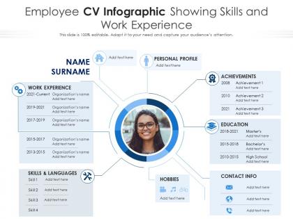
Employee cv infographic showing skills and work experience




Try Before you Buy Download Free Sample Product
 Impress Your
Audience
 100%
Editable
 Save Hours
of Time


Our Employee CV Infographic Showing Skills And Work Experience are topically designed to provide an attractive backdrop to any subject. Use them to look like a presentation pro.
People who downloaded this PowerPoint presentation also viewed the following :
Employee cv infographic showing skills and work experience with all 2 slides:
Use our Employee CV Infographic Showing Skills And Work Experience to effectively help you save your valuable time. They are readymade to fit into any presentation structure.


FAQs for Employee cv infographic showing skills
Definitely include your contact info and a short summary at the top. Skills section should have some visual flair - progress bars or icons work great. Work experience needs clear dates, and honestly, a good color scheme makes such a difference (I'm kinda obsessed with that stuff). White space is your friend so it doesn't look messy. Add numbers to your achievements when you can - recruiters literally spend like 6 seconds scanning each one. Oh, and save it as both PDF and PNG since some platforms are picky about formats.
Honestly, infographics can make your CV way more interesting than those dense text blocks everyone hates reading. Use icons and charts to show off your skills timeline - recruiters will actually look at it instead of skimming past. I'm always surprised how much better visual layouts work for highlighting achievements. Clean design guides their eyes to your best stuff naturally. Short sentences work. Then mix in longer ones that flow better when you're explaining experience or whatever. Just don't forget to keep a boring text version handy since some application systems are still stuck in the stone age and can't handle graphics properly.
Honestly, just make it super scannable first. Clean headings, consistent fonts, tons of white space. Recruiters spend like 6 seconds on these things. Stick to 2-3 colors max and make sure there's actual contrast - I've seen so many "aesthetic" resumes that are basically unreadable. Break up your sections visually so they're not just walls of text. Icons are fine but don't go crazy with them. And here's the thing - your actual experience still matters way more than making it look fancy. Don't let design tricks hide your real skills.
Match your colors to the industry you're going after - finance loves those safe blues and grays, while design roles give you more room to play. Don't go crazy though. I've seen so many resumes that look like a unicorn exploded on them, and it's just distracting. Two or three colors tops, and make sure your text doesn't disappear into the background. Oh, and test it in black and white too since some places still print everything out. Start with one main color plus some neutral tones, then see how it looks both ways.
For infographic CVs, you want hard numbers that actually mean something - like "boosted sales 30%" or "led 15-person team." Skills work amazing visually. Rate your software knowledge on scales or show language levels with those little bar charts. Timeline elements are honestly perfect for this format! Career moves, project lengths, years in different roles - all that stuff translates super well into graphics. Your education and certs look great too when designed right. Oh, and portfolio metrics if you've got them. Just don't stuff it with soft skills or paragraphs of text - totally ruins the whole point of going visual in the first place.
Think of your CV infographic like telling a story, not just dumping job titles on a page. Timeline formats work great - connect each role to show how you built your skills over time. I've seen people do cool stuff with metaphors (mountain climbing, puzzle pieces, whatever). Honestly, the visual metaphor thing can get cheesy if you overdo it, but when done right it's memorable. Add little snippets about challenges you faced or those "aha moments" that changed your direction. Pick 2-3 main themes from your career first. Then design around those instead of cramming everything in.
Canva's probably your best bet - loads of professional templates and super easy even if you're not a design person. Adobe InDesign is amazing if you actually know design and want total control. Figma's solid too, plus it's free and browser-based which is nice. I mean, PowerPoint technically works but feels weird using it for this? Like using a butter knife to fix something lol. Honestly just go with Canva for speed - you can bang out something that looks proper professional in like an hour max.
Honestly, infographics are a game-changer because they cut through all those bland black-and-white resumes recruiters are drowning in. You're turning your experience into something visual that's actually easy to scan. Hiring managers literally spend 6 seconds max on each resume at first - crazy right? So charts, icons, and smart color choices can highlight your wins way better than plain text. Don't just make it pretty though. Focus on showcasing real achievements and skills. Oh, and definitely keep a boring traditional version handy for those annoying ATS systems that'll reject anything creative.
Honestly, just think about who's gonna see this thing. Creative fields like marketing? Go wild with colors and fun graphics - they'll love it. Finance or law firms though? Keep it super clean because anything too flashy screams "unprofessional" to them. I'd definitely stalk a few companies you want to work for first - check their websites and social media to see what vibe they're going for. Age matters too btw. Then just match that energy with your design. It's kinda like dressing for the job you want, but for infographics.
Look, stick with clean colors - blues, grays, that corporate stuff. Honestly, I've seen CVs that look like someone threw glitter at Microsoft Word and it's... not great. Be creative with your layout instead. Maybe use some smart charts or timelines to show your experience - way easier to scan than walls of text. Keep the language professional but don't go overboard with fancy words. The whole point is standing out for good design choices, not because you blinded someone with neon green headers. Quick test: would this fly at like, a law firm? If yes, you're golden.
Don't cram a ton of text everywhere - you'll kill the whole visual vibe. Also watch your color choices because clashing colors or ones that make text impossible to read are the worst. Skip those fancy fonts that look amazing but nobody can actually scan quickly. Make sure your achievements don't get buried under a mountain of graphics (happens more than you'd think). White space is your friend - without it everything looks messy. The 10-second test works great: show someone your infographic briefly and see if they get your key strengths. If not, time to simplify.
Honestly, stick to icons that replace super obvious stuff - phone numbers, email, location, skill ratings. Like instead of writing "Phone:" just throw in a phone icon. Star ratings are perfect for showing how good you are at Excel or whatever. Progress bars look clean for skills too. Timeline graphics can make your work history way less boring than just listing dates. But here's the thing - don't get weird with custom symbols nobody recognizes. If your mom wouldn't immediately get what the icon means, just write it out. Keep it simple and you'll be fine.
Dude, typography can totally make or break your infographic CV. Sans-serif fonts like Arial or Helvetica are your best bet - they're just easier to read when someone's quickly scanning. I learned this the hard way using some decorative font that looked cool but was impossible to read lol. Keep it to 2-3 font weights max. Make your headers way bigger than body text so there's clear hierarchy. Recruiters need to find stuff fast, you know? Oh and definitely test how it looks at different sizes before you're done. Trust me on that one.
Look, different industries want totally different vibes on your CV. Tech companies dig clean, minimal designs - show off your coding projects front and center. Creative fields? Go wild with colors and make your portfolio the star. Finance people are way more buttoned-up, so stick with conservative layouts but throw in some charts of your wins (like revenue you boosted). Healthcare is all about certifications and patient results. Honestly, just stalk some LinkedIn profiles in your target field first. See what catches your eye, then design yours to hit those same notes. The fonts and colors matter more than you'd think - they set the whole tone.
Here's the thing with CV infographics - ATS systems are basically blind to graphics. They'll scan your beautiful design and see absolutely nothing, which sucks but that's reality. So yeah, you need a boring text version too. I'd submit both whenever you can, or paste all the key details in your email if there's only one upload slot. Keep the infographic as a PDF so it doesn't get mangled, but honestly? The visual one's just for impressing humans after you've already gotten through the robot gatekeepers first.
-
Qualitative and comprehensive slides.