


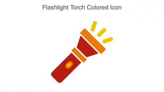
Flashlight Torch Colored Icon In Powerpoint Pptx Png And Editable Eps Format




Try Before you Buy Download Free Sample Product
 Impress Your
 Audience
 100%
100% Editable
 Save Hours
 of Time


Use this Flashlight torch colored icon in powerpoint pptx png and editable eps format and create amazing PowerPoint presentations or graphics with ease. This downloaded file is available in all the editable formats such as EPS, PNG and Powerpoint pptx.
People who downloaded this PowerPoint presentation also viewed the following :
Flashlight Torch Colored Icon In Powerpoint Pptx Png And Editable Eps Format with all 6 slides:
Use our Flashlight Torch Colored Icon In Powerpoint Pptx Png And Editable Eps Format to effectively help you save your valuable time. They are readymade to fit into any presentation structure.





FAQs for Flashlight Torch Colored Icon In Powerpoint Pptx Png And
Key design elements for visually appealing flashlight torch icons include clean geometric shapes, distinctive beam representation, balanced proportions, strategic use of negative space, and clear contrast between the body and light elements. These elements work together by ensuring instant recognition, scalability across different sizes, and visual clarity, with many designers finding that simplified forms with subtle gradients or highlights ultimately deliver better user experience and brand consistency.
Color in flashlight torch icons significantly influences user perception through psychological associations, visual hierarchy, and brand recognition cues. Warm colors like yellow and orange suggest brightness and energy, while cooler tones convey reliability and professionalism, with many mobile app developers finding that high-contrast color schemes enhance user engagement and accessibility across diverse user interfaces.
Industries that frequently utilize flashlight torch icons include security services, outdoor recreation, emergency preparedness, automotive, construction, and camping equipment manufacturers. These sectors leverage the torch symbol to communicate reliability, guidance, and illumination in challenging environments, with many companies finding that the icon instantly conveys trustworthiness and preparedness to customers seeking dependable solutions.
A flashlight torch icon symbolizes guidance by representing illumination through darkness and uncertainty, safety through emergency preparedness and security awareness, and innovation by suggesting breakthrough thinking and enlightenment. These visual metaphors resonate across industries, with financial services using torch imagery for investment guidance, healthcare organizations emphasizing patient safety protocols, and technology companies showcasing innovative solutions, ultimately delivering clear brand messaging that connects with audiences seeking direction and reliability.
Best practices for creating a minimalist flashlight torch icon include using simple geometric shapes, maintaining clear contrast between light and dark elements, emphasizing the beam with subtle gradients, and ensuring scalability across different sizes. These design principles streamline visual communication by reducing visual clutter, enhancing immediate recognition, and delivering consistent brand representation, with many digital platforms finding that simplified icons ultimately improve user experience and interface efficiency.
Cultural differences influence flashlight torch icon interpretation through varying associations with emergency preparedness, outdoor activities, and technological familiarity across regions. While Western users typically associate flashlights with camping and power outages, users in developing regions may view them as essential daily tools, and different cultural contexts around exploration, safety, and self-reliance can significantly impact user recognition and engagement with the icon.
**INPUT**: What file formats are ideal for using flashlight torch icons in digital presentations? **OUTPUT**: Ideal file formats for flashlight torch icons include PNG for transparency backgrounds, SVG for scalability across devices, JPEG for smaller file sizes, and EPS for vector editing capabilities. These formats enhance presentation quality by maintaining crisp visual clarity, enabling seamless integration across platforms, and supporting responsive design requirements, with many organizations finding that vector formats like SVG deliver superior performance in professional presentations.
A flashlight torch icon enhances mobile app usability by providing instant visual recognition for lighting features, emergency tools, camera flash controls, and search functionalities within the interface. Through intuitive symbolism, users can quickly access essential features like night mode activation, document scanning assistance, and safety applications, ultimately streamlining navigation while delivering faster task completion and improved user experiences across various app categories.
Scalability ensures flashlight torch icons maintain clarity, recognition, and visual impact across diverse applications, from mobile app interfaces and website navigation to large-scale signage and print materials. This design flexibility enables organizations in emergency services, outdoor retail, and mobile applications to deliver consistent branding and user experiences, while streamlining visual communication and enhancing interface usability across multiple platforms and devices.
Animations involving a flashlight torch icons enhance presentations by directing audience attention to specific content areas, creating visual emphasis through spotlight effects, and maintaining engagement during data-heavy segments. These animated elements streamline information delivery by guiding viewers through complex slides systematically, while enabling presenters to reveal key insights progressively, ultimately delivering more focused audience comprehension and retention.
Well-known brands effectively using flashlight torch icons include Maglite with their distinctive beam logo, Energizer featuring torch imagery in battery marketing, Coleman integrating flashlight symbols across outdoor equipment lines, and Streamlight incorporating torch elements in tactical lighting branding. These companies leverage torch iconography to communicate reliability, illumination, and preparedness across consumer touchpoints, with many outdoor and emergency preparedness brands finding that torch symbols instantly convey trustworthiness and practical functionality.
Designers can ensure flashlight torch icon accessibility by incorporating high contrast ratios, alternative text descriptions, scalable vector formats, and tactile feedback options for screen readers. These approaches streamline user experiences across visual abilities, with many mobile applications and web platforms finding that combining bold iconography with descriptive labels ultimately delivers inclusive design and broader user engagement.
Current flashlight torch icon trends include minimalist line art, gradient fills, 3D depth effects, animated light beams, and adaptive designs for dark/light modes. These evolving approaches enhance user interface clarity by incorporating micro-interactions, contextual color variations, and scalable vector formats, with many mobile applications and emergency service platforms finding that dynamic lighting effects significantly improve user engagement and accessibility.
The choice of a flashlight torch icon significantly impacts branding strategy by conveying core values like guidance, reliability, innovation, and problem-solving capabilities across all customer touchpoints. This visual element becomes deeply integrated into brand recognition, marketing materials, and digital presence, with companies in security, consulting, and technology sectors finding that consistent torch iconography enhances brand memorability, builds trust, and differentiates their services in competitive markets.
A flashlight torch icon can convey urgency through bold, angular designs with intense beam effects, comfort via soft rounded shapes with warm glowing light, or adventure through rugged textures and dynamic positioning. These design variations enable brands across emergency services, outdoor retail, and mobile applications to communicate specific emotional responses, with many finding that stylistic choices like color temperature, beam intensity, and geometric forms significantly influence user perception and engagement.
-
Excellent Designs.
-
Their designing team is so expert in making tailored templates. They craft the exact thing I have in my mind…..really happy.