


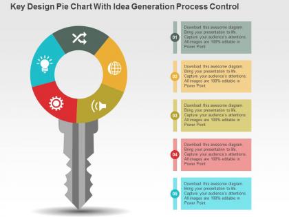
Key design pie chart with idea generation process control powerpoint slides




Try Before you Buy Download Free Sample Product
 Impress Your
 Audience
 100%
100% Editable
 Save Hours
 of Time


Pick key design pie chart with idea generation process control PowerPoint slide in your presentation. The PPT illustration is useful in demonstrating the innovation as well as problem solving concept in the corporate industry. The simple yet resourceful design will give you the edge that is required to stay competitive. Coming up with the creative idea is important for the business firm as it assist them to execute this strategies in the desired manner. Our presentation visual provides you the option to implement your plans brilliantly and then make your business successful. With this remarkable PowerPoint slide you can impress your viewers as they will engage with it which is what the objective of creating the presentation design is. Apart from this, the key shaped PPT template may be useful in showcasing the business problem solving concept to your viewers as how to overcome the challenges that comes in the success path. To include it in your presentation, simply click the download button. Also, visit other sections to check more designs. Our Key Design Pie Chart With Idea Generation Process Control Powerpoint Slides make it easy to handle the data. They enable accurate calculations.
People who downloaded this PowerPoint presentation also viewed the following :
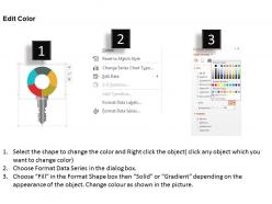
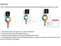
Key design pie chart with idea generation process control powerpoint slides with all 3 slides:
Frowns disappear with our Key Design Pie Chart With Idea Generation Process Control Powerpoint Slides. Grins begin to appear on faces.
FAQs for Key design pie chart with idea generation process
Key elements for effective pie chart design include clear data hierarchy, appropriate color contrast, readable labels, logical segment ordering, and limiting categories to 5-7 maximum. These design principles enhance audience comprehension by minimizing cognitive load, ensuring visual accessibility, and highlighting the most critical data relationships, with many presenters finding that simplified, well-contrasted charts deliver significantly better engagement and message retention.
Color choices significantly impact pie chart readability through contrast levels, accessibility compliance, and visual hierarchy establishment. Strategic color selection enhances data comprehension by ensuring sufficient contrast between segments, accommodating color-blind users through varied saturation and brightness, and guiding attention to key insights, with many organizations finding that thoughtful color palettes ultimately deliver clearer communication and broader audience engagement.
Common pie chart mistakes include using too many slices, unclear labeling, missing data totals, poor color contrast, and starting segments at random positions instead of 12 o'clock. These design flaws can confuse audiences and undermine data credibility, with many organizations finding that streamlined charts with 3-5 segments, clear legends, and logical ordering ultimately deliver clearer insights and more persuasive presentations.
When categories have vastly different magnitudes, combine smaller segments into an "Others" category, use a secondary breakdown chart for detailed view, or employ alternative visualizations like bar charts for better comparison. This approach prevents tiny slices from becoming unreadable while maintaining data integrity, with many analysts finding that strategic grouping enhances audience comprehension and decision-making effectiveness.
Texture and patterns enhance pie chart readability by providing visual distinction beyond color alone, particularly beneficial for colorblind audiences and black-and-white printing. These design elements include diagonal lines, dots, crosshatching, and geometric patterns that help viewers distinguish between segments like budget allocations or market share data, ultimately delivering clearer communication and improved accessibility across diverse presentation contexts.
Pie charts integrate effectively with other visual elements through strategic placement alongside bar graphs for trend comparison, data tables for precise values, infographics for storytelling context, and complementary color schemes that maintain visual cohesion. This strategic combination enables presenters to deliver comprehensive data narratives, enhanced audience understanding, and stronger decision-making frameworks, with many organizations finding that multi-visual approaches significantly improve stakeholder engagement and information retention.
**INPUT**: What software tools or templates are recommended for creating polished pie charts? **OUTPUT**: Recommended software tools include Excel, PowerPoint, Tableau, Google Charts, Adobe Illustrator, and specialized template platforms like SlideTeam. These solutions streamline chart creation by offering customizable designs, automated data integration, and professional formatting options, with many organizations finding that template-based approaches significantly reduce design time while delivering consistent, presentation-ready visuals. [Word count: 54 words]
Animations enhance pie chart presentations by drawing attention to specific segments, revealing data progressively through build-in effects, and creating visual emphasis through rotation or highlighting techniques. These dynamic elements help presenters control audience focus, make complex data more digestible, and maintain engagement throughout the presentation, with many organizations finding that animated charts significantly improve information retention and audience comprehension.
Labeling pie chart segments ensures clarity, accessibility, and accurate data interpretation by providing direct identification of categories, percentages, and values without requiring legend cross-referencing. Best practices include positioning labels outside segments with leader lines, using consistent formatting, maintaining readable font sizes, and including both category names and percentages, with many organizations finding that clear labeling significantly reduces misinterpretation and enhances decision-making efficiency.
Cultural color interpretations significantly impact pie chart design for global audiences, as red symbolizes luck in China but danger in Western cultures, while white represents purity in America but mourning in some Asian countries. Successful international presentations require culturally neutral color schemes, consistent legends, and awareness of color-blind accessibility, with many multinational organizations finding that strategic color choices enhance cross-cultural communication and prevent misinterpretation.
Bar charts, column charts, stacked bar charts, donut charts, and treemap visualizations often deliver superior data clarity compared to pie charts, especially when comparing multiple categories or displaying precise values. These alternatives enhance readability by eliminating angle interpretation challenges, streamline complex data presentations, and enable better decision-making in business dashboards, with many organizations finding improved stakeholder comprehension and faster analytical insights.
Pie charts tell compelling data stories by highlighting dominant segments, showing proportional relationships, and emphasizing key findings through strategic color coding and labeling. Effective narrative pie charts focus audiences on critical insights, such as market share leaders in retail analysis or budget allocation priorities in financial presentations, ultimately transforming raw data into actionable business intelligence that drives informed decision-making.
**INPUT**: What are the advantages of using 3D pie charts versus 2D pie charts? **OUTPUT**: 3D pie charts offer enhanced visual appeal, depth perception, and engagement potential that can capture audience attention more effectively than traditional 2D formats. However, while 3D effects create striking presentations, they can distort data proportions and reduce accuracy in interpretation, with many analysts finding that 2D charts ultimately deliver clearer communication and better analytical precision.
Data should be normalized by converting raw numbers to percentages, ensuring all values sum to 100%, removing negative values, and grouping small segments under "Others" to maintain clarity. Through proper scaling and percentage calculations, organizations streamline data visualization across departments like sales, marketing, and finance, ultimately delivering clearer insights and more effective presentations that enhance stakeholder understanding.
Pie charts present significant limitations for time-based data analysis, as they cannot effectively show temporal changes, progression patterns, or trend trajectories that businesses require for strategic decision-making. While pie charts excel at displaying proportional relationships at single points, organizations increasingly favor line graphs, area charts, and time series visualizations for tracking performance metrics, market share evolution, and operational trends, ultimately delivering clearer insights for forecasting and competitive advantage.
-
Commendable slides with attractive designs. Extremely pleased with the fact that they are easy to modify. Great work!
-
Amazing product with appealing content and design.