


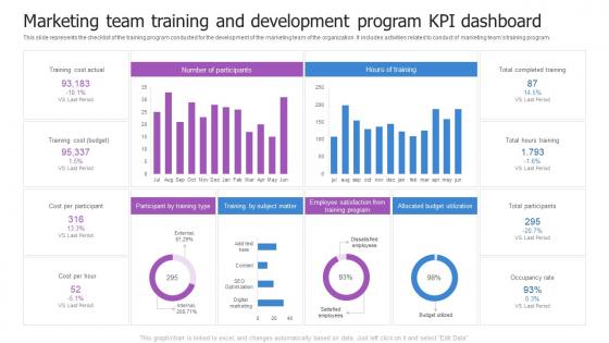
Marketing Team Training And Development Program Kpi Dashboard




Try Before you Buy Download Free Sample Product
 Impress Your
 Audience
 100%
100% Editable
 Save Hours
 of Time


This slide represents the checklist of the training program conducted for the development of the marketing team of the organization. It includes activities related to conduct of marketing teams training program.
People who downloaded this PowerPoint presentation also viewed the following :
Marketing Team Training And Development Program Kpi Dashboard with all 7 slides:
Use our Marketing Team Training And Development Program Kpi Dashboard to effectively help you save your valuable time. They are readymade to fit into any presentation structure.





FAQs for Marketing Team Training And Development
Look, you really just need three things: clear visual hierarchy, relevant metrics, and real-time data. Put your most critical KPIs right at the top - big numbers that catch your eye first. I swear I've seen so many dashboards that are just chart vomit everywhere. Focus on metrics that actually matter for your team's decisions. Auto-refresh is clutch so you're not staring at yesterday's numbers. Also, keep it simple enough that a quick glance tells you if you're winning or losing. Ten seconds max - that's your test.
Start with your strategic goals and work backwards to find metrics that actually matter. Each KPI should map to a specific goal - if you can't connect them, drop it. I've seen way too many "metric soup" dashboards that don't help anyone make decisions! Structure your dashboard like your strategy: big picture stuff at the top, then operational details underneath. Group related metrics visually and label everything clearly so people get how they connect. Oh, and audit your dashboard regularly - keep asking "does this actually help us hit our goals?"
Gauges and scorecards are your best bet for KPI dashboards - they show progress toward targets super clearly. Simple bar charts work well for comparing stuff across different time periods. Line charts are solid for spotting trends. I'd skip pie charts unless you're literally showing parts of a whole (they're honestly annoying to read fast). The executives I've worked with always gravitate toward clean, number-heavy scorecards. Keep things simple since people need to process info quickly. Oh, and definitely test layouts with whoever's actually using the dashboard - what looks good to you might not click with them.
Monthly updates are usually the sweet spot for most KPI dashboards. Fast-paced stuff like e-commerce or active campaigns? Weekly makes way more sense. Strategic metrics can probably get away with quarterly - those don't shift as dramatically anyway. The real test is whether people still trust your data. Stale numbers kill dashboard credibility faster than anything. Your team will just stop checking if the info feels old. Start monthly and see how often they're actually using it. If they're in there constantly asking for fresher data, bump it to weekly. Pretty straightforward once you watch usage patterns.
So for KPI dashboards, Power BI and Tableau are the big names but they're kinda complex at first. Google Data Studio is free and works great if you're already using Google stuff. Excel can work too - though it gets ugly pretty quick lol. Klipfolio and Geckoboard are way easier to use if you don't want the headache. Really depends on what data you're pulling from and how fancy you need it. I'd mess around with Power BI's free trial first, or just jump into Data Studio since it won't cost you anything.
Honestly, just pick your 5-7 most important KPIs that actually matter to the business. Don't try to cram everything in there - I've worked with dashboards that were basically metric vomit and nobody used them. Group similar stuff together and make the big numbers stand out visually. Your audience matters too. Executives want the bird's-eye view while managers need to dig deeper into specifics. Here's what I always do - test it with real people first. Watch their reaction when they open it. If they look confused or overwhelmed right away, you've got too much going on. Sometimes less really is more with this stuff.
Honestly, UX makes or breaks dashboards. People will literally abandon the most important data if it's confusing or takes forever to load. Clean design beats fancy charts every single time - I've watched teams build these gorgeous-looking monstrosities that nobody actually uses. Fast loading, intuitive navigation, visuals that make sense immediately. That's what matters. Mobile responsiveness is huge too since everyone's checking stuff on their phones now. Oh, and definitely test with real users first. You'll be shocked how differently people navigate than you expect.
So basically you'll want to set up different views for each team - sales sees their conversion rates and pipeline stuff, marketing gets lead gen and campaign ROI. Most tools have permission settings so people aren't drowning in metrics they don't care about. Ask each team what their top 3-5 numbers are first (this saves so much headache later). Then you can tweak the charts, timeframes, alerts - whatever makes sense for how they actually work. Oh and different teams love different chart types, so don't just default to the same boring graphs everywhere.
Don't cram everything onto one screen - that's the biggest mistake I see. Pick 5-7 metrics that actually matter for decisions, not just stuff that looks impressive. If someone has to click more than twice to find info, you've already lost them. Oh, and executives want totally different data than your ops team does, so know your audience first. I always ask "so what?" after adding each metric - if you can't answer that, cut it. Clear visuals are everything. Honestly, figure out what decisions this thing needs to support, then build around that.
So connect your dashboard to historical data using ETL processes or automated pipelines that grab past metrics. Tableau and Power BI are honestly great for this stuff - probably their strongest point. Your visualizations should show data across different time periods (monthly, quarterly, yearly) so trends and weird outliers pop out. Clean, consistent formatting is crucial though, or your trend lines will look totally screwed up. Oh and definitely set up regular refresh schedules. That way your historical data stays current and actually useful for making decisions instead of just looking pretty.
So you'll definitely want response time and resolution time - those are like the bread and butter metrics. CSAT scores are huge too, plus first-call resolution rates. Most places also track ticket volume and agent utilization. Oh, and escalation rates, though honestly that one's a pain because every team defines it differently. If your company does NPS, throw that in there. SLA compliance stuff matters too depending on your business. I'd start with these basics and then just add whatever your boss actually cares about - no point tracking things that'll just sit there ignored, you know?
Honestly, real-time data integration is a total game changer for dashboards. You'll stop staring at yesterday's numbers and actually catch problems while you can still fix them. Your KPI dashboard becomes this living thing that shows what's happening right now - which sounds obvious but most people are still working off stale reports from who knows when. Everyone stays on the same page because they're all looking at current data instead of five different outdated versions floating around. I'd start by figuring out which KPIs you absolutely need updated in real-time first, then work from there.
Start with cleaning your raw data before it even touches the dashboard - seriously, I've watched so many projects crash because someone skipped this step. Set up automated checks for weird outliers or missing values. Track where each metric actually comes from so you're not guessing later. Test everything against datasets where you already know what the results should be - saves you from looking like an idiot when numbers don't add up. Oh, and run regular audits on your calculations. Multiple checkpoints will save your ass every time.
Set up feedback loops - quarterly or monthly depending on how much they rely on it. Quick surveys work best: what's useful, what's confusing, what do they actually need? I've watched so many dashboards turn into widget graveyards because no one bothered asking users how they really use the data. Demo sessions help when you push updates, plus keep a backlog of requests. Brief check-ins beat long formal reviews every time. The trick is making feedback feel effortless, not like another task on their pile. Trust me, they'll actually respond if you keep it simple.
First thing - don't give everyone access to everything. Sales team gets sales stuff, finance gets their numbers, you know? Role-based permissions are your friend here. Make sure "conversion rate" means the same thing on every dashboard (learned this the hard way). Set up regular data refreshes and tell people when things update - stale data is worse than no data, honestly. Create a simple cheat sheet explaining what each metric actually measures. I'd test it with a small group first before unleashing it on the whole company. Trust me on that one.
-
“The presentation template I got from you was a very useful one.My presentation went very well and the comments were positive.Thank you for the support. Kudos to the team!”
-
SlideTeam was so customer-centric and quick service-provider that I doubted the amount I was paying and literally re-checked the transaction.