


Objectives template powerpoint slide designs download






Try Before you Buy Download Free Sample Product
 Impress Your
 Audience
 100%
100% Editable
 Save Hours
 of Time


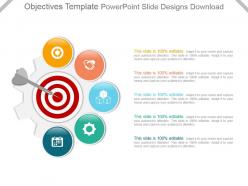
Handle the impasse with our Objectives Template Powerpoint Slide Designs Download. Create conditions for establishing accord.
People who downloaded this PowerPoint presentation also viewed the following :
Objectives template powerpoint slide designs download with all 7 slides:
Build a bond of faith with our Objectives Template Powerpoint Slide Designs Download. Your colleagues will demonstrate belief.
FAQs for Objectives template powerpoint
Find templates with good visual flow - bullets or numbers work best. Nobody reads cramped text, so spacing matters way more than you'd think. Match your company colors and make sure there's decent contrast so people can actually see it. Templates that fit 3-7 objectives are the sweet spot. Icons help break things up too. Honestly, download a few and test with your real content first. I've seen gorgeous templates turn into disasters once you add actual text - what looks clean empty gets messy fast with real objectives.
Think of objectives slides as your presentation GPS - they tell everyone where you're going before you start driving. People can actually follow along when they know what's coming next. Clean bullet points work best, honestly. You'll look way more put-together too, which never hurts. Good templates help highlight your main points without all the visual clutter that makes audiences zone out. I always feel less nervous when I've got that roadmap laid out upfront. Your audience gets it faster, and you can focus on actually delivering instead of wondering if they're lost.
Academic presentations need super clean, minimal templates - no flashy stuff. Bullet points and numbered lists work great. I bombed my thesis defense partly because of distracting colors, so learn from my mistake! Arial or Calibri fonts are your safest bet. Pick templates with lots of white space and room for sub-points if needed. Some even have spots for methodology notes, which is clutch. Honestly, academic crowds are pretty conservative design-wise. Download a few different layouts so you can match the vibe to your audience.
Yeah, different industries totally have their own vibe for objectives slides. Medical companies go for clean templates with healthcare icons - makes sense for patient goals. Tech bros want everything sleek and modern obviously. Banks need that super professional look so people trust them with money (honestly can't blame them). Manufacturing likes industrial colors and process visuals. Schools want something academic but not intimidating. Oh, and matching your design to what your audience expects is huge - it just feels more legit that way. Your slides should fit your industry's whole aesthetic, you know?
Honestly, customizing your PowerPoint templates makes a huge difference for engagement. People can tell when you've put actual effort in versus just using whatever default template was there. The colors and fonts you pick should match your content - it helps guide where people look and makes complex stuff way easier to follow. Generic templates are fine as a starting point, but tweaking the spacing and colors makes it feel like *yours*. I mean, we've all seen those cookie-cutter presentations that scream "last-minute work." Don't be that person! Your audience will notice the difference.
Okay so first thing - make your headline bold and just call it "Objectives" or "Goals." Number your bullet points and don't cram more than 3-5 on there. I've made this mistake before where I tried fitting like 8 objectives and it looked awful. Use bigger text for main points, smaller for details underneath. White space is your friend here - resist the urge to fill every inch. Simple icons work if they actually help, but skip them if you're just decorating. Pick colors that contrast well so people can actually read it. Your audience should get the gist in 10 seconds max, so keep everything clean and scannable.
You'll lose your audience instantly if your goals don't match what they're expecting. People zone out when content feels irrelevant, or they get annoyed because you're not tackling what they actually came to hear. I've watched so many presentations crash and burn from this exact issue! Your audience shows up with specific problems and questions. If your objectives ignore those, you might as well be talking to yourself. Do your homework first - figure out what they genuinely need. Then build your objectives around that. Oh, and always tell them upfront how your goals will fix their problems. Saves everyone time.
Place your visuals right next to the text they support - don't just scatter them around randomly. Icons work really well for this stuff. Think target symbols, checkmarks, arrows. Charts are perfect if you've got measurable goals with actual timelines. But honestly? Less is more. I've seen way too many slides that look like a design student threw up on them. Stick to one style and color scheme so it doesn't look chaotic. Here's my test: would this graphic make sense without the text? If not, ditch it. You want visuals that actually help explain your objectives, not just pretty decorations.
Honestly, less is more with objective slides. Stick to 3-5 max or people's eyes will glaze over. Be specific too - none of that "improve processes" fluff. What exactly are you trying to accomplish? Skip the flashy animations (yeah they're tempting but they're just distracting). Your objectives should actually match what you're covering - sounds obvious but you'd be surprised how often this gets messed up. Bullet points work great for quick scanning. Oh, and test your slide from the back of the room first. Can't tell you how many times I've seen tiny text that nobody can read.
Oh totally, culture makes a huge difference! Japanese and German audiences want way more detail upfront - like, they expect everything laid out properly from the start. Americans? We're cool with just bullet points and getting to the meat of it quickly. Colors can bite you too - red screams "danger" here but means good luck in China (learned that one the hard way). Also, don't forget some people read right-to-left, so your whole layout flow gets flipped. Honestly, just run it by someone local first if you can. Saves you from looking like an idiot later.
For objectives slides, stick with professional stuff - navy/white or gray/blue combos work really well. Orange or green are solid for highlighting key points. Skip the rainbow explosion slides (seriously, they're brutal to sit through). Good contrast between text and background is crucial so people can actually read your stuff. I'd grab templates with max 2-3 colors, then tweak the accent colors later if you need to match company branding. Oh, and avoid anything super bright - your audience will thank you.
Here's how I'd measure it: Watch if people actually nod or take notes when you mention those objectives. Do they ask questions that connect back to your goals? That's gold right there. The boring slides usually make people zone out, so engagement matters way more than you think. Check if they use your exact language in follow-up emails too. But honestly? The real test is asking someone a week later what your main points were. If they remember two out of three, you crushed it. Skip the corporate jargon and make them memorable instead.
Honestly, good typography can totally save your objectives template from looking like garbage. Go with something clean like Arial or Calibri - nothing too fancy that'll distract people. Make your text at least 18pt so everyone can actually read it without squinting (learned this the hard way). Only use one or two font weights, and don't go crazy with the bold - just hit your main objectives with it. The best typography is kind of invisible, you know? People should focus on your goals, not wonder why you chose some weird decorative font that belongs on a wedding invitation.
Most places update their templates every 6-12 months, but honestly it varies a ton. Premium sites refresh more often since they're fighting for subscribers - makes sense, right? Free ones might only update once a year or when there's some massive design shift. The big template sites try to keep up with trends (remember when everyone went crazy for those gradients?). I'd bookmark a few different sources and check every few months. Or just go with something classic that won't look super dated next year. Way easier than constantly hunting for new ones.
Try SlidesCarnival and SlidesGo first - their free templates actually look legit. Canva's good too but you'll need an account. Template.net has some decent stuff, though honestly their website is kind of a mess to navigate. Oh, and Google Slides has this template gallery that nobody really talks about but it's got some clean designs. Just double-check you're getting the right format for your PowerPoint version. I learned that the hard way once. Preview everything before your meeting!
-
Informative design.
-
Easily Editable.