


Performance Kpi Dashboard Highlighting Marketing Campaign Results




Try Before you Buy Download Free Sample Product
 Impress Your
 Audience
 100%
100% Editable
 Save Hours
 of Time


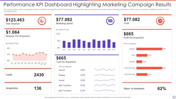
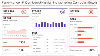
The purpose of this slide is to highlight results of marketing campaign through KPI dashboard. It provides information about total revenue generated, marketing expenditure, profit, cost per acquisition by different channels, return on investment etc.
People who downloaded this PowerPoint presentation also viewed the following :
Performance Kpi Dashboard Highlighting Marketing Campaign Results with all 7 slides:
Use our Performance Kpi Dashboard Highlighting Marketing Campaign Results to effectively help you save your valuable time. They are readymade to fit into any presentation structure.





FAQs for Performance Kpi Dashboard Highlighting
Effective KPI dashboards should include revenue metrics, customer acquisition costs, conversion rates, operational efficiency measures, and employee productivity indicators tailored to specific business objectives. These comprehensive dashboards enable organizations to track financial performance, monitor customer satisfaction, and assess operational bottlenecks, ultimately delivering real-time insights that streamline decision-making and enhance competitive advantage across departments.
KPI dashboards can be customized through role-based access controls, department-specific metrics selection, personalized visualization formats, and tailored reporting frequencies that align with each team's objectives. Sales teams might focus on conversion rates and pipeline metrics, while HR departments emphasize employee engagement and retention data, with finance teams tracking budget variance and cash flow, ultimately delivering relevant insights that enhance decision-making across organizational functions.
Best practices for KPI dashboard visualization include using clear hierarchical layouts, consistent color coding, appropriate chart types for each metric, minimal text overlays, and strategic white space management. These design principles streamline decision-making by reducing cognitive load, highlighting critical trends, and enabling rapid pattern recognition, with many organizations finding that well-designed dashboards ultimately deliver faster response times and improved operational efficiency.
KPI dashboards should be reviewed weekly or monthly for operational metrics, quarterly for strategic indicators, and updated immediately when business objectives change or data sources shift. The frequency depends on your industry pace and decision-making cycles, with retail and manufacturing often requiring daily monitoring, while financial services and healthcare typically benefit from monthly reviews, ultimately ensuring dashboards remain actionable and aligned with evolving business priorities.
Real-time data transforms KPI dashboards from static reports into dynamic decision-making tools by providing immediate visibility into performance fluctuations, operational bottlenecks, and emerging trends. This enables organizations across manufacturing, retail, and financial services to respond swiftly to issues, capitalize on opportunities, and maintain competitive advantage through proactive management rather than reactive corrections.
Stakeholders can ensure KPI alignment through strategic mapping exercises, cross-departmental collaboration, regular leadership reviews, and cascading objectives from high-level goals to operational metrics. Through systematic alignment processes, organizations streamline decision-making, enhance accountability, and drive measurable progress toward strategic outcomes, with many finding that quarterly alignment reviews and stakeholder input sessions ultimately deliver greater organizational focus and competitive advantage.
Recommended KPI dashboard tools include Tableau, Power BI, Qlik Sense, Google Data Studio, and Sisense, each offering drag-and-drop functionality, real-time data integration, and customizable visualizations. These platforms streamline dashboard creation by providing pre-built templates, automated data connections, and interactive features, with many organizations finding that cloud-based solutions deliver faster deployment and enhanced collaboration across teams.
Strategic color coding and intuitive design enhance KPI dashboard usability by creating visual hierarchies, enabling rapid data interpretation, and reducing cognitive load through consistent formatting. Through traffic light systems for status indicators, contrasting colors for critical metrics, and clean layouts that prioritize key information, organizations streamline decision-making processes, ultimately delivering faster insights and improved operational efficiency across teams.
Common pitfalls include displaying too many metrics simultaneously, using unclear visualizations, failing to align KPIs with strategic objectives, lacking real-time data integration, and poor mobile optimization. These design flaws overwhelm users and reduce decision-making effectiveness, with many organizations finding that streamlined dashboards focusing on 5-7 key metrics ultimately deliver better user adoption and actionable insights.
Qualitative data can be incorporated through visual text summaries, sentiment analysis scores, color-coded feedback categories, and contextual annotations that complement quantitative metrics. By integrating customer testimonials, employee feedback themes, and market insights alongside numerical KPIs, organizations streamline decision-making processes, enhance strategic understanding, and ultimately deliver more comprehensive performance visibility across departments.
Effective storytelling techniques for KPI dashboards include narrative frameworks, visual hierarchies, progressive disclosure, contextual annotations, and trend-based storytelling that transforms data into compelling business narratives. These approaches enable organizations to communicate complex performance insights through strategic sequencing, comparative analysis, and outcome-focused presentations, with many finding that storytelling enhances stakeholder engagement and accelerates data-driven decision-making across departments.
Mobile compatibility in KPI dashboards is achieved through responsive design frameworks, cloud-based platforms, progressive web applications, touch-optimized interfaces, and adaptive data visualization techniques. These technologies streamline mobile access by automatically adjusting layouts, optimizing load times, and ensuring seamless functionality across devices, with many executives finding that mobile-enabled dashboards deliver faster decision-making and enhanced operational oversight.
KPI dashboards deliver real-time visibility, automated data updates, interactive visualizations, and centralized performance tracking, while traditional reporting often involves manual compilation and delayed insights. Through streamlined monitoring, organizations across manufacturing, healthcare, and financial services enhance decision-making speed, reduce reporting overhead, and enable proactive performance management, ultimately delivering competitive advantage and operational efficiency.
User feedback can be gathered through surveys, usage analytics, stakeholder interviews, focus groups, and dashboard interaction tracking to identify pain points and improvement opportunities. This feedback integrates into iterative design cycles through A/B testing of dashboard elements, regular review sessions with key users, and agile development sprints, ultimately delivering more intuitive interfaces and actionable insights that enhance decision-making efficiency.
Ethical considerations include data privacy protection, employee consent for public visibility, avoiding discriminatory comparisons, ensuring accuracy and context, and preventing misuse of sensitive information. While transparent dashboards enhance accountability and organizational trust, they must balance openness with individual dignity, with many companies finding that anonymized metrics and clear data governance policies ultimately deliver better employee engagement without compromising personal privacy.
-
Great product, helpful indeed!
-
A perfect platform for all your presentation needs. Unlimited products at an affordable price.