


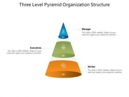
Three level pyramid organization structure




Try Before you Buy Download Free Sample Product
 Impress Your
 Audience
 100%
100% Editable
 Save Hours
 of Time


Convince folks you have the acumen with our Three Level Pyramid Organization Structure. They will establish your eligibility.
People who downloaded this PowerPoint presentation also viewed the following :
Three level pyramid organization structure with all 5 slides:
Earn the applause with our Three Level Pyramid Organization Structure. You will deserve every clap.


FAQs for Three level
Look, it's basically about not losing people halfway through your presentation. Start big picture, then get into the meat of it, finish with examples or what to do next. Think of it like storytelling - you need that beginning, middle, end thing or everyone just zones out. I've definitely been guilty of rambling presentations myself lol. The structure keeps YOU on track too since you can't just word-vomit random ideas everywhere. Honestly, once you map it out this way, everything feels way more polished. Try it on your next one - you'll see what I mean.
So here's the thing about pyramid structure - it's a game changer. Put your main point right at the top, then stack your key arguments underneath, and dump all the detailed evidence at the bottom. Journalists do this all the time because people have zero attention span these days. If someone stops reading after the first paragraph, they'll still get your point. I learned this the hard way after writing way too many emails that buried the important stuff halfway down. Trust me, lead with the "so what" and you'll sound way clearer when explaining complicated topics.
Don't pack too much into each level - learned this the hard way when I watched people's eyes glaze over during presentations. Your main point needs to be super clear. Then stick to just 2-3 supporting arguments underneath. I used to go crazy with sub-points (honestly still catch myself doing it sometimes). Three levels means three, not some sneaky five-level situation. Each tier should actually back up what's above it - sounds obvious but you'd be surprised how often this breaks down. Lead with your conclusion, then work your way down.
Honestly, the three-level pyramid is perfect for when you really need to sell something - like budget meetings or pitching new ideas. Put your main point at the top. Then add 2-3 supporting reasons in the middle. Bottom layer? That's your specific evidence and data. I probably use this for every important presentation now. The cool thing is executives can bail after level two if they're already sold, but if someone's being difficult, you've got all that backup proof ready. Actually saved my butt last month when our CFO kept pushing back on everything.
For your pyramid, try using different colors for each level - maybe go from dark at the bottom to lighter at the top. Icons help a ton if they actually relate to what you're talking about. Make your foundational text bigger since that's your main point, then scale down as you go up. Arrows or lines between sections show how everything connects (though honestly, sometimes they just add clutter). The whole thing should be scannable in like 3 seconds max. Oh, and avoid cramming too much text - people's attention spans are terrible these days. Clean designs usually win over busy ones.
Look, the three-level thing works because it basically forces you to pick just three main points - that's it. No wandering around or getting sidetracked. You put your big idea at the top, then three arguments that actually back it up underneath. Way cleaner than those chronological presentations where people ramble for like 10 minutes before getting to the point (honestly drives me crazy). Each level gets more detailed as you go down, but everything still connects to that main message at the top. Your audience can actually follow along since it all ladders back up. Seriously, try it next time - your whole argument becomes so much tighter.
So basically you want your top-level message first, then break that down into like 3-4 main points underneath. Details go at the bottom of each section. Think of it as a roadmap - people know where you're headed before you get into all the nitty-gritty stuff. Nobody zones out because they can actually follow your logic. Each piece connects back to your main point, which is honestly genius because most presentations are just random info dumps. Oh and definitely sketch this out beforehand - I learned that the hard way. Your audience will thank you for not making their brains work overtime trying to connect dots.
Okay so visuals are what make that three-tier thing actually click for people. Charts, diagrams, even just indented bullet points - whatever helps them see the hierarchy instantly. Without visuals, you're basically dumping info on them and crossing your fingers they'll organize it in their heads (spoiler: nope). I'd honestly start with something super simple like a triangle diagram. The visual cues pull their eyes from broad concepts down to specifics. Makes your whole argument way easier to follow instead of just being a wall of text.
Okay so basically you want to be super obvious about guiding people through your presentation. Say stuff like "let me zoom out here" or "now we're diving into details." Always pause after - people literally need a sec to catch up mentally. I learned this the hard way lol. Visual slides showing where you are in the structure help too. Don't assume anyone's following your logic automatically because they're probably not. Oh and practice those transition phrases beforehand so you don't sound like a robot when you're up there.
Honestly, just go with PowerPoint first - the SmartArt hierarchy templates are pretty decent and super fast. Google Slides has the same thing if you're not a Microsoft person. Want something prettier? Canva's templates look way more professional without the hassle. My coworker swears by Lucidchart for anything complex, and draw.io is solid too (they renamed it to diagrams.net for some reason). You could technically build one in Excel but that's kind of ridiculous unless you're already knee-deep in spreadsheet hell. Start simple with PowerPoint and see if it works - you can always make it fancier later.
Oh absolutely! The iPhone launch is the perfect example - Jobs broke it down into three parts: revolutionary interface, breakthrough internet device, and best iPod ever. Super clean. TED talks do this constantly because people actually remember stuff when it's grouped in threes. Your brain just works that way, which is kinda wild if you think about it. McKinsey consultants are obsessed with this structure too. Even politicians use it all the time. Honestly, once you notice the pattern you'll see it everywhere. Try mapping out your next presentation with three main points - it makes everything way more digestible.
So basically, the three-level thing works because people can actually follow where you're going. You know how some presentations just feel like a laundry list? This gives them a roadmap instead. Main point at the top, then your big supporting ideas, then all the nitty-gritty details underneath. People stay with you way better when they can see the structure. I swear it's like the difference between having GPS versus just wandering around hoping you'll find the right street. Try it next time - you'll see people actually nodding along instead of checking their phones.
Okay so first thing - use different colors or fonts for each pyramid level so people can actually tell them apart. Your top level needs to be crazy short, like painfully brief, because that's your main point. Then add more details as you go down. I literally always screw this up and put way too much in the first level lol. Keep formatting consistent within each level though. Oh and tell people when you're switching levels! Say something like "getting more specific now" or whatever. Definitely test it on someone first - what makes sense to you might be total chaos to them.
Feedback is honestly a game-changer for fixing your three-level pyramid. Shows you exactly where your logic falls apart or audiences check out. You'll see if your main point actually lands, whether your supporting stuff makes sense, or if you're missing something crucial. I've watched so many presentations crash because what seemed obvious to the presenter was total gibberish to everyone else - it's painful to watch. Use what people tell you to reorder arguments, beef up weak spots, or sometimes scrap your whole conclusion. Oh, and definitely run it by someone before the real thing. Trust me, beats getting those deer-in-headlights looks during your actual presentation.
Yeah, three-level pyramids are super common! Engineering teams do individual contributors → tech leads → directors all the time. Sales orgs work the same way with reps, managers, then VPs. Healthcare's got nurses, charge nurses, department heads. Honestly works great when you need clear escalation but hate bureaucratic nonsense slowing everything down. The sweet spot is usually 5-8 people per manager - any more and you're basically herding cats. Oh, and I've noticed it's literally everywhere once you start paying attention to org charts!
No Reviews