


0314 business ppt diagram 5 business gears steps powerpoint template





Try Before you Buy Download Free Sample Product
 Impress Your
 Audience
 100%
100% Editable
 Save Hours
 of Time


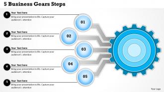
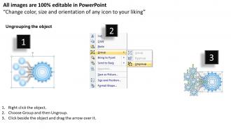
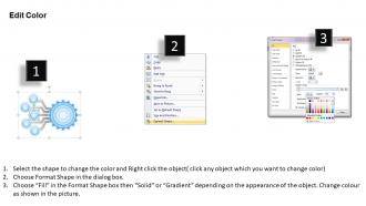
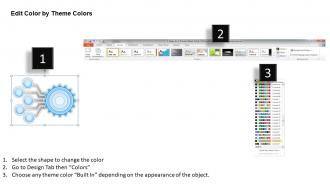
Demonstrate the value of business development using business gears steps PowerPoint visual design. This creative PPT background helps you to showcase the valuable information that how the corporate success can be achieved. Whether you are working in a multinational company or an entrepreneur you need effective strategic approach to accomplish your objectives. The gear shaped business presentation infographic allows you to convey the information to the investors, associates, colleagues that success can be achieved with the teamwork and every member is important when it comes to deliver some quality work. The designing experts have crafted this amazing PowerPoint illustration layout for the industry professionals. This professional presentation image provides you an option to stand out in the crowd as it inspire your team to achieve both individual as well as business targets. The PPT template slide is fully amendable and you may share it in your own style. Just have a look and then use it to fulfill your goals. You have repeatedly displayed your professional acumen. Now put a stamp of authority with our 0314 Business Ppt Diagram 5 Business Gears Steps Powerpoint Template.
People who downloaded this PowerPoint presentation also viewed the following :
0314 business ppt diagram 5 business gears steps powerpoint template with all 5 slides:
Our 0314 Business Ppt Diagram 5 Business Gears Steps Powerpoint Template give you something different. They help you create a new look.

FAQs for 0314 business ppt diagram 5 business gears
Ok so you need the basics: problem, solution, market size, financials, and team. Investors will definitely grill you on competitors - honestly that question comes up every single time. Keep slides super visual, especially money stuff. Hook them fast with your exec summary, like first 2 minutes or you've lost them. Be specific about funding - exactly how much and where it goes. Oh and practice without slides because the projector will 100% break when you need it most. Trust me on that one lol.
Honestly, visuals are a game-changer for business presentations. People's brains just process diagrams and flowcharts way faster than walls of text. Nobody wants to stare at another boring slide full of bullet points - I've been in those meetings and everyone's eyes glaze over. Try using roadmaps or simple step-by-step graphics to show how your strategy actually works. Even something basic like gears connecting different parts of your business can make complex stuff click for people. Trust me, one good visual that tells your story will stick with stakeholders way longer than paragraphs of explanation.
Think of presentation templates as brand guardrails for your team. They keep everyone using the same fonts, colors, and layouts so everything looks professional and cohesive. Otherwise you get chaos - I've literally seen presentations with like 5 different fonts that looked absolutely terrible. Templates save tons of time too since people aren't building slides from scratch every single time. Sales, marketing, whoever - they'll all look like they're from the same company. Just create a few solid templates for different presentation types and actually make your team use them. It's honestly one of those simple fixes that makes a huge difference.
Dude, turn your data into actual stories about real people - customers, employees, whoever your audience gives a shit about. Walk them through someone's journey instead of just throwing charts at them. People's eyes glaze over with raw numbers, but frame those same metrics in a story? Game changer. Use something like "Picture this..." or "So last month, our biggest client Sarah calls me..." Trust me, the whole vibe in the room shifts. Problem, struggle, solution, outcome - that's your formula right there. Way better than boring-ass bullet points.
Focus on revenue growth, profit margins, and customer acquisition costs - those three are your bread and butter. Customer retention rates matter too, plus maybe cost per sale if you have room. Executives eat up those trend lines, trust me. Year-over-year comparisons are clutch because numbers without context mean nothing. Keep slides super clean and put your biggest wins (or disasters) right up front. Oh, and definitely prep talking points for each metric so you're not just standing there reading numbers like a robot. That's always awkward.
Honestly, you just gotta figure out what each group actually wants to hear. Investors? Hit them with ROI numbers and market size right off the bat - they're only thinking about profit. Employees care more about how stuff impacts their actual job and whether they can grow. I totally bombed a board presentation once because I spent like 10 minutes talking about team happiness... they didn't care at all lol. Switch up your language too. Investors eat up all that business-speak and data, but your team just wants you to talk normally. Before you start any presentation, literally ask yourself "what do THEY get out of this?" Makes everything way clearer.
Big fonts and high contrast colors are your best friends - people in the back need to actually see your stuff. One main point per slide, that's it. Skip the bullet point overload (I've sat through way too many of those). Images work better than walls of text anyway. Charts should be super simple, or throw in a good quote instead. The story approach beats just rattling off features every time. Oh, and don't forget a clear call-to-action on your last slide so people know what you want them to do.
Dude, infographics literally saved my presentations. People's eyes used to glaze over when I'd show spreadsheets - now they actually pay attention. Your brain processes visuals way faster than text, so suddenly those complex trends make sense at a glance. Charts and icons tell the story better than rows of numbers ever will. Honestly, I wish I'd figured this out sooner. Try it next time you've got quarterly results or market data to present. Convert your main points into a simple visual first. You'll see the difference immediately - way more engagement than boring old spreadsheets.
Practice out loud way more than feels necessary - like, embarrassingly much. Know your stuff so well that nerves can't derail you. Three deep breaths before starting helps tons. Pick one friendly face if the whole crowd feels intense. I honestly used to spiral about presentations constantly! Getting there early to mess with the tech saves you from last-minute panic. Oh, and the audience genuinely wants you to do well, not bomb. Some jitters are actually good - makes you seem more real. You've got this.
Oh man, this stuff is so tricky! Americans love those direct, data-packed pitches, but try that in Tokyo and you might totally miss the mark. Asian cultures are way more about building relationships first - less "here are the numbers" and more getting to know each other. Europeans? They want ALL the technical details, like way more than we'd normally share here. I learned this the hard way once, actually. You should definitely research their cultural norms first. Also adjust how direct you're being, and budget extra time for Q&A since some cultures won't interrupt you even if they're confused.
Honestly, skip the basic PowerPoint if you can. Canva Pro is my go-to - super easy to use and the templates actually look professional. Prezi's cool for those fancy zoom-in presentations, though sometimes it makes people dizzy lol. If you're dealing with lots of data, Tableau's worth checking out. Google Slides works too, especially since it syncs with your spreadsheets automatically. Just pick whatever your team will actually stick with. I'd probably start with Canva Pro since anyone can figure it out pretty quickly and the collaboration stuff is solid.
Dude, you NEED a call to action or you're basically just doing fancy storytime. I mean, what's the point otherwise? Be super specific about what happens next - like "I need budget approval by Friday so we can start Monday" instead of that wishy-washy "let's touch base" garbage. Whether it's scheduling meetings, getting sign-offs, whatever - give them concrete steps and deadlines. Don't let people wiggle out with vague responses. End strong with something like "who's in?" so they actually have to commit right there.
Dude, definitely go with clean fonts - Calibri or Arial work great. Pick consistent colors (your company ones if you have them) and don't cram everything together. White space is your friend! I swear, some presentations look like a unicorn threw up on them lol. Make your text big enough so people in the back can actually see it. Bullet points beat paragraph dumps every time. Oh, and align stuff properly - crooked slides drive me nuts. Test everything on the actual projector beforehand though. Trust me on that one - you don't want tech issues mid-presentation!
Send out a quick survey within 24 hours while everything's still fresh in their minds. I always ask what confused them most - people are weirdly honest about that stuff! Try to do a verbal check right after your presentation too since half the audience won't bother with surveys later. Keep it short though, like 3-4 questions max about clarity and engagement. Mix in some rating scales with open-ended questions so you get the full picture. The trick is making it stupidly easy to respond - under 2 minutes or they'll bail. Track patterns across multiple presentations and you'll start spotting your weak spots.
Honestly, minimalist layouts are everywhere right now - tons of white space, clean lines. Interactive charts for data storytelling are pretty hot too. Dark mode templates make everything look way more polished, though I'm probably biased since I use dark mode for literally everything. Micro-animations between slides are clutch, and bold sans-serif fonts that don't strain your eyes on screens. Oh, and those gradient overlays everyone's doing. The whole vibe should feel more like a sleek app than boring old PowerPoint. I'd say pick one trend first and try it out on your next presentation - see what works.
-
Innovative and Colorful designs.
-
I discovered this website through a google search, the services matched my needs perfectly and the pricing was very reasonable. I was thrilled with the product and the customer service. I will definitely use their slides again for my presentations and recommend them to other colleagues.