


0314 thank you slide with contact details 1




Try Before you Buy Download Free Sample Product
 Impress Your
 Audience
 100%
100% Editable
 Save Hours
 of Time


Do you still follow the traditional approach to end your presentation slide? It’s time to bring to use our uniquely designed 0314 Thank You Slide With Contact Details 1 with a handshake picture from the clip art to support the PowerPoint PPT. The PPT design helps to bring in variation to your working style, signify the business relationship, reinforce the connection to the next level and summarize the points of discussion. It often leaves a bad impression if we don’t follow up or provide the necessary contact details – may it be FAX, e mail id, phone number or office address- this PowerPoint visual does it all. In order to register the audience for the next phase this Presentation slideshow is of utmost importance as it triggers lot of important questions and answers plus helps to acknowledge the fact that even their presence was very important for the smoothing running of the meeting and it is important to thank them for their time.Our 0314 Thank You Slide With Contact Details 1 create a cordial atmosphere. Smiles will start flashing your way.
People who downloaded this PowerPoint presentation also viewed the following :
Content of this Powerpoint Presentation
Description:
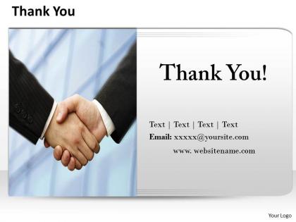
The image displayed is a professional closing slide used typically at the end of a presentation or a meeting. It encompasses various textual elements designed to offer closure, express gratitude, and provide contact information to the audience. The slide has a dominant "Thank You!" header at the top, indicating that the presentation is reaching its conclusion and acknowledges the audience's time and attention.
In the middle part of the slide, there is a handshake image, symbolizing the agreement, successful deal, partnership, or completion of a discussion. The handshake is a universal sign of professionalism and mutual respect in the business world.
Below the handshake, additional placeholders marked with "Text | Text | Text | Text" suggest where additional personalized information or key takeaways can be added. These are likely to be bullet points summarizing the content or action items for the future.
At the bottom, there is space allocated for contact detail with placeholders for an email address ("Email: [email protected]") and a website URL ("www.websitename.com"). This portion of the slide is intended to offer the presenter's contact information, making it easy for audience members to reach out for further engagement or inquiries.
The slide also provides space for a company logo, which reinforces the company's brand and allows for visual consistency throughout the presentation.
Use Cases:
Here are seven potential industries where this type of slide could be used, along with their specific uses, presenters, and audiences:
1. Corporate Finance:
Use: Ending a financial report presentation.
Presenter: CFO or Financial Analyst.
Audience: Stakeholders or investors.
2. Technology Startups:
Use: Concluding a product pitch or investor update.
Presenter: CEO or Product Manager.
Audience: Potential investors or partners.
3. Academic Conferences:
Use: Wrapping up a research presentation or lecture.
Presenter: Researcher or Academic Professor.
Audience: Students, colleagues, or conference attendees.
4. Health Care:
Use: Finishing a medical conference talk or workshop summary.
Presenter: Medical Doctor or Health Care Administrator.
Audience: Medical professionals or healthcare industry stakeholders.
5. Real Estate:
Use: Closing a real estate investment or market trend seminar.
Presenter: Real Estate Agent or Market Analyst.
Audience: Investors, clients, or industry experts.
6. Marketing Agencies:
Use: Ending a marketing strategy presentation or campaign analysis.
Presenter: Marketing Director or Brand Strategist.
Audience: Clients, the marketing team, or potential customers.
7. Non-profit Organizations:
Use: Closing a fund-raising event or results presentation.
Presenter: Executive Director or Development Officer.
Audience: Donors, volunteers, or board members.
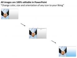
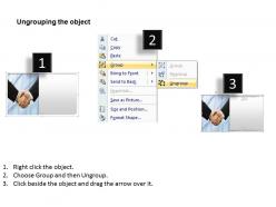
0314 thank you slide with contact details 1 with all 5 slides:
Refine your thoughts with our 0314 Thank You Slide With Contact Details 1. Narrow them down to the very best.
FAQs for 0314 thank you slide with
Definitely put your email and LinkedIn on there. Phone too if it makes sense for your situation. I always add a QR code to my LinkedIn - people are weirdly obsessed with scanning those things! Make sure there's a clear next step like "Let's connect" or "Questions?" Include any resources you mentioned during your talk too. Links to reports, your company site, whatever. Keep it clean but throw your logo/colors on there. The whole point is making it super easy for people to reach you afterward. That's honestly where the best conversations happen anyway.
Honestly, colors matter way more than you'd think for thank you slides. Blues and greens just hit different - they make people feel good about what they just heard. But man, avoid anything too bright or clashing. I once used this neon yellow that was... let's just say nobody thanked me for that choice! If you've got brand colors, use those. Otherwise stick with something calm and professional that fits your whole presentation vibe. People remember that last thing they see, so don't mess it up with jarring colors when you're trying to end strong.
Honestly, just go with something basic like Arial or Helvetica - or whatever font you've been using throughout your presentation. Don't get fancy with some curly script that nobody can actually read from their seats. Make your "Thank You" big and bold, then shrink down the font for contact info stuff underneath. Sans-serif fonts are your friend here since they're way easier to read from far away. I learned this the hard way when I used some "elegant" font once and people were literally squinting at my slides. If the person in the back row can't read it, it's too complicated.
Swap out your contact details first - use the email or phone number that makes most sense for that crowd. Your call-to-action should match what they'll actually do next, whether that's booking time with you or grabbing some resources. The small stuff really matters though. Drop in something specific about their industry or reference a point from your talk. Executives want it short and actionable. Tech folks? They'll appreciate links to docs or deeper materials. One thing I learned the hard way - have your personalized version locked and loaded before you start presenting. You don't want to be frantically editing slides while people are filing out.
Go for photos of your actual team or behind-the-scenes stuff from your project. Way better than those awful stock photos of people in suits shaking hands - ugh. Hand-drawn doodles work too, or candid office shots. Really anything that feels personal instead of corporate. Icons are clutch for contact info and next steps. Just don't go overboard with the design so people can actually read your details. Match whatever vibe your presentation already has, but add some human personality to it.
Honestly, just tie your thank you slide back to where you started. Something like "We kicked off today talking about [problem]..." then circle back to your solution. Don't go overboard though - I've seen people turn it into this whole dramatic thing that drags on forever. Keep it snappy! You're basically creating a story arc so it feels complete instead of just awkward silence after "Any questions?" Try "Now that we've figured out the path forward..." or whatever fits your vibe. Your audience gets that satisfying wrap-up feeling, and your whole presentation seems way more polished. It's such a small thing but makes a huge difference.
Don't cram everything onto one slide - contact info, social handles, AND a long call-to-action is way too much. People's eyes just glaze over. Use readable fonts too (seems obvious but you'd be surprised how many presentations I've sat through where I literally can't read the email address). Your thank you should connect to what you actually talked about, not some generic "thanks for your time" thing. Oh, and here's the big one - actually pause when you get to this slide. I see so many people rush through their contact info like they're embarrassed or something, then wonder why nobody follows up later.
Honestly, adding some soft background music to your thank you slide is a game changer. Makes it way more memorable and hits those feel-good vibes. Just don't go overboard - you want something gentle like ambient music or acoustic tracks, not anything that'll drown out your message. A simple chime sound effect works too when the slide pops up. I learned this the hard way after using dramatic music once and everyone was more focused on that than what I was saying lol. Test your audio beforehand though, and have a backup ready because tech always fails at the worst moments.
Honestly, I'd go with like 30-60 seconds depending on the crowd. Smaller groups? 30 seconds works fine since people can jump right into questions. But bigger audiences need more time to process that you're actually done - maybe closer to a minute. I've watched people flash their thank you slide for literally 10 seconds and bail, which feels super rushed. Almost rude? The slide basically signals you're open for Q&A, so don't rush it. Just keep it simple - "Thank You" plus your email or whatever. Use those seconds to read the room and see if anyone's got questions brewing.
Don't just slap "Thanks for listening!" on your last slide - that's wasted space! Make it work for you instead. Put "Questions?" or "Let's discuss" with your contact info right there. People always screenshot the thank you slide, so I throw my email and LinkedIn on it. You could ask something like "What resonated most?" to get conversation going. Some folks even add QR codes for extra resources (though honestly, half the time those don't work anyway). The whole point is making it super easy for people to keep talking with you afterward.
Okay so here's the thing - your thank you slide is literally the last impression you make, and it usually sits there forever during Q&A. Don't waste that prime real estate! Slap your logo and brand colors on there because that's what people will remember (and probably screenshot). I've sat through way too many presentations where the final slide is just boring text. Your branding makes you look legit and helps you stand out from whoever else they're considering. Oh, and definitely throw your contact info on there too - make it easy for people to find you later.
Don't just throw up a boring "thanks" slide and walk away. That's your moment to actually do something useful! Add specific next steps like "I'll email you the proposal by Thursday" or "Let's grab coffee next week to discuss this more." Include your contact info obviously. Most presenters totally waste this opportunity which is kinda crazy when you think about it. You've got everyone's attention right then - why not use it? Mention any upcoming events or projects they might care about. Make it clear what happens next instead of leaving people hanging.
Honestly, the best thank you slides I've seen have clear next steps right there - like "email me at..." or LinkedIn info. Apple does this perfectly, btw. Super clean with just one obvious action. TED speakers are great at this too - they'll throw in a powerful quote or visual that hammers home their main point along with contact details. But here's the thing: don't try to squeeze everything onto one slide. Some presentations even add bonus value, like key takeaways or a free download link. Pick the ONE thing you most want people to do and make it dead obvious. Works way better than cluttering it up.
Oh absolutely, culture totally changes how you should do thank you slides. Japanese folks expect you to acknowledge hierarchy and be super detailed about it. Scandinavians? They want simple and direct. Colors are weird too - red's lucky in China but screams danger other places. Some cultures want you thanking individuals specifically, others prefer group thanks. Honestly, the formal vs casual thing trips people up the most. When I'm not sure about an audience, I always go more formal than casual. Better safe than sorry, you know? Just do a quick Google about their cultural norms first.
Go with at least 1920x1080 resolution - most projectors handle that fine. Make your contact info and QR codes big enough so people in the back can actually see them. Nobody wants to squint at tiny text. Save as PDF when you're sharing digitally later, it keeps everything looking right across different devices. File size matters too if you're emailing it around. Compress your images but don't go crazy or the text gets all pixelated and gross. Test it on both light and dark backgrounds since venues are unpredictable. Oh, and definitely keep backups - one local, one in the cloud. You'll thank yourself later.
-
Editable templates with innovative design and color combination.
-
Amazing product with appealing content and design.