

0314 thank you end slide design





Try Before you Buy Download Free Sample Product
 Impress Your
 Audience
 100%
100% Editable
 Save Hours
 of Time


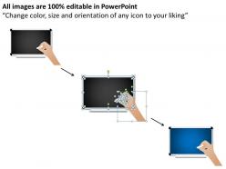
We present to you 0314 Thank You End Slide Design which supports the art graphic of a black board image and chalk, through which message is being conveyed. The thank you slide can not only be used when the meeting or conference ends however it can be used in the very beginning to greet the audience for their presence. This presentation graphic thus makes a good presenter-audience relationship and keeps away the awkwardness, because then audience prove to be really very supportive. Besides just beginning or ending the meeting with thank you note custom, this message can be conveyed at any moment in the meeting, so this PowerPoint presentation adds that professional touch. Because the audience also play an important role in making the presentation work with their own gestures like contributing ideas, laughing, clapping, participating and giving value, hence it becomes all the more important to reciprocate the same gesture in the same way and avoid throwing any negative impression using the presentation visual.Conquer the moment with our 0314 Thank You End Slide Design. Herald the victory of your ideas.
People who downloaded this PowerPoint presentation also viewed the following :
0314 thank you end slide design with all 5 slides:
Stir it up with our 0314 Thank You End Slide Design. Keep your audience in an ebullient mood.

FAQs for 0314 thank you
Honestly, less is more with thank you slides. Put your "Thank You" front and center - that's what people need to see first. Don't go crazy with graphics or mix like 5 different fonts (trust me, I've seen some disasters). White space is your friend here. Keep your colors matching whatever you used in the rest of your deck. Contact info should be big enough that someone in the back row can actually read it - seems obvious but you'd be surprised. I usually stick to maybe 2 or 3 things max on the whole slide. Clean typography beats fancy design every time.
Dude, colors seriously matter more than people think for thank you slides. Soft blues and greens make people feel chill and trusting. Oranges and yellows? They're great for that positive, energetic vibe. I cringe when I see harsh reds or those depressing gray slides - like why would you end on that note? Your audience should walk away feeling good, not weird or disconnected. Pick something that fits your brand but goes warmer if you can. Oh, and definitely test it first - just show someone and see what their gut reaction is. You'll know pretty quick if it's working.
Honestly, just go with clean sans-serif fonts like Montserrat or Open Sans - they look friendly but won't give people headaches trying to read them. Script fonts seem tempting but trust me, they're a nightmare on projectors. Skip Times New Roman unless you want your thank you to feel like a corporate memo. Make everything at least 24pt so the people in back can actually see it. Oh, and don't go crazy with multiple fonts - one or two max. Quick test: stand across the room and see if you can read it. If you're squinting, everyone else will be too.
Go with visuals that feel warm and connected - hands reaching out, people working together, maybe hearts or handshake icons. Your actual team photos work way better than stock stuff (which honestly can look pretty generic). Match whatever image you pick to the vibe you're going for. Don't clutter things up though - your gratitude should be front and center. Warm colors are your friend here: soft blues, greens, neutral tones. I'd stick with one meaningful image paired with text rather than cramming a bunch of graphics on there. Less is definitely more with this kind of thing.
Ugh, don't cram a novel onto your last slide - that's the worst thing you can do. Generic stock photos are almost as bad, honestly. Just stick to your main point and maybe one decent image. Oh, and ease up on the sales pitch! People literally just listened to you talk for however long, so let them process for a sec. Make your contact info big enough that someone can actually see it from the back. One clear next step works way better than confusing them with options. Really, simpler is always better with closing slides.
So for formal stuff, just keep it clean - corporate colors, your logo, basic "Thank you for your time." Pretty standard. But informal presentations? Go nuts! Bright colors, fun fonts, casual "Thanks!" or even emojis if your crowd's into that. I've actually seen people nail it with memes on thank you slides, which sounds weird but totally works sometimes. Just match whatever energy you had throughout the whole thing. Oh and honestly, if you're not sure which way to go, being a little too formal beats looking unprofessional.
Honestly, whitespace is a game-changer for thank you slides. Give your "thank you" room to breathe instead of cramming everything together like most people do. It's like that pause after a joke - makes way more impact. Don't let your main message compete with contact info or logos. I've seen so many slides that look totally messy because they stuff everything in there. Space things out on purpose to create some visual hierarchy. Start with your thank you having plenty of room, then add other stuff with intentional gaps between elements.
Dude, don't waste your thank you slide! Most people just throw "Thanks!" on there and call it done, but your audience is literally staring at that screen for like 10 extra seconds. That's prime real estate. Instead, sneak your main point in there one last time. So instead of generic thanks, try "Thank you - Customer feedback drives our Q3 strategy" or whatever your big takeaway was. It's honestly the last thing they'll see before questions start flying, so why not make it stick? I've seen too many good presentations fizzle out with boring end slides.
Honestly, interactive Q&A slides work great - just let people ask whatever they want. Quick polls are solid too since everyone loves sharing their opinions (sometimes too much lol). Instead of boring "thank you" slides, try highlighting your main points with cool visuals or numbers. Oh, and resource slides with actual useful links? Way better than generic thanks. Some presenters do "what's next" steps which keeps people engaged. The whole point is avoiding that awkward fade-out at the end. Pick something that either gets them involved or gives them something they'll actually use later.
For your thank you page, fade-ins are perfect - they feel welcoming without being annoying. Try sliding your main text in from the left, then delay your email/social links by like half a second. Honestly, I've seen people go crazy with bouncing animations and it's just... no. Don't do that. Keep everything under 1 second since people are mentally checking out at this point anyway. You want it smooth, not flashy. Oh and make sure nothing loops - that gets irritating fast. Test the timing when you click through to see if it flows naturally.
Definitely throw your contact info on there - email, LinkedIn, company site if it makes sense. I always recap my main point too since half the room checks out during Q&A. List any resources you mentioned so people can find them later. QR codes are kinda trendy now for linking to extra stuff or your contact card - actually works pretty well. Oh, and don't just say "thanks" and disappear. Make it brain-dead simple for anyone interested to reach you afterward. That's literally the whole point of the slide.
Just match your thank you slide to whoever's watching! Corporate folks want clean, professional stuff - no fancy colors or weird fonts. Younger crowds? Go wild with bright colors, casual language, maybe even throw in a meme if it fits (I've seen it work surprisingly well). Different cultures respond to different colors and symbols too, so think about that. Oh, and if you're presenting to like doctors or engineers, use their lingo and imagery they'll recognize. Basically ask yourself how they'd normally talk to each other, then copy that vibe. Makes such a difference honestly.
Put your thank you slide right after your main content wraps up but before Q&A starts. It's like a clear "hey, I'm done with the main stuff" signal to your audience. So many people just dive straight into questions - drives me nuts honestly. If you're doing Q&A, make it second-to-last. No Q&A? Then it goes last. Oh, and throw your contact info on there too since that slide usually stays up while everyone's shuffling around afterward. Perfect time for people to snap a pic of your email.
Honestly, just watch people's reactions when you get to that final slide. Are they already packing up or scrolling their phones? That's your cue the slide's probably boring them. After each presentation, I jot down what felt off - like if someone asked a question I totally could've answered right there on the slide. Super annoying when that happens! Body language tells you everything too. If they look confused about next steps, you know what to fix. Try changing one thing at a time in your next few presentations and see if people stay more engaged.
Honestly, minimalist designs are killing it right now - clean white background with one bold "Thank You" in huge font. Gradient backgrounds are everywhere too, especially those sunset vibes. I'd actually skip stock photos and use real candid shots of your team instead. Way more authentic. Simple icon-based designs work well if they match your industry. Oh, and definitely stick to your brand colors but don't be scared to go bolder than your regular slides. You'll thank me later when everyone's asking about your template!
-
Unique research projects to present in meeting.
-
Presentation Design is very nice, good work with the content as well.