


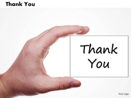
0314 thank you design slide




Try Before you Buy Download Free Sample Product
 Impress Your
 Audience
 100%
100% Editable
 Save Hours
 of Time


One of the classic way to greet someone is actually show concern to mark the fact that there presence matters in a good way and to continuing with this tradition we present to you 0314 Thank You Design Slide. This PPT diagram is very important for the fact that audience should not feel like a hostage while attending the meeting and they should be signed off from the meeting with a good thank you note. It is widely acknowledged fact that audience always remember the last words or sentences best, so it is important that those should be good enough to have a long lasting impact. Thank you slide should not be just a tradition, which is followed by all and says thank you for not leaving the hall, however this PowerPoint presentation serves the same purpose but in the other way round. This thank you slide is a very polite way of sincerely thanking the audience rather than a thrown away line used by everyone. Our 0314 Thank You Design Slide create the fun factor. They convert groans into grins.
People who downloaded this PowerPoint presentation also viewed the following :
0314 thank you design slide with all 2 slides:
Let our 0314 Thank You Design Slide be your constant companion. They will literally walk your talk.
FAQs for 0314 thank
Definitely include your contact stuff - email, LinkedIn, job title. People will screenshot this slide later and totally forget what presentation it was from, so throw the title and date on there too. Make it super clear what you want them to do next with something like "Questions?" or "Let's connect." Oh, and if you mentioned any resources during your talk, list those here since this slide stays up forever during Q&A. Just keep everything big enough that people in the back can actually read it - I've seen too many tiny-font thank you slides that are basically useless.
Honestly, a "Thank You" slide is clutch because it shows you actually value people's time - and that matters more than you'd think. It creates this natural moment where folks feel comfortable jumping in with questions instead of you just... ending weird and awkward. Plus it gives you a second to catch your breath before Q&A starts. Way better than abruptly saying "welp, that's it" and bolting. I'd throw your contact info on there too so people can hit you up later if something comes to mind. It's basically signaling you're down for actual conversation, not just talking at them.
Honestly, don't stress too much about these slides - I've seen people go way overboard. Just keep it clean with lots of white space and make your font bigger than normal so people can actually read it. Stick with whatever colors you used in the rest of your presentation. Your contact info needs to be visible but shouldn't take over the whole thing, you know? Maybe throw in your logo or something simple if you want, but seriously, less is more here. The goal is just making it super easy for people to grab your details quickly.
Yeah, so your audience totally changes how you write that final slide. Younger crowds? Go casual - "Thanks for hanging out!" or throw in some emojis. But if you're presenting to executives or older folks, stick with the classic "We appreciate your time." Industry's huge too. Tech people don't care if you're informal, but financial execs will judge you for it (learned that one the hard way). Oh, and cultural stuff matters - some groups prefer individual recognition vs. group shoutouts. Honestly though, just match whatever tone you used throughout your presentation. When I'm unsure, I go slightly more formal than my gut says.
Don't just slap "Thanks!" on a blank slide and call it done. Your contact info should be easy to read - none of that tiny font nonsense. Skip the random stock photos that make no sense with your topic. Instead of "Any questions?" be specific about what you actually want from people. A QR code is pretty clutch for networking too. Keep it clean but make sure your details stand out. I mean, it's literally your last shot to leave a good impression, so don't waste it on something that looks like you threw it together in 30 seconds.
Honestly, it's all about reading the room. Corporate folks want polish - throw in your contact info, next steps, maybe "Questions?" or whatever call-to-action makes sense. Academic presentations? Way more chill. Half the professors aren't even looking at your final slide anyway lol. But you could do references, thank contributors, or drop some thought-provoking question. Here's the thing - corporate wants action, academic wants discussion. Different vibes entirely. Oh, and always have your contact ready either way. The real conversations start after you stop talking.
Dude, visuals make such a difference for gratitude stuff. People connect emotionally with images way more than just text. Go for warm, genuine shots - handshakes, actual smiling people, maybe some welcoming colors. Just please avoid those cheesy stock photos (you know the ones I mean). Your images should match whatever you're saying and who you're talking to. Company branding works too, or simple icons if that's more your vibe. Oh and abstract designs can be pretty effective actually. The whole point is making people feel genuinely appreciated, not like they're getting some corporate form letter.
Honestly, those boring "Thank You" slides drive me nuts – total missed opportunity! Instead, throw in something like "Questions?" or "Let's chat more" with your contact info. I always include my email and LinkedIn right there. Makes it super easy for people to follow up. A QR code works great too if you've got extra resources or want feedback. The whole point is keeping the conversation going, not awkwardly ending it. Your slide should basically say "hey, reach out!" not just... thanks and done.
Honestly, there's so much more you can do than just throwing your logo on there. Use your brand colors as a gradient background - looks way cleaner. Or add your company values as bullet points like "Thanks for trusting our commitment to innovation." I've noticed some people use their brand's patterns as subtle overlays, which is pretty smart. Match your slide's vibe to how you normally talk too. If you're usually playful, toss in a fun GIF or something. The whole point is making it feel like YOU while still being grateful. Just start with whatever brand guidelines you have and go from there.
Oh totally! Different cultures are huge for this stuff. Japanese audiences expect way more formal language and those deeper bow visuals - shows respect. Americans? Just go casual with "Thanks for your time!" Colors are tricky too. Red's lucky in China but screams danger other places (learned that one the hard way lol). Middle Eastern folks read right-to-left so your text should flow that way. Do your homework on the specific audience first. Honestly though, if you're unsure just go more formal than less - nobody's ever been offended by being too respectful, you know?
Okay so here's the thing - your thank you slide can actually boost retention by like 15-25% if you do it right. People remember the beginning and end of presentations best, so don't waste that prime real estate with just "Thanks!" I used to do that all the time and it's such a missed opportunity. Instead, throw your main takeaway or call-to-action on there. Your audience is still tuned in but they're already shifting into "okay what's next" mode. Give them something concrete to remember. Short sentences work great here. Make that final slide actually earn its spot.
Yeah, totally! That thank you slide is actually perfect timing - everyone's paying attention after you just delivered something useful. Skip the boring "thanks for listening" stuff. Try "Questions? Email me at..." or "Want to see this in action? Book a demo here." QR codes work great too. I've seen people do "Find me on LinkedIn - I actually check my messages there!" which feels way more personal. The trick is being super specific about what they should do next. People need that clear direction right when they're most interested, you know? Otherwise that energy just fizzles out.
Honestly? About 30-60 seconds depending on your crowd. Small group meetings, 30 seconds is plenty. But bigger audiences need more time to mentally switch from "listening mode" to "question mode" - they're slower to react. I always use that time to scan the room and see who looks like they're gearing up to ask something. The worst is when presenters leave it up there for like 3 minutes... so awkward. Nobody knows what to do with themselves. Just don't rush it off too fast either - people need a beat to process that you're actually done.
You've got tons of great examples to pull from! Apple always goes super minimal - just "Thank You" in their clean font on white. Steve Jobs did the same thing, nothing flashy but it stuck with people. TED speakers usually throw in personal photos or quotes that mean something to them. Obama's campaign slides paired "Thank You" with those powerful rally shots. Honestly, the best ones just match whoever's presenting. Don't stress about making it perfect - go with whatever feels like *you*. Could be minimal and sleek, or warm with personal touches.
Dude, just throw your contact info right on that thank you slide. QR code for a quick survey works great - people love scanning those things. Your email or LinkedIn too if you want. Way better than crossing your fingers someone will hunt you down later. Ask something simple like "What hit home for you?" Nothing that feels like work. Honestly, timing is everything here. They're already sitting there with phones out and still thinking about your talk. Make it brain-dead easy to respond while you've got their attention. Short sentences on the slide work best - don't make them squint at paragraphs.
-
Topic best represented with attractive design.
-
Use of icon with content is very relateable, informative and appealing.