


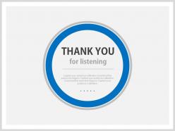
Blue background thank you slide for listening powerpoint slides





Try Before you Buy Download Free Sample Product
 Impress Your
 Audience
 100%
100% Editable
 Save Hours
 of Time


Thanks giving is an act of good deed and also celebrated as one of the important festival in many countries whereas its having a traditional and cultural value too so this time we have come up with an blue background thank you slide for listening PowerPoint Slides which helps you in obliging towards your listener’s for giving their precious moments towards your content, article etc. This Presentation design will also help you in explaining the value of saying thank you for your deeds as it helps in engaging the interest of your audiences and will give them a personal touch also which makes them feel connected till the very last word . Our PowerPoint layout will result in good rewards by being obliged such as from a peaceful social life to a continuous success in business etc. Start downloading this PPT layout which will improve the efficiency of your context and maintains a strong bond with the potential audiences. Doubts begin to crumble with our Blue Background Thank You Slide For Listening Powerpoint Slides. They allow the facts to flow in.
People who downloaded this PowerPoint presentation also viewed the following :
Blue background thank you slide for listening powerpoint slides with all 4 slides:
Bind your ideas with our Blue Background Thank You Slide For Listening Powerpoint Slides. They will add great value to the worth of your package.
FAQs for Blue background thank you slide for
Definitely put a big "Thank You" at the top, then add your email and LinkedIn - people always want to connect after. Oh, and throw in your company website or links to stuff you mentioned during the talk. Keep it looking consistent with your other slides though. Here's the thing nobody tells you: this slide gets screenshotted more than any other! So don't rush off stage right away. Give people like 30 seconds to actually grab their phones and get your info. I've seen so many speakers just click past it immediately and everyone's scrambling with their cameras.
Your thank you slide should match the rest of your presentation - same fonts, colors, all that stuff. I've watched too many people throw in some random generic template at the end and honestly? It's such a waste. This is literally your last shot to make an impression. Maybe add a quick visual nod to your main points or stick your contact info on there if you want people reaching out later. Just keep it clean but don't make it boring - you want them walking away actually remembering what you said.
Deep blues and soft golds are your best bet here - those earthy tones just feel more genuine, you know? Navy with cream looks classic too. Definitely skip bright reds though, way too aggressive for a thank you moment. Oh, and muted greens work great if that fits your brand better. The whole point is keeping people comfortable, not hitting them with harsh contrasts. Make sure your text pops against whatever background you pick. I'd throw in a subtle gradient or texture to make it look less... basic? Just test it on a few different screens first since colors can look weird depending on the display.
Oh totally! I made this mistake with a Japanese client once - used bright colors and it felt way too casual for them. Some cultures want clean, minimal designs while others love vibrant stuff. The words matter too. Formal vs casual can make or break it. Quick tip: research your audience first or grab a local colleague to check your design. Colors especially can be tricky - what looks celebratory to us might read differently elsewhere. Font choices count too, though that's probably overthinking it a bit. Better safe than sorry though!
Throw in their company logo or reference something specific they mentioned during Q&A - makes a huge difference. Local stuff works great too, like a pic of the conference city or an inside joke about their industry. I always cringe when speakers use the exact same generic slide everywhere. QR codes are clutch for contact info, way easier than people frantically writing down your email. Oh, and if someone said something quotable during the session, definitely work that in. Small touches like this make it obvious you didn't just phone it in with some template.
Honestly, just tuck your logo in a corner somewhere - don't make it the star of the show. Your brand colors can blend into the background naturally. Contact info works great too, or maybe a link to something actually useful. I've seen way too many thank you slides that feel like giant billboards (so awkward). Your website URL is perfect because it helps without being all salesy. The whole point is making people feel good about your presentation, not like they just sat through a pitch. If you nailed it, they'll remember you anyway.
Ugh, don't just throw "Thank You" on there and walk away - I see people do this constantly. Makes everything feel super awkward when everyone's just sitting there like... now what? Put your contact info on there instead. Maybe add what you actually want them to do next. Key points they might want later? Perfect. Just skip those cringey handshake stock photos (we've ALL seen way too many). Your thank you slide should feel natural, not like you suddenly ran out of things to say. Give people something concrete - whether that's emailing you or whatever next step makes sense.
Honestly, smooth transitions make such a difference on thank you slides. You don't want it just *BAM* appearing out of nowhere - that's jarring as hell. A simple fade-in or slide-up gives people a second to process that you're wrapping up. Keep it around 0.5-1 seconds though. Any longer and you'll lose people's attention. I'm partial to a gentle zoom that draws focus to your message. But definitely test it first! What feels smooth when you're building the deck might feel weird when you're actually presenting. The goal is making your gratitude feel intentional, not like an afterthought.
Yeah, totally put your contact info on there! Email and LinkedIn work best - phone numbers feel kinda aggressive unless you're actually selling something. Just don't make it huge and obnoxious, you know? The thank you should still be the main thing people see. I usually put contact stuff in a decent font size where people can easily snap a pic if they're interested. You want to make it simple for folks to reach out later without seeming desperate for attention. It's basically about being available without being pushy about it.
Connect your thank you slide back to where you started - like "We kicked off talking about [that problem]" then show how far you've come. Honestly, the best ones feel like wrapping up a good story! Maybe throw in a quick customer win or help them picture their future after using your ideas. Don't just say "thanks, bye" - that's such a missed opportunity. Short sentences work great here. You could even add a call-to-action that keeps their momentum going. It's way more satisfying when it feels like a real conclusion, you know?
Honestly? Less is way more with thank you slides. Just do "Thank You" or "Questions?" - like 3-7 words tops. I've sat through presentations where people put entire paragraphs on their final slide and it's just... why? Your audience literally just listened to you talk for however long. They don't want to read a novel now. Give them a second to breathe and process what you said. Big, clean text works best. Oh, and throw your email on there if people might actually need to reach you later. The whole point is transitioning smoothly to Q&A or just ending gracefully.
Ditch the boring "thanks" slide! Throw in your contact info, LinkedIn, or a QR code instead. Ask something specific like "what's one thing you'll try this week?" People actually respond when you give them a clear prompt. Oh, and make it visual - buttons work way better than text walls. I always add "let's connect on LinkedIn" because honestly? People will do it if you just ask. Give them multiple ways to engage while they're still pumped from your talk.
Visuals stick way better than just text - that's why you need good imagery on your thank you slide. Pick something that actually connects to your presentation or brand. Could be a relevant photo, your logo, or just a clean background that matches the rest of your deck. I've sat through way too many presentations that end with some random stock photo of handshakes or whatever. Don't be that person. Make it feel intentional, not slapped on at the last minute. The image should match the vibe you're going for because honestly? That's what people will remember when they leave.
Okay so instead of just slapping "Thank You" on your last slide, make it do double duty. Try "Thank You - Questions?" or "Thanks! What's on your mind?" Something that actually signals you want them to talk. I learned this the hard way after watching too many presentations just... die in silence. Super awkward. Keep that slide up during Q&A too - it shows you're still engaged. Oh, and throw in a hand gesture when you transition. People need those visual cues more than you'd think. Trust me on this one.
Yep, go with clean fonts like Arial or Calibri. Way easier to read on screens than anything fancy. Comic Sans is a hard no - looks super unprofessional even if it feels "friendly." Make your text at least 24pt, bigger if possible. Everyone needs to see your contact info clearly, especially people stuck in the back. Oh and here's a trick my old boss taught me - back away from your laptop screen. If you're squinting to read it, that's exactly what your audience will be doing. Sans-serif fonts just work better for presentations, trust me.
-
Presentation Design is very nice, good work with the content as well.
-
Unique and attractive product design.