

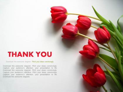
Thank you slide with flowers powerpoint slides




Try Before you Buy Download Free Sample Product
 Impress Your
 Audience
 100%
100% Editable
 Save Hours
 of Time


Tired of using the same slides for professional meetings. Well, we provide to you Thank You Slide With Flowers PowerPoint Slides for ending your meeting, discussion in an effective manner. The visually stunning photographs available in the PPT slide can be used for marketing campaign or any business negotiations, to end the discussion on a good note. The eye catching pictures in presentation diagram can be used to appreciate the support provided by target audience, family, friends and colleagues. The PowerPoint presentation slide can be used in organizing the contact details, website link, email and other essential data. The technology friendly way of communicating is widely accepted and recognized now a days. This thank you closing note ensures your work be appreciated and have a long lasting impact. The PPT graphic helps ensure that concluding words leave a great impact because we all get only one chance to make a good last impression. The presentation slide supports giving a new beginning to your every ending. Create favorable conditions with our Thank You Slide With Flowers Powerpoint Slides. They help cut down the constraints.
People who downloaded this PowerPoint presentation also viewed the following :
Thank you slide with flowers powerpoint slides with all 4 slides:
Ascend the ladder of success with ease. Our Thank You Slide With Flowers Powerpoint Slides will provide strong and sturdy steps.

FAQs for Thank you slide with
Oh definitely put your contact stuff on there - email, LinkedIn, Twitter if it makes sense. I always add something like "Questions?" or "Let's connect!" because honestly, people screenshot that slide constantly but then can't track you down later. Super annoying. Throw in links or QR codes for any resources you mentioned too. Keep everything readable from way back - I learned that one the hard way. Oh, and leave it up during Q&A! People will snap pics of your info while you're answering questions.
Honestly, your "Thank You" slide doesn't have to be where everyone mentally checks out. Throw in your contact info and some clear next steps - maybe even a question that gets people thinking. I've watched way too many speakers just slap up "Thanks!" and then seem confused when the audience starts shuffling around. Try making it a bridge to Q&A instead. QR codes work great for follow-up stuff, or you could pose something that sparks discussion. Don't just use boring text either - make it look decent. You want the conversation to keep going after you're done talking.
Go with softer colors for that thank you slide - navy and white looks clean, or try sage green with cream. Warm grays work too. Honestly, anything beats those aggressive bright colors that make people wince. You don't want them leaving feeling like they got smacked with a highlighter! Blues are safe, muted greens feel calming. Just avoid reds and oranges since they're way too intense for wrapping up. I always think of it like this: would this color make me feel genuinely appreciated? That's your test right there.
Oh absolutely, put your contact info on there! That's when people actually want to reach out to you. Email for sure, plus LinkedIn if your crowd uses it. Twitter? Nah, skip it unless you're actually active there professionally. I learned this the hard way when someone tried contacting me on a platform I never check lol. Creative presentations work great with social links too, especially if you're building your personal brand. Just don't go crazy - stick to 2-3 contact methods max. Keep it clean and make sure you'll actually respond when people hit you up.
Make your "Thank You" slide match everything else you've been showing - same colors, fonts, all that stuff. Don't suddenly switch to Comic Sans, you know? Keep the vibe consistent too. Was your presentation super formal and data-focused? Then don't get weird and quirky on the last slide. But if you've been more relaxed throughout, your thank you can have some personality. I always think it's smart to tie the message back to your main theme instead of boring old "Thank You." Like if you talked about innovation, maybe "Thanks for exploring what's next with us." Oh, and definitely throw your contact info on there so people can actually follow up.
Honestly, those generic "Thank You" slides are such a missed opportunity! Try dropping in a quote about gratitude instead, or maybe a photo that ties back to your main theme. Visual metaphors are clutch - like if you talked about teamwork, show puzzle pieces fitting together or something. I'm always here for presenters who throw in a little humor at the end, but yeah, definitely read your audience first. Oh, and don't forget practical stuff! Add your contact info with "let's keep chatting" or stick a QR code there for extra resources. Just make it feel real, not like you slapped it on last minute.
Dude, visuals on your thank you slide are a total game changer. Like, instead of just boring text on white background, throw in your logo or some image that actually connects to what you just talked about. I swear, nothing kills presentation energy faster than those bland "Questions?" slides everyone does. Your audience needs something to look at while you're wrapping up anyway. A relevant photo works great, or even just some clean design element that matches your brand. Makes the whole thing feel way more polished and genuine. Trust me, it's such an easy win for leaving people with a good final impression.
Honestly? 30-60 seconds tops. Just enough time for people to clap and maybe squeeze in one quick question. Nobody wants to stare at "THANK YOU!" while everyone's shuffling around packing up their laptops - it gets weird fast. I usually aim for 45 seconds in formal settings, but casual stuff can be way shorter. Really depends on the vibe though. If people seem into it and want to chat more, just move past the slide naturally. Oh, and definitely have your contact info ready to throw up next - way more useful than letting that thank you slide overstay its welcome.
Yeah, cultural stuff really matters for thank you slides. Some cultures dig the clean, minimal look - shows respect. Others want bright, bold colors to feel the appreciation. Red's lucky in China but screams "danger" here, which is kinda funny when you think about it. Font choices and how much text you use also hits different depending where you're presenting. I bombed a presentation in Japan once because of this! Do a quick search on your audience's background first. You'll save yourself the awkwardness. Even small tweaks make a huge difference in how your message lands.
Depends on your audience honestly. Formal presentation about layoffs? Skip the jokes. But for most other stuff, humor works great on thank you slides. I've seen people nail it with funny GIFs or callbacks to something they said earlier. Self-deprecating jokes about your own presentation always land well too - people eat that up. Just don't let the humor overshadow actually thanking people, you know? Oh and definitely test your joke on someone first if you're not sure. Nothing worse than crickets when you thought you were being hilarious.
Definitely go with something clean like Helvetica, Arial, or Montserrat for your thank you slide. Sans-serif fonts are way easier to read from the back row than those fancy serif ones. I learned this the hard way lol. Make it bold and big enough that people can actually see it - you'd be surprised how many presentations fail at this basic thing. Skip anything decorative or script-y unless you're doing something super creative. Oh, and test it from across the room first! Sounds obvious but you'll thank me later when your slide doesn't look tiny and sad.
Just throw a quick "Questions?" or "What are your thoughts?" right on your thank you slide. Include your email too - way easier for people to reach out afterward. If it's live, maybe try "Let's discuss!" instead. Honestly, the trick is making it feel chill so people aren't intimidated to speak up. I'd put it in smaller text under your main "Thank You" so it doesn't look cluttered but people can still see it. Oh, and don't overthink the wording - simple usually works best for this stuff.
Yeah, subtle animations can actually make your "Thank You" slide pop more. Simple fades or gentle slides work great for highlighting contact info or next steps. Just don't go crazy with it - bouncing text and spinning stuff looks super amateur, honestly. I learned this the hard way once. Keep everything under 2 seconds total and test it first so it doesn't feel jarky. The whole point is looking polished while making sure people notice the important bits. Less is definitely more here.
Honestly, skip the separate "Thank You" slide. It's kinda awkward when presentations just end with a random "Thanks!" slide - feels so abrupt. What works way better is putting everything on your closing slide. Wrap up your main points, throw in your contact info, then just add "Thank you" at the bottom or work it into what you're saying. Way more natural flow that way. Your closing slide should already be summarizing key takeaways or next steps anyway, so you might as well make it do double duty. Trust me, audiences prefer it when everything's wrapped up together nicely.
Honestly, just keep your thank you slide super simple. I see people mess this up all the time by throwing everything on there - like 5 different social handles, their phone number, email, whatever. It looks messy. Stick to your name and maybe one way to reach you. Oh, and don't use it as a chance to sneak in stuff you forgot to mention earlier (we've all been tempted lol). Your audience is already mentally done at that point anyway. Just match whatever design you've been using and add something like "Questions?" Short sentences work better here. People appreciate when you don't overcomplicate the ending.
-
Content of slide is easy to understand and edit.
-
Excellent products for quick understanding.