


0414 business women with column pie chart powerpoint graph





Try Before you Buy Download Free Sample Product
 Impress Your
 Audience
 100%
100% Editable
 Save Hours
 of Time


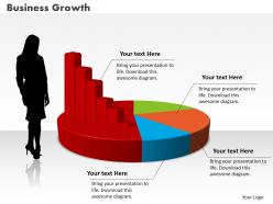
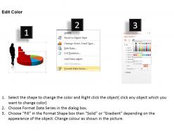
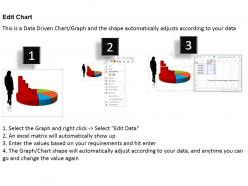
Incorporate our business women with column pie chart PowerPoint slide template into your presentation which is designed especially to meet your financial presentation requirements. The PPT diagram has been created with utmost care. Finance is the most important aspect in any business which needs to be managing with the complete attention. Graphic of business women with 3D column and pie chart has been used to craft this slide show. This PPT contains the concept of data analysis. Use this slide for your data and financial presentations. You can also change the colors, text, font, values, etc. in the slide as per your requirements as the slide is wholly modifiable. Our strategy to create the design is to make the finance presentation an easy task by giving them the pre-designed template that can be easily merged in your presentation. If you want to highlight any other finance aspect then you may browse our other designs also. Get in the frame with our 0414 Business Women With Column Pie Chart Powerpoint Graph. The focus will be centered on you.
People who downloaded this PowerPoint presentation also viewed the following :
0414 business women with column pie chart powerpoint graph with all 3 slides:
Do the maths on ballpark figures. Derive conclusions with our 0414 Business Women With Column Pie Chart Powerpoint Graph.
FAQs for 0414 business women with column pie
Key elements include demographic breakdowns by industry and leadership levels, performance metrics comparing achievement rates, representation percentages across departments, salary distribution data, and career progression timelines. These components enable organizations to visualize gender equity patterns, identify advancement opportunities, and benchmark diversity initiatives, ultimately delivering strategic insights that enhance workplace inclusion and competitive talent management across sectors.
Color psychology in pie charts representing business women can be effectively utilized by choosing empowering colors like deep blues for leadership, warm purples for innovation, and rich greens for growth and financial success. These strategic color choices enhance data comprehension while reinforcing positive associations, with many organizations finding that thoughtful color selection increases audience engagement and strengthens the professional narrative around women's business achievements.
Data most relevant for businesswomen's achievements pie charts includes leadership positions across sectors, entrepreneurship rates by industry, educational attainment levels, revenue generation metrics, and award recognitions. These datasets enable organizations to showcase progress in gender diversity, identify growth opportunities in sectors like technology and finance, and demonstrate measurable outcomes that drive strategic initiatives while highlighting competitive advantages of inclusive business practices.
To ensure your pie chart is visually appealing and easy to understand, use distinct colors, clear labels, limit segments to 5-7 pieces, and arrange data logically from largest to smallest. Professional business presentations benefit from consistent color schemes, readable fonts, and strategic white space, with many executives finding that clean, uncluttered designs enhance data comprehension and decision-making effectiveness.
**INPUT**: What software tools can help create dynamic pie charts for presentations on business women? **OUTPUT**: Dynamic pie chart creation tools include Microsoft PowerPoint, Tableau, Google Charts, Chart.js, and specialized presentation platforms like Prezi or Canva Pro. These technologies streamline data visualization by offering interactive elements, real-time updates, and customizable templates, with many organizations finding that dynamic charts enhance audience engagement and deliver more compelling business presentations.
Incorporate storytelling into pie chart presentations by creating a narrative arc that reveals data progressively, using contrasting colors to highlight key segments, and connecting each slice to specific business outcomes or customer journeys. Frame your pie chart within a compelling business story, such as market share evolution or budget allocation impacts, while using animation sequences to unveil segments dramatically, ultimately transforming static data into engaging narratives that drive strategic decision-making.
Common mistakes include using too many segments, poor color contrast, missing data labels, inconsistent formatting, and unclear legends that reduce readability and professional impact. When presenting women's business data, ensure segments are proportionally accurate, colors are accessible and professional, labels are clearly visible, and the chart tells a compelling story, ultimately delivering clarity and credibility that enhances your column's analytical value.
Tailor pie charts by segmenting data across industry-specific metrics like leadership representation, wage gaps, career advancement rates, and workplace flexibility policies within sectors. Healthcare, technology, finance, and manufacturing present distinct challenges and opportunities for women, with each industry requiring targeted data visualization that highlights sector-specific barriers, progress indicators, and strategic opportunities for organizational improvement and competitive advantage.
Pie charts effectively visualize diversity representation across leadership roles, departments, and workforce demographics, making inclusion metrics immediately comprehensible to stakeholders and board members. These visual representations enable organizations to track progress in gender equity, identify areas needing improvement, and communicate diversity achievements to investors, ultimately driving accountability and strategic decision-making in increasingly competitive talent markets.
**INPUT**: Can you suggest effective ways to present the data visualized in a pie chart verbally during a presentation? **OUTPUT**: Effective pie chart presentation involves starting with the total figure, highlighting the largest segment first, then presenting remaining segments in descending order while using percentages and concrete numbers. Professional presenters enhance comprehension by comparing segments to familiar references, emphasizing key insights through strategic pauses, and connecting data patterns to business implications, ultimately delivering clearer stakeholder understanding and more impactful decision-making outcomes.
Pie charts can effectively compare success metrics between women-led and male-led businesses by visualizing proportional differences in revenue growth, market share, profitability ratios, and employee retention rates. These comparative visualizations enable stakeholders to identify performance patterns across gender leadership demographics, with many organizations finding that such data-driven insights enhance investment decisions and strategic partnerships, ultimately delivering greater transparency in business performance analysis.
Innovative pie chart animations include sequential slice reveals, explosive separations highlighting key segments, rotation effects with data callouts, morphing transitions between datasets, and interactive hover animations. These dynamic techniques transform static data presentations by drawing attention to critical insights, maintaining audience focus during complex explanations, and creating memorable visual narratives, ultimately delivering more impactful business communications.
Combining pie charts with bar graphs, line charts, trend analyses, and demographic breakdowns creates multi-dimensional insights into women's business representation, leadership progression, and industry distribution. This strategic combination enables comprehensive storytelling by showing proportional data alongside performance metrics, timeline progressions, and comparative analyses, with many organizations finding that integrated visual approaches deliver clearer strategic insights and more compelling business cases for diversity initiatives.
Best practices for labeling pie chart sections include using clear, descriptive labels placed directly on segments or connected with leader lines, maintaining consistent font sizes, applying high contrast colors, and limiting segments to seven or fewer for optimal readability. These approaches enhance data comprehension by ensuring accessibility for diverse audiences, reducing cognitive load, and enabling quick identification of key business insights, ultimately delivering more effective presentations and data-driven decision making.
Survey data from business women can be effectively represented in pie charts by categorizing responses into clear, mutually exclusive segments like career priorities, workplace challenges, leadership styles, industry sectors, or experience levels. Each segment should display percentage values and use distinct colors with descriptive labels, ensuring the largest segments appear prominently while maintaining visual clarity and professional formatting for impactful business presentations.
-
Informative presentations that are easily editable.
-
Use of different colors is good. It's simple and attractive.