


0414 data composition line pie chart powerpoint graph




Try Before you Buy Download Free Sample Product
 Impress Your
 Audience
 100%
100% Editable
 Save Hours
 of Time


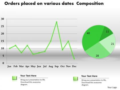
Download data composition line pie chart PowerPoint graph to present your business data in the organized manner. The presentation example crafted with the graphic of line graph and pie chart which are always useful in communicating the information to the audience. Line graphs assist you to compare changes over the period of time for more than one group whereas pie charts are useful when you are trying to comparing parts of a whole as they do not show changes over time. In contrast to these, bar graphs are quite suitable to compare things between different groups or to monitor changes over time. This PPT slide template gives you an access to present your data in the interesting manner which enables you to make an impact on the audience. This PowerPoint sample available in excel linked format so you can edit the data and then use it as required. Download this impressive and creative design in your presentation to share the data. Bring the gang together with our 0414 Data Composition Line Pie Chart Powerpoint Graph. They will develop a common aim.
People who downloaded this PowerPoint presentation also viewed the following :
0414 data composition line pie chart powerpoint graph with all 3 slides:
Our 0414 Data Composition Line Pie Chart Powerpoint Graph focus on every conceivable angle. You won't come up with half baked ideas.
-
Use of icon with content is very relateable, informative and appealing.
-
Innovative and Colorful designs.