


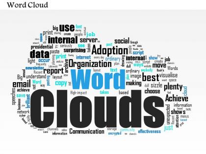
0514 word cloud powerpoint slide template




Try Before you Buy Download Free Sample Product
 Impress Your
 Audience
 100%
100% Editable
 Save Hours
 of Time


Information is the keystone of knowledge. Without a well-informed entity or unit, it is not possible for associated people to be aware of the happenings in this information technology world. PPT inspiration can take a toll if proper presentation tools are not available. Using words as a medium of communication has certainly been an age old and time tested method to notify the target audience. Words have a great impact on the viewers and they are inspired towards the PowerPoint slide design ideas that use them as presentation material. Are you in search of one such PowerPoint slide deck template online? Are you frustrated by the dearth of good quality PPT diagrams that do justice to your thoughts? We at our website publish thousands of efficient and powerful PPT example slides, one such being the word cloud PPT slide. Our designers have made sure that by downloading the PPT samples, you will feel the power of a professional presentation aide. Embed the basics with our 0514 Word Cloud Powerpoint Slide Template. Explain fundamental aspects with clarity.
People who downloaded this PowerPoint presentation also viewed the following :
0514 word cloud powerpoint slide template with all 3 slides:
Gain time with our 0514 Word Cloud Powerpoint Slide Template. Complete your assignment that much faster.
FAQs for 0514 word cloud
Word clouds are honestly perfect for when you've got a ton of data but don't want people's eyes glazing over. Your audience can immediately see the big themes without trudging through paragraphs of text. Plus they look way cooler than bullet points - I always think they make presentations feel more modern somehow. The bigger words automatically draw attention to what matters most. They're especially good for survey results or customer feedback stuff. Just don't go overboard with too many words or it gets cluttered fast and kinda defeats the whole point.
So basically, bigger words = more important in your data. It's like a cheat code for spotting trends without reading everything. Clean out boring words first though - "the," "and," all that filler stuff. Otherwise your cloud will be useless. You can filter by different things too, like time periods or sentiment if you want to get fancy. Honestly, they're kind of addictive to make once you start. Way easier than staring at spreadsheets for hours trying to find patterns that jump right out visually.
So for word clouds, pick 2-3 fonts that actually look good together - don't go crazy with like 5 different ones. Colors should match whatever vibe you're going for. Give your words room to breathe too, cramped text looks awful. Here's the fun part: use custom shapes instead of boring rectangles. Makes everything way more interesting, even if your data is super dry. Put your biggest keywords front and center obviously. Oh, and test it on your phone first - I learned this the hard way when mine looked terrible on mobile. Also try it with real content, not just placeholder text, because that's when you catch the weird spacing issues.
Honestly, just go with WordClouds.com first - it's free and super easy to figure out. Canva's got some options too if you're already using their other stuff. Wordle works but feels kinda dated now? If you want to get fancy with it, Python's wordcloud library is amazing for custom shapes and colors, though that's obviously way more work. Most people just want to change fonts and colors anyway. I always end up spending way too much time tweaking the colors lol. But yeah, start with the web tools - they'll probably do everything you need without the hassle.
Dude, word clouds are amazing for getting people involved! Instead of just staring at your slides, they can actually submit words about your topic in real-time. The cloud builds up as more people respond - honestly it's weirdly satisfying to watch grow. People love seeing their input show up visually, and you'll instantly know what's clicking with your audience. Short sentences work great too. Plus it breaks up all those boring text slides (we've all been there). I'd throw one at the beginning to see what people already know, or use it at the end for main takeaways.
Oh totally! Marketing teams love them for social media analytics and customer feedback - shows what people actually care about. Teachers use them constantly too, like for vocab lessons or getting kids to reflect on stuff. Market researchers throw them at datasets to spot trends and consumer sentiment. Honestly, they're kind of overused sometimes but whatever. Short version: perfect when you need to show frequency/importance to people who hate looking at boring spreadsheets. Works great in HR, education, research - basically anywhere you've got text data and impatient stakeholders.
Honestly, colors make or break word clouds. I bombed a presentation once using pastels - couldn't see anything on the projector lol. Bright colors grab attention for your key terms, but don't go crazy with like 8 different shades. Stick to 3-4 max or it looks messy. Muted colors seem more professional but kinda boring. Your main words need to pop against the background and stand out from less important stuff. Oh, and definitely test it on whatever screen you're actually presenting on. My laptop made everything look fine, then boom - totally washed out in the conference room.
Word clouds work best as backup players, not the star of your presentation. Match your colors and fonts across everything - looks way cleaner that way. Let charts do the number-crunching while word clouds highlight your main themes. Honestly, I've watched people throw every visual imaginable onto one slide and it's just... messy. Put your word cloud somewhere strategic. Maybe upfront to set the scene, or wrap things up at the end. Just don't repeat the same info twice - each visual should tell its own piece of the story.
Word clouds are actually pretty solid for branding stuff. They make your core values super visual - like you can instantly see what your company's about. I'd throw them on your about page or use them in presentations when you're trying to explain your brand to people. Oh, and they work well as social media posts too, honestly way better than boring text blocks. Make sure you use your brand colors though, and let your biggest values show up as the largest words. You could even make one from customer reviews - that's kinda cool because it shows how people actually see you. Start with your mission statement words and see what happens.
Word clouds are honestly pretty fun to mess around with! Your kids can make them from vocab words, book chapters, or their own essays to spot themes. I got weirdly obsessed with making these last year. Try using them for brainstorming sessions or test review too. Historical speeches work great - kids love analyzing which words pop up most in MLK's "I Have a Dream" speech. The visual thing really clicks for some students who struggle with text-heavy stuff. Just grab one lesson this week and throw in a simple word cloud activity. Start small and see how it goes!
Word clouds are honestly pretty tricky. People get distracted trying to read every single word instead of listening to you talk. The text in back gets way too small to see from the audience, and if you mess up the colors it just looks like a rainbow explosion. I've seen presentations where everyone's squinting at the screen for like 30 seconds straight - super awkward. Keep it simple with maybe 3-4 colors max that actually contrast well. Also definitely have a regular slide ready as backup because sometimes these things just don't work the way you planned.
Big words jump out at you first - that's just how our brains work. Smaller text? People skip right over it or think it's not worth their time. Placement's huge too since we naturally scan top-left to center first. I've literally watched people get the wrong takeaway from charts because the designer made some random outlier massive while burying the actual main point in tiny font. Pretty frustrating honestly. Just make sure your biggest words actually represent your most important data points, not whatever happened to show up most frequently.
Honestly, the biggest issue is people think word clouds show actual relationships between ideas - but they're just counting how often words pop up. Bigger doesn't mean more important, it just means more frequent. Context gets totally lost too. Like, you can't tell if "amazing" was used sarcastically or genuinely, you know? They look pretty but they're basically useless for real analysis. I'd say use them to spark discussions maybe, but don't base any serious decisions on them. You'll need actual data breakdowns to understand what's really going on behind all those floating words.
Honestly, just shoot out a quick Google Form right after your presentation - like 3-4 questions max while it's still fresh. Ask stuff like "Did the word cloud actually help clarify the main themes?" or "What grabbed your attention most?" Real-time polling works too if you're feeling fancy - Mentimeter's pretty solid for that. Focus groups give you way better insights though, if I'm being real. Have people rate whether it was clearer than boring bullet points would've been. Oh, and send that survey within 24 hours or people will totally forget to respond.
Honestly, there's so much you can do beyond just the basic oval! Custom shapes work great - like a lightbulb if you're talking about innovation, or even your company logo. Interactive ones are really popular now where people click words for more info. 3D word clouds always grab attention in presentations, though maybe I'm biased because I love anything that pops visually. You could try animated versions where words appear and fade, or do side-by-side comparisons for before/after data. Color-coding by topic or mood adds depth too. Just figure out your main message first, then pick whatever format actually supports what you're saying.
-
Visually stunning presentation, love the content.
-
Use of different colors is good. It's simple and attractive.