

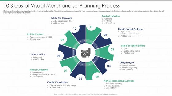
10 Steps Of Visual Merchandise Planning Process




Try Before you Buy Download Free Sample Product
 Impress Your
 Audience
 100%
100% Editable
 Save Hours
 of Time


Mentioned slide outlines various steps involved in merchandising plan. Visual merchandiser can increase the store sales by following steps such as product selection, target customers, selection location of store, design layout, planning for promotional activities etc.
People who downloaded this PowerPoint presentation also viewed the following :
10 Steps Of Visual Merchandise Planning Process with all 6 slides:
Use our 10 Steps Of Visual Merchandise Planning Process to effectively help you save your valuable time. They are readymade to fit into any presentation structure.





FAQs for 10 Steps Of Visual
Ok so the big things are product placement, how much space you give each section, and timing everything right. Put your bestsellers at eye level and in busy areas - that's retail 101. Give more floor space to categories that actually make money. Timing is where most people mess up though, honestly it's such a pain to get right. Map out how customers move through your store naturally, then place stuff accordingly. Oh and group products that go together! Check your current setup against sales numbers - I bet you'll find some obvious fixes pretty quick.
So basically, you're guiding people through your store without them knowing it. Product placement, lighting, displays - all that stuff creates emotional connections and makes certain items pop. You know how you always grab something you didn't plan on buying? That's the magic happening. It affects how long people hang around and how much they spend by making products easier to find and way more tempting. Oh, and when you're setting up displays, think about where customers look first. Those natural sight lines are pure gold if you use them right.
Dude, color theory is everything in visual merchandising. Complementary colors make products jump out at you, while analogous ones create those chill zones where people just keep browsing. Reds and oranges? Total impulse-buy magnets - perfect for sale areas. Blues and greens are way more zen, so use those for your pricier stuff. I swear, some stores I've worked with doubled their sales just from switching up their color game. Oh, and map out how customers walk through your space first - then you can basically paint a path that leads them exactly where you want them to go.
Map out how people move through your space first - they naturally go counterclockwise, so work with that. Wide main aisles are key, but actually make the side paths narrower since it gets people looking closer at stuff. Those power walls when customers first walk in? Don't blow them on boring basics - that's prime real estate. Mix up your fixture heights so it doesn't look flat and boring. Oh, and definitely walk through like you're shopping there yourself. You'll immediately see which corners feel dead or awkward. The whole point is guiding people's eyes to what you want them to see without being obvious about it.
Sales per square foot is your gold standard - shows if displays actually make people buy stuff. I'd also watch conversion rates and how long people hang out in different areas. Heat mapping is cool but honestly overkill for most stores. Track which products sell faster after you move them around, plus average purchase amounts near your main displays. Oh and foot traffic patterns obviously. The trick is picking maybe 3-4 things you'll actually look at each week instead of drowning in spreadsheets you'll ignore. Keep it simple.
Honestly, seasonal trends control everything when it comes to visual merchandising. You've gotta plan displays like 2-3 months out because people's brains work weird - they're already thinking spring fashion in February when there's still snow everywhere! Look at last year's data to figure out what sold when, then adjust your floor layouts. Balance the trendy stuff that gets people excited with the basics that actually pay the bills. Oh and definitely map out your seasonal calendar ASAP. Leave room for those random micro-trends though - they always catch you off guard but can be total goldmines if you're quick enough.
Okay so there's actually a bunch of tech stuff that'll make your life way easier. Planogram software like JDA or SAP is gold for mapping out store layouts - that's where I'd start honestly. Heat mapping shows you where people actually stop and stare, which is pretty cool for tweaking displays. You'll also want digital asset management to keep all your photos organized (trust me on this one). Some people love AR tools for virtual planning, though I've never tried those myself. Photo editing software saves me tons of time too. Seriously, start with planogram software - biggest bang for your buck.
Okay so basically you want your displays to tell a story instead of just dumping products everywhere. Think about it like setting up scenes - maybe a back-to-school thing that follows a student from grabbing morning coffee all the way to cramming for exams at midnight. Props and lighting help move people through the story naturally. Seasonal stuff works great for this too, or showing how products actually fit into someone's real life. Honestly, the whole point is making shoppers feel like they're walking through someone's day rather than just staring at random merchandise. It's way more engaging than typical displays.
Honestly, the worst thing I see is when brands push products they don't even have in stock - like, why promote something that's gonna be backordered? Sales data should drive everything, not just pretty layouts. Most teams work in silos too, completely ignoring what actually sells during different seasons. Copying your competitors is another huge red flag because your customers aren't their customers, you know? I always tell people to leave room for pivots when something randomly blows up. Start with what's moving, then make it look good. Way better than beautiful displays of stuff nobody wants.
Brick-and-mortar is all about physical stuff - lighting, displays, guiding people through your actual space. Online you're basically recreating that same vibe but with website layouts, product photos, and navigation. Store merchandising uses atmosphere and browsing to hook customers. Digital relies way more on data though, which is honestly pretty cool since you can test different layouts instantly. Tools are totally different but both want the same outcome - more sales. Oh and pro tip: map out how customers move through each channel first, then figure out where your visual choices actually impact their decisions.
So here's what I'd do - create solid planograms and brand standards first, like your colors, how fixtures should look, product groupings, all that stuff. But don't make everything identical because honestly? That just looks boring and corporate. Pick maybe 2-3 things that have to be exactly the same everywhere, then let each store tweak the rest based on their space and customers. Document it all with photos and measurements. I'd also plan regular check-ins, whether you visit or do video calls. The trick is giving stores enough freedom to feel local while keeping your brand recognizable.
Oh man, culture stuff is SO important for displays! Like, red screams good luck in China but totally means danger elsewhere. Shopping behaviors are wildly different too. During Ramadan, you'd completely flip your whole strategy in Muslim areas. Don't even get me started on mannequins - showing skin can seriously backfire depending where you are. Local holidays mess with everything as well. Honestly, I'd always test concepts locally first and definitely work with regional teams who actually get the nuances. You'll save yourself major headaches that way!
Honestly, change up your displays every 2-3 weeks or people just stop seeing them. I'm always scrolling through Instagram and Pinterest for ideas - plus checking out what other stores are doing (yeah, I'm that person lol). The trick is connecting everything to seasons, holidays, or whatever's happening locally. Don't just make stuff look cute though - actually track what sells versus what doesn't. Trust me on this one: make yourself a calendar so you're not panicking at 9pm the night before wondering what to swap out next.
So basically you want your displays to match whoever's actually walking through your door. Figure out your customers first - their age, income, what they're into. Gen Z shoppers love bold colors and Instagram-worthy setups, but luxury buyers? They want that clean, minimal vibe with nice materials. Cultural stuff matters too, especially around holidays. Oh and honestly, it's kinda like redecorating for different dinner guests - you wouldn't use the same setup for everyone, right? Try different approaches and see what actually gets people buying. Track which displays work best for each group.
Good displays really do help move inventory faster. Put your slow sellers at eye level with better lighting - customers actually notice them that way. Cross-merchandising works too, like pairing accessories near your main items. Honestly, the difference can be pretty dramatic when you track turnover rates before and after changing displays. I always forget how much lighting matters until I see the sales bump. No one wants dead stock sitting around forever, right? Smart placement makes products way more discoverable, and customers find what they need without getting frustrated and leaving empty-handed.
-
Topic best represented with attractive design.
-
SlideTeam makes creating presentations easy. Unlimited products, premium quality designs and affordable.