


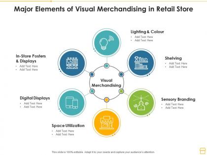
Major elements of visual merchandising in retail store




Try Before you Buy Download Free Sample Product
 Impress Your
 Audience
 100%
100% Editable
 Save Hours
 of Time


Our Major Elements Of Visual Merchandising In Retail Store are topically designed to provide an attractive backdrop to any subject. Use them to look like a presentation pro.
People who downloaded this PowerPoint presentation also viewed the following :
Major elements of visual merchandising in retail store with all 2 slides:
Use our Major Elements Of Visual Merchandising In Retail Store to effectively help you save your valuable time. They are readymade to fit into any presentation structure.
FAQs for Major elements of visual merchandising
Okay so first thing - you need good focal points that grab attention. Put your best stuff at eye level where people actually look. Lighting is honestly everything though, like seriously it can make cheap displays look expensive. Make sure the flow feels natural so people don't get confused wandering around. Color coordination helps tie everything together. Oh and rotate your displays regularly or it gets stale fast. Tell some kind of story with how you arrange things. Clear sight lines are key too - nobody wants to feel lost in a maze when they're shopping, you know?
Oh totally, colors mess with people's heads way more than you'd think! Red and orange get customers hyped up - like they need to buy NOW. Perfect for clearance racks. Blue and green do the opposite though, they're super chill and make people trust you more. That's why fancy stores love those colors when someone's dropping serious cash. McDonald's actually figured this out and ditched their crazy red everywhere because they wanted people to hang out longer instead of just grabbing food and leaving. Quick purchases need energetic vibes, bigger decisions need calming ones.
Honestly, lighting can totally make or break your display. I learned this the hard way when I first started! You'll want to layer different types - ambient for overall coverage, then accent lighting to make your best stuff pop. Warm lights work great for cozy vibes (clothes, home goods), but go with cool white for tech or luxury items. The trick is making your hero products about 3-5 times brighter than everything else around them. Creates this natural flow that draws people's eyes exactly where you want them. Short sentences work too. Drama is everything in retail.
Okay so basically create little scenes instead of just putting stuff on shelves randomly. Like that "cozy Sunday morning" vibe with pajamas, coffee mugs, soft blankets - you know what I mean? People need to picture themselves actually using this stuff. Pick one story per display area and stick with it. Don't overthink it though - just think about how your customers actually live their lives and build around that. The goal is they walk by and think "oh that's totally my vibe." Works way better than those boring traditional setups everyone does.
Dude, the worst thing you can do is cram too much stuff everywhere - it looks messy and turns people off. Also your lighting needs to be consistent or it just feels weird walking around. I swear people forget to switch displays up too, like customers notice when you've had the same setup for months. Don't block walkways either, and pick ONE main thing to highlight per area. Too many "look at me!" spots just confuse everyone. Oh and make sure price tags are actually visible - sounds obvious but you'd be surprised how often they're hidden behind products. Just walk through your store like you're shopping there. Does it feel inviting or chaotic?
Swap out your displays every 6-8 weeks - way too many stores just leave stuff up forever! Put them where people actually stop and look around. Colors should match the season (sounds obvious but you'd be surprised). Tell some kind of story with your setup, like that cozy fall feeling or whatever. Oh, and definitely use different heights and textures so it's not boring to look at. Don't cram everything together though. The key thing? Connect it to products you're actually trying to sell. I always start planning the next season while my current display is still going.
Track sales per square foot and conversion rates first - those show if displays actually drive purchases. Foot traffic patterns matter too, plus how long people linger around your setups. Basket size is another good one. Honestly, dwell time might be my favorite metric because you can literally see people getting drawn in. Before changing anything, measure your baseline numbers so you've got proof when management asks for ROI later. I'd check these monthly, maybe bi-weekly if you're testing new layouts frequently.
So online visual merchandising is way more flexible - you can test different product layouts and see what actually works in real-time. Physical stores have those space limits and you're stuck with seasonal displays, but online you're basically designing how people move through your site. Everything's about optimizing images and using data to show customers what they want to see. There's no "prime spot" like those endcaps either, it's all search rankings and click rates. The best part? You can swap your main images instantly based on what's converting. Honestly, I'd start by looking at where people bail out of your site first.
Honestly, AR mirrors are probably the coolest thing I've seen lately - customers can try on clothes or see how furniture fits without the hassle. Smart shelves track everything automatically, which saves so much time. Digital signs are getting crazy good at showing personalized stuff based on who walks by. Oh, and projection mapping makes stores look like art installations (total Instagram bait). Don't go overboard though - maybe start with some digital displays or a simple AR app. You don't need the whole futuristic setup right away to make a difference.
Okay so think of visual merchandising as how your brand talks without words. Colors, layouts, props - all that stuff tells your story when customers walk in. Apple's stores are crazy clean and minimal, right? Target always feels fun and approachable. Your displays need to scream whatever makes you different - luxury, eco-friendly, quirky, whatever your thing is. Every single visual element should feel like *you* so people recognize your vibe instantly. Honestly, consistency is everything here. From your windows to how you arrange products on shelves, it's all gotta connect back to who you are as a brand.
Okay so the main thing is putting your best sellers at eye level - people literally shop with their eyes first. I'd group similar stuff together and remember most people scan left to right. Three items look way better than two or four for some weird psychological reason. Don't cram everything - give products room to breathe or it looks messy as hell. Keep shelves stocked and face everything forward because empty spots make you look unprofessional. Honestly, I'd start by tracking what actually sells from each spot first. That'll tell you more than any fancy merchandising theory.
Oh man, this is huge - I've seen companies totally bomb because they ignored cultural differences. Red means luck in China but screams danger here in the US. Shopping habits are completely different too. We had this sleek European display that looked super chic, but Middle Eastern customers thought it looked cheap and empty - they wanted that abundant, luxury vibe. Religious stuff matters too, plus how you style mannequins. Even reading patterns vary by culture, which honestly I didn't realize until way too late. Don't just translate your concepts - actually work with local teams to redesign them. Trust me on this one.
Honestly, you've got such an advantage over the big guys here. Target's stuck following some corporate playbook while you can literally change your displays whenever you want. Focus on making it feel personal - group stuff by lifestyle instead of just throwing similar products together. Your lighting alone can make everything look way more expensive than it actually is. And that window? Make people want to come in and ask about what you're showing off. I mean, you can actually have real conversations with customers about your products, which is something those massive chains will never pull off. Even small tweaks make a huge difference.
Honestly, customer psychology is like 90% of visual merchandising. People shop with their emotions first - they see something that makes them feel good, then figure out why they "need" it later. Your eye naturally scans left to right, so put your best stuff there. Colors matter way more than you'd think - bright ones energize people, softer tones calm them down. I always tell people to watch how customers actually move around the store (it's kinda fascinating actually). Figure out what your target customer really wants deep down - are they stressed? Trying to impress someone? Then design your displays to hit those feelings. Test different setups and see what works.
Put your impulse stuff right at eye level - checkout lines, store entrances, those endcap displays. Grocery stores are so sneaky putting candy at kid height by the registers, but honestly? It works. Bright colors grab attention fast. Create some FOMO with "limited time" or "while supplies last" signs. Oh, and bundle things together - when someone grabs batteries, make sure they see the flashlight display right there. You're basically catching people when they're already spending money and not thinking too hard about it.
-
Informative presentations that are easily editable.
-
Great experience, I would definitely use your services further.
-
Thanks for all your great templates they have saved me lots of time and accelerate my presentations. Great product, keep them up!
-
Easily Editable.