

Retail store layout sample of ppt




Try Before you Buy Download Free Sample Product
 Impress Your
 Audience
 100%
100% Editable
 Save Hours
 of Time


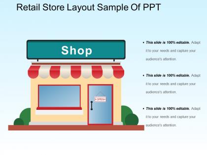
Plan your retail store layout with our “Retail store layout sample PPT design”. It is a professionally designed PPT template which helps in bringing the exact picture of your store. A good store layout guides the customer and exposes him/her to the entire store offering. .A good layout itself acts as the most meaningful communication between the retailer and the customer. So,keeping the concept of retail layout as an important milestone to achieve your desired sales and targets, our designers at SlideTeam have created yet another spectacular design which can be shared with the appropriate audience. The PPT template shows a retail shop design with some text boxes which can be used to show some important points regarding the layout. This PPT layout is useful for FMCG companies, clothing brand companies, or any company which have their own franchisees.They can use the PPT to create balance between sales and shopping space. The sales and marketing team can also use this presentation for discussing the layouts. So,download our retail layout PPT to sail through a tough task of building everything on your own and enhance the customer experience in shopping and increasing the purchases. Our Retail Store Layout Sample Of Ppt will entertain the hall. The event will be full of fun.
People who downloaded this PowerPoint presentation also viewed the following :
Retail store layout sample of ppt with all 5 slides:
Deliberate deeply about every issue with our Retail Store Layout Sample Of Ppt. Ensure you don't judge in a hurry.
FAQs for Retail store layout
So first thing - map out how people actually walk through your store. Most folks turn right when they walk in (weird but true), so that's prime real estate for your best stuff. Keep aisles at least 4 feet wide or people get claustrophobic. You want clear sight lines too - customers should be able to see across the whole space without feeling lost. Your checkout needs to be visible but not create a traffic jam. Honestly, the whole point is making it stupid easy for people to find what they came for while stumbling across things they didn't know they wanted.
Your store layout completely changes how people shop. Grid setups work great for grocery runs - customers hit every aisle systematically. Racetrack designs push shoppers past more products, though some find it manipulative honestly. Free-flow lets people wander and discover stuff, but it can feel chaotic if you overdo it. Match the layout to how customers want to shop. Grids for quick necessity trips, racetracks when they're browsing with purpose, free-flow for that "experience" vibe. Try different setups in sections and see what actually drives sales - sometimes the theory doesn't match reality.
Product placement makes such a difference for getting customers engaged! Put your high-margin stuff at eye level and stick popular items toward the back - forces people to walk through more of your store. End caps are seriously underrated for this. I'd group related products together so people stumble onto things they weren't planning to buy. Like, you want to create this natural flow where one thing leads to another. Track which displays actually get attention though - some spots just don't work no matter what you put there. Short sentences mixed with longer ones keep the journey interesting for shoppers.
Honestly, a good layout is like having a roadmap for your customers - they'll flow through naturally instead of getting lost. Put your high-margin stuff where people actually walk, not shoved in some corner collecting dust. Your staff won't waste time hunting for where things belong either, which is a huge time-saver. Here's the thing though - people buy more when they're not frustrated trying to find stuff. I'd start by just watching where customers go and where they seem to give up. You'll probably spot some obvious fixes right away that could bump up sales without spending a ton.
Honestly, start small with tech - don't go crazy right away. Digital signage is solid for product info, and customers actually enjoy messing around with touchscreens (way more than I expected). Smart mirrors in fitting rooms are pretty cool - people can try different colors without changing. For bigger stores, mobile apps with indoor maps are clutch. Oh, and beacon tech can push personalized deals based on where someone's standing, which is kinda neat. I'd pick maybe two things max to test first. See what your customers actually use before dumping money into a bunch of fancy stuff they'll ignore.
So basically you want wide main aisles - like highways for carts. Then add narrower side paths that push people past your expensive stuff and impulse buys. Put essentials like milk way in the back so customers have to walk through everything else. I know, kinda sneaky but honestly it works! Oh and make your pathways curve a little instead of going straight - keeps people wondering what's around the next corner and they'll hang around longer. The whole thing should feel natural, not like you're herding them around.
Think of your layout as your brand's personality walking around in physical form. Cluttered mess = discount vibes. Clean, intentional spacing? Premium all the way. Lighting's huge too - fluorescents scream cheap while warm spots feel fancy. Match your flow to your story. Accessible brand needs easy navigation. Going for exclusive? Add some mystery with what people can actually see. I swear harsh lighting kills the vibe faster than anything else. Walk through regularly and honestly ask yourself: does this space actually show who we are? The disconnect is usually pretty obvious once you look for it.
Oh man, lighting makes such a huge difference! Warm, bright lights literally pull customers toward displays and make them want to stick around longer. Cool lighting? It's fine for checkout but feels super clinical everywhere else - learned that the hard way. People avoid dark corners like the plague, so map out where your lighting sucks compared to where customers actually walk. Warmer tones (around 2700-3000K) create that cozy vibe that gets people browsing instead of just rushing through. Honestly, fixing a few dark spots could boost your dwell time without spending a fortune.
Hey! So seasonal stuff totally changes the game for store layouts. Move all your holiday merchandise right up front where people walk in - that's prime real estate. Clearance is tricky though, honestly I've seen stores mess this up constantly. You want promotional zones that pop but don't block views of your regular products. Regular inventory has to shift around to make room for temporary displays and all that seasonal chaos. Oh, and plan this whole thing like 6 weeks out or you'll be stressed trying to rearrange everything last minute.
Ugh, where do I even start? First off, don't put your entrance in some weird spot that confuses people. Cramming too much stuff into tiny aisles is the worst - it's like shopping in a sardine can. Why do stores always hide their best products in the back corner? Makes no sense. Put that stuff up front where people actually see it. Oh, and fix your lighting! Especially in fitting rooms - nobody's buying clothes when they look terrible under fluorescent death rays. Your checkout area should grab those last-minute impulse buys too. Honestly, just walk through like you've never been there before and see where it feels off.
Okay so demographics are huge for store layouts. Young people browse randomly and buy on impulse, so you want wider aisles with cool displays right at their eye level. Older customers? Completely different - they hate searching around for stuff and need clear paths through the store. If families shop there, think strollers and kids running around, so more space is key. Oh and income matters too - richer customers expect that fancy, uncluttered vibe. Honestly I'd start by figuring out who your main customers are, then design different sections based on how they actually move and shop.
Honestly, it's all about making checkout fast and grabbing those last-minute sales. Set up multiple lanes with clear signs so people know where to go - nobody likes waiting in a long line when there's a shorter one right there. Stock candy, magazines, little gadgets nearby since people will totally impulse buy while they're stuck waiting. Self-checkout works great for folks with just a couple items, though my mom still refuses to use them lol. Make sure you've got enough space so shopping carts aren't creating chaos everywhere. Good lighting helps too. The whole point is keeping that final impression positive.
Track your sales per square foot and conversion rates before making changes - those numbers don't lie. Heat mapping is clutch for seeing where people actually go vs where you think they go. I swear the dead zones will shock you. Monitor how long customers hang out in each section and whether moving products around boosts their performance. Quick surveys help too, but honestly just chatting with customers works great. Give it 4-6 weeks before judging results though. People need time to adjust to new layouts.
Honestly, accessibility should be your starting point when designing any retail space. Wide aisles are a must - wheelchairs need room to maneuver. Lower some of your shelving so it's actually reachable, and make sure your lighting doesn't suck for people with vision issues. Oh, and check your flooring isn't some slippery nightmare waiting to happen. Beyond just doing the right thing, you're missing out on customers if people can't move around your store easily. Try walking through it yourself and think - could someone with crutches or a walker actually shop here? That question alone will fix most layout problems.
Honestly, heat mapping is your best friend here - it shows exactly where people hang out vs where they just walk through. I'd start by tracking how customers actually move around your store and where they're buying stuff, not just browsing. Sales data tells the real story about what placements work. You can spot bottlenecks during rush times too, which is clutch. The trick is A/B testing different layouts based on what you find. Don't change everything at once though - test one section, see if it actually makes a difference, then move on. Way less overwhelming that way.
-
Awesomely designed templates, Easy to understand.
-
Appreciate the research and its presentable format.