


Retail store presentation powerpoint ideas




Try Before you Buy Download Free Sample Product
 Impress Your
 Audience
 100%
100% Editable
 Save Hours
 of Time


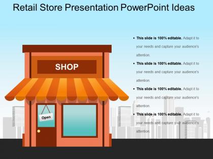
Developing a web store is quite involving. There are various things to do apart from just the designing part, which include website template that could take months to develop as well as get it running. The use of the best retail website presentation template helps to save your time so that rather than focusing on programming and design, you can focus more on the backend programming part along with customization of the retail site so that it fits the organization's requirements. The retail purchasing store PowerPoint template acts as a handy tool to explain the AIDA model which stands for Attention, Interest, Desire, and Action. The retail store model design template aids to suggest an understanding of how to target a market effectively. The presenter can use the purchasing store diagram PowerPoint slide to describe the actions as well as strategies on each step of the marketing path. The sales manager can use this retail shop design PPT template to encourage customers to subscribe to their site, emailing them with the latest offers as well as encouraging them to make repeated purchases. Dispel inhibitions with our Retail Store Presentation Powerpoint Ideas. Build confidence in folks to be expressive.
People who downloaded this PowerPoint presentation also viewed the following :
Retail store presentation powerpoint ideas with all 5 slides:
Beef up your impression with our Retail Store Presentation Powerpoint Ideas. Add extra flesh to your image.
FAQs for Retail store
Focus on your entrance first - keep it clean and welcoming. Wide aisles are crucial so people can actually browse without bumping into stuff. Map out how customers will move through your space naturally, like you're creating a flow that makes sense. Put your big money-makers at eye level where everyone walks by. Honestly, the checkout placement can make or break sales too. High-traffic spots are gold for positioning anything you want people to notice. Just think about their whole journey from walking in to buying something and smooth out any weird awkward parts.
Okay so visual merchandising is basically about guiding customers around your store and making them actually want to buy things. Good lighting and clear sight lines help people navigate without getting lost or frustrated. Group stuff logically too - like put that jacket next to scarves and boots so people can picture the whole outfit. Apple stores are honestly the gold standard for this kind of thing. The trick is making displays that actually match how your customers think and shop, not just what looks Instagram-worthy. When done right, people discover things they didn't even know they wanted.
Dude, lighting totally changes how people shop - it's crazy! Bright, cool lights make customers move faster and buy practical stuff. But dim, warm lighting? That makes them stay longer and grab more impulse purchases. I swear, the psychology behind it is fascinating. You can use accent lights to highlight certain products too, which basically controls where people look and walk. Really depends what you want though. Need quick turnover? Crank up the brightness. Want people spending more per visit? Go cozy and warm - they'll browse way longer.
Dude, seasonal displays are money makers - I've seen stores pull 15-30% sales bumps when they nail the timing. People get emotionally attached to holidays and they're already planning to spend anyway. You just gotta hit that sweet spot with timing though. Put stuff out too early and customers get annoyed (seriously, who wants Christmas trees in September?). Track what works best for your crowd each year. Some themes absolutely crush it while others flop hard. Once you figure out your winners, go bigger on those next season. It's basically free money sitting there.
Eye level is money - that's where your best stuff should go. When people walk in, hit them with your power wall (new arrivals work great there). I always group related products together so they end up buying more than planned. Those endcaps at the end of aisles? Pure gold for conversions. Mix things up every few weeks too - customers stop seeing displays if they're always the same. Oh, and make sure it feels natural while you're secretly steering them toward whatever makes you the most profit. Works every time.
Colors mess with people's heads way more than you'd think. Red makes shoppers feel rushed - that's why every "SALE!" sign uses it. Banks love blue because it screams trustworthy, and anything green feels healthy or eco-friendly. Yellow and orange are attention magnets, but honestly? They can look pretty tacky if you go overboard. There's a reason Chanel isn't rocking neon yellow packaging. You want your colors to match what you're selling and the vibe you're going for in each part of your store.
Pick one thing that'll grab attention from way down the street - your coolest product or something visually striking. Don't clutter it up, but use different heights and maybe group things in threes for that balanced look. Lighting makes or breaks everything, honestly. I learned this the hard way when my first display looked amazing during the day but completely disappeared at night! Tell some kind of story with your setup, tie it to what's happening seasonally. Switch things around every few weeks so people don't get bored walking by. Oh, and definitely step outside to see how it actually looks from their perspective.
Put directional signs where people naturally pause and think "wait, where am I going?" - store entrances, where aisles meet, between departments. Keep them at eye level with consistent design so customers aren't craning their necks around. Most stores totally overcomplicate this whole thing tbh. Just map out how people actually move through your space, then drop signs at those "hmm" moments. Simple language beats fancy wording every time. Walk through it yourself first - you'll spot the confusing spots right away. The whole point is making shopping feel effortless, not like solving a puzzle.
Traffic flow's huge - watch how people line up during busy times and see where they're getting stuck. Your cashiers need decent counter space or they'll hate their jobs. Lighting matters too since everyone's fumbling with cards and cash. I swear half the stores I go to have these tiny cramped lanes that just piss everyone off. Don't forget wheelchair accessibility requirements. Impulse buys are great money makers but keep them organized, not just thrown everywhere. Honestly? Just stand there during your rush hours and you'll spot the problems pretty quick.
Honestly, digital signage is a game changer for stores. You can switch up promotions instantly - no more reprinting stuff constantly. The bright, moving displays grab way more attention than boring static posters ever will. What's cool is you can show different content throughout the day. Morning rush gets coffee promos, evening crowd sees dinner specials or whatever. My buddy started with just two screens in his busiest spots to test things out. Smart move since you don't want to go overboard right away. The ROI comes pretty fast though - customers definitely engage more.
Okay so cleanliness is huge - it's literally what makes or breaks first impressions. Nobody wants to shop somewhere dusty or cluttered because then they're focused on the mess instead of your actual products. I always tell people to do a morning walkthrough like you're seeing the place for the first time. You'll catch stuff you've been blind to for weeks. Organized displays help customers find things easier and stumble across new items too. Honestly, messy stores just scream "low quality" and people bounce pretty quick. Oh, and definitely deal with any weird smells - those linger in customers' minds way longer than you'd think.
Tell customers the real story behind your products - like how that jewelry designer started in her garage or whatever got your founder into sustainable stuff. People eat that up way more than boring product specs. Your displays should show these stories visually, and staff can share quick customer wins they've seen. Honestly, little story cards work great too. Just don't make it sound rehearsed - that's the kiss of death. Pick your bestseller first. See what happens when you give it a backstory instead of just listing features.
Okay so basically when you hit multiple senses, people stay longer and buy more stuff. Music, scents, letting them actually touch things - it all creates this emotional thing that makes your store stick in their heads. Plus it just feels way better than those weird sterile places that make you want to leave immediately. You're kinda tricking their brain into connecting with your brand, but in a good way obviously. The trick is being smart about what vibe each thing gives off and making sure it actually fits who you're trying to attract.
Track it through your sales numbers and see how customers actually move around the store. Conversion rates and time spent in different areas tell you a lot. Heat mapping is wild - customers never go where you think they will! I'd also just watch people and ask what grabs their attention. Super simple but works. The trick is getting your baseline numbers first, then making changes and comparing over the same time period. Otherwise you're just guessing if anything actually worked.
Honestly, the worst thing you can do is cram too much stuff everywhere - customers just get overwhelmed and leave. Lighting's huge too, nobody wants to shop in a cave. Oh, and dust! I swear people notice that more than you think. Your pricing needs to be consistent or folks get confused. Make sure your team actually knows where things are (awkward when they don't), and switch up your featured stuff so regulars don't get bored. I'd walk through once a week pretending I'm shopping there for the first time. You'll catch issues you totally missed before.
-
Easily Understandable slides.
-
Really like the color and design of the presentation.